A Good Bubble Chart About the Bust
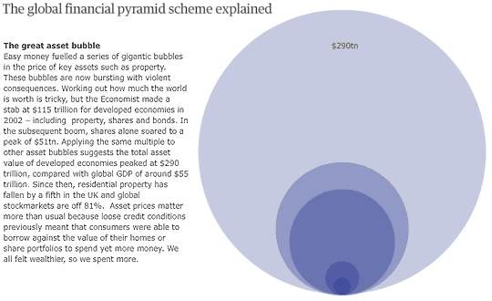
After quite sometime I have come across this really well done bubble chart. Checkout where did all the money go? (requires flash) on Guardian.

Instead of overwhelming us with all the bubbles at once, they have used simple animation to tell the story. I think, bubbles worked in this case also due to the astronomical size of numbers (although very sad). For example, the smallest bubble represents central bank gold reserves, where as the largest bubble represents the great asset bubble or the percieved value of all assets (before the recession hit us and the bubble is busted).
Not all data has the same pattern, which is all the more reason why bubbles are not good for all situations.
What do you think about the where did all the money go data visualization? cool or not so?
Recently discussed data visualizations: Professional Resume or Data Visualization Fail ? | Do you know how to KISS, Wall Street Journal does

Hello Awesome...
My name is Chandoo. Thanks for dropping by. My mission is to make you awesome in Excel & your work. I live in Wellington, New Zealand. When I am not F9ing my formulas, I cycle, cook or play lego with my kids. Know more about me.
I hope you enjoyed this article. Visit Excel for Beginner or Advanced Excel pages to learn more or join my online video class to master Excel.
Thank you and see you around.
Related articles:
|
Leave a Reply
| « Excel Colors Somehow Getting Changed ? | “Too Many Worksheets” Driving You Nuts? Read This! » |

 At Chandoo.org, I have one goal, "to make you awesome in Excel & Power BI". I started this website in 2007 and today it has 1,000+ articles and tutorials on data analysis, visualization, reporting and automation using Excel and Power BI.

One Response to “A Good Bubble Chart About the Bust”
Chandoo... going through old infographics I found this... and it looks interesting... please put up a tutorial or video on it
or maybe actually improving it by adding countrywise or firmwise(Lehman Bros., Countrywide, Fannie Mae etc.) interactive options