
So how did your weekend go?
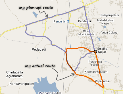 Recently I bought a bicycle. Naturally, outdoor biking has become my primary fitness activity now. So, I went to Google Maps on Sunday morning and found a nice route of 14 kilometers. So I set out on my bike.
Barely a kilometer on that route, I found myself at a cul-de-sac. So I asked a passer by how do I get to “Rampuram“, the place where my route would merge with a state high-way. He vaguely pointed to the left and told me to go right. And right I went, thru what I can call as a walking trial (and what Google tells me as a major road). After biking for a few more minutes, I ended up at an over bridge. And this is where I trusted my gut and took left. And I kept riding on a steep road. I saw 1-2 villages whose names I did not recognize. So I told myself, yeah, this must be the right route. And then, I came to an intersection that looked very familiar. And guess what?, I took a wrong turn and I ended up doing a shorter route. I rode back on the highway to home as it was getting too hot and too late.
But then the weekend ended on a brighter note as we watched a couple of good movies and played with kids.
How was your weekend?
Why did you tell me about the biking story?
Today, we have no excel post. Instead, I am going to ask you to fill-up a survey. And I realized, people always help whenever I lost my way. So…, 😛
Are you interested in online VBA Classes?
Many of you have emailed and asked me, “Chandoo, can you help us learn VBA too? Just like you do with Excel.”
![]() Well, as flattering as those requests were, the fact is, I was lousy at VBA. Well, I used to be very good at Visual Basic, back in the college days. But my programming skills have rusted over the years as I did very little coding. I guess, I have become a business-guy. So it took me time to re-learn VBA. And now, I am happy to announce that We are ready to start our very first batch of VBA Class.
Well, as flattering as those requests were, the fact is, I was lousy at VBA. Well, I used to be very good at Visual Basic, back in the college days. But my programming skills have rusted over the years as I did very little coding. I guess, I have become a business-guy. So it took me time to re-learn VBA. And now, I am happy to announce that We are ready to start our very first batch of VBA Class.
We even have an awesome domain for the classes – VBAClasses.com. (Dont go there yet, it is still blank.)
But, before we start, I need some help from you. I want to know what is it that you want to learn, so that we can design the course curriculum & methodology around your needs.
So please take a few minutes and complete this survey:
(If you cannot see the survey, click here).
Thank you very much.
Thank you so much for your time. I promise that next time, I will tell a more exciting biking story. May be I will find a unicorn or double rainbow. Or, I can just throw in a VBA tip to make it worthwhile.


25 Responses to “Display Alerts in Dashboards to Grab User Attention [Quick Tip]”
I prefer the red,grey,light grey,black icon set. I've also used in-cell pie charts from Fabrice's Sparklines for Excel as an alert which could also provide another piece of information.
I prefer the red,grey,light grey,black icon set. I've also used in-cell pie charts from Fabrice's Sparklines for Excel as an alert which can also provide another piece of information.
For Excel 2007, your formula should do the same as the Excel 2003 version, so that non-alert rows are blank - if they are 0, the unnecessary green icon will show
Hi Chandoo,
Nice Post !! just to add something for EXL 2003, we can also 4 Ifs and link to the alert data
For Ex: If we have alert data in Cell A2 and want to split in 4 orders namely <25%, 25-50%, 50-75% and 75%< then we can following formula and put fonts as you have suggested :
=IF(A2<0.25,CHAR(153),IF(A2<=0.5,CHAR(155),IF(A2=0.76,CHAR(152)))))
And then using Conditional Formating we can dashboard reflected on different COLOURS as per their respective alert.
Best Regards
Rohit1409
Hi Chandoo,
Nice Post !!! just to add something for EXL 2003, we can also 4 Ifs and link to the alert data
For Ex: If we have alert data in Cell A2 and want to split in 4 orders namely <25%, 25-50%, 50-75% and 75%< then we can following formula and put fonts as you have suggested :
=IF(A2<0.25,CHAR(153),IF(A2<=0.5,CHAR(155),IF(A2=0.76,CHAR(152)))))
And then using Conditional Formating we can dashboard reflected on different COLOURS as per their respective alert.
Best Regards
Rohit1409
The Complete formula [Don't Know how it got cut ]
=IF(A2<0.25,CHAR(153),IF(A2<=0.5,CHAR(155),IF(A2=0.76,CHAR(152)))))
PS : Use in single line [I have split it to avoid cuts 😉 ]
Hi Chandoo..
why it is not displaying the complete formula..
anyways here is the balance
"=IF(A2<0.25,CHAR(153), IF(A2<=0.5,CHAR(155), IF(A2=0.76,CHAR(152)))))"
@Rohit... your formulas are fine. Just that the width of comment area is fixed and hence my website is cropping it at 640pixels. I just edited your formula and added few white spaces so that it wraps nicely.
Very good idea btw.. kudos!
Hi,
Maybe just go for 'bold' ; 'underline' or 'italic' to draw the users attention? Those methods (if those can be called methods) are used cross media type (books, journals, blogs, billboards, ...) to guide the readers eye to valuable information.
Just a basic thought
@Tom.. good idea..
[...] has a very nice writeup on how to add such alerts to dashboard sheets. Possibly related posts: (automatically generated)Divide your data set into workbooksHow to enforce [...]
Hi Chandoo,
You certainly grabbed my attention! although I wasn't sure what my brother (Suresh) and cousin (Shyam) were doing right, and I was doing wrong? 😉
I love your blog btw - Many thanks for all your hard work in unravelling the secrets and mysteries of Excel!
Best regards
Ramesh
I thought I saw an advertisment for a book about learning excel called excel himalaya or something. It cost about 35.00 us money but seemed to have the things I need to have my admin assistant to start to use. I was hoping to start with this book and then send her to school if she shows some interest and aptitude. Any help on this would be appreciated. Thanks
Great web site and information!!!!
@Jeff... checkout http://chandoo.org/wp/2010/08/25/excel-everest-review/
thanks, your website is awesome!
[...] Alerts to highlight focus areas [...]
[...] There are lots of numbers in this dashboard. I would suggest adding few more visualizations like showing indicators or applying conditional formatting or replacing a table with a chart. This would reduce the [...]
[...] is the same technique as alert icons in dashboard. Just that I also showed green [...]
[...] is the same technique as alert icons in dashboard. Just that I also showed green [...]
Hi Chandoo
Firstly thanks for all the cool tips on how to use Excel better.
I am new to the site and have a question which you may be able to assist with but dont know if these comment boxes are the best way of asking ?
I am looking at assets and trying to calculate the depreciation total by taking a year (say 2010) adding the expected life of the asset (say 10 years) then comparing that to a future date (say 2015) using an IF statement. The calculation in normal is - IF((year in col B (2010) plus 10years)>year 2015, add a years depreciation, otherwise leave blank). The converted date value does not appear able to add 10 years in order to compare it to 2015. Am I missing something ?
I use the “IF” Statement in conjunction with Conditional Formatting in MS Excel to give verbiage to alert one of a required action, dependant on a review date. This makes a visual stimulus, plus it clues one as to what the conditional format is trying to warn you about and what follow-up actions are required.
Wow, I'm really impressed with dashboards. I had no idea this stuff was even possible with excel. I'd like to offer an interactive dashboard to my customers, showing analytics of their data. I have a .pdf file with the datapoints. I'd like them to enter the data on my website, and be able to see their data. Is something like that possible.
Hi Chandoo,
I've recently purchased the package for both templates.
In the portfolio dashboard,under the calculations worksheet, I'm attempting to change the date range in the gantt chart to show only the range of the project that starts in late 2013. How do I do this?
Thanks
Adam
[...] is the same technique as alert icons in dashboard. Just that I also showed green [...]
Hi Chandoo,
I'm new at Excel Dashboard and found your blog really useful and helpful! It's very nice of you that you dedicate your time to do this.
Could you please explain how can I use Alerts based on dates on a Dashboar?
For example, if a target date is coming closer to the actual date, the alert is yellow or red.
I'd really appreciate some help!
Thank you
Where can I download the file Excel of Averall Statistics ???
Thanks a lot.