
 Imagine carefully creating a workbook with several calculations and formulas only see errors. What to do when you get an Excel formula error? Of course, you can shake your head and ask, “Why, why would you do that?”, but that will not help.

So in this article let’s learn how to fix Excel formula error. Those annoying #SOMETHING!s that you see when your excel formulas have something wrong with them.
Excel Formula Error Checklist
Use this checklist to quickly understand common formula errors, what they mean, when you would see them and how to fix them. Read on to know more about the errors.
| Error | What it means? | Most common reason | How to fix it? |
|---|---|---|---|
| #N/A | Not Applicable | When VLLOKUP can't find what you want | Make sure your list has the value you are looking for. Use IFERROR or IFNA to fix |
| #DIV/0! | Divide by Zero | Denominator is zero | Use IF formula to safe divide |
| #NAME? | Could not find the name | Spelling mistake / typo | Double check your formula and fix the error |
| ######### | Could not display or format | Cell too small | Adjust column width |
| #VALUE! | Invalid value | Converting non-dates or numbers | Make sure your dates are correctly formatted |
| #REF! | Reference missing | When you delete a row / column / cell | Check cell dependancies before deleting |
| #NUM! | Invalid number | Number too high or too low | Check your calculation |
| #NULL! | Missing or null value | Reference points to nothing | See if your references are right |
#N/A Formula Error
This is one of the most frequent excel formula error you see while using vlookup formula. The N/A error is shown when some data is missing, or inappropriate arguments are passed to the lookup functions (vlookup, hlookup etc.) of if the list is not sorted and you are trying to lookup using sort option. You can also generate a #N/A error by writing =NA() in a cell.
How to fix #N/A error?
Make sure you wrap the lookup functions with some error handling mechanism. For eg. if you are not sure the value you are looking is available, you can write something like =IFERROR(VLOOKUP(…), “Value not found”). This will print “value not found” whenever the vlookup returns any error (including #N/A)
Related: Learn more about IFERROR formula
#DIV/0! Formula Error
This is the easiest of all. When you divide something with 0, you see this error. For eg. a cell with the formula =23/0 would return in this error.
How to fix #DIV/0 error?
Simple, use IF formula to safe divide, like this:
=IF(A2=0, “”, A1/A2)
#NAME? Formula Error
The most common reason why you see this error is because you misspelled a formula or table or named range. For eg. if you write =summa(a1:a10) in a cell, it would return #NAME? error. There are few other reasons why this can happen. If you forget to close a text in double quotes or omit the range operator :. All these examples should return #NAME? error. =sum(range1, UNDEFIED_RANGE_NAME), =sum(a1a10)
How to fix #NAME? Error?
- Make sure you have mentioned the correct formula name. Use auto-complete when typing formulas. This way, when you type formulas or use names / structural references, you will not make any mistakes.
- Make sure you have defined all the tables and named ranges you are using in the formula.
- Make sure any user defined functions you are using are properly installed.
- Double check the ranges and string parameters in your formulas.
###### Error
You see a cell full of # symbols when the contents cannot fit in the cell. For eg. a long number like 2339432094394 entered in a small cell will show ####s. Also, you see the ###### when you format negative numbers as dates.
How to fix the ###### error?
Simple, adjust the column width. And if the error is due to negative dates, make them positive.
#VALUE! Excel Formula Error
Value error is shown when you use text parameters to a function that accepts numbers. For eg. the formula =SUM(“ab”,”cd”) returns #VALUE! error.
How to fix the #VALUE! error?
Make sure your formula parameters have correct data types. If you are using functions that work on numbers (like sum, sumproduct etc.) then the parameters should be numbers.
#REF! Formula Error
This is one of the most common error messages you see when you fiddle with a worksheet full of formulas. You get #REF! Excel formula error when one of the formula parameters is pointing to an invalid range. This can happen because you deleted the cells. For eg. try to write a sum forumla like =SUM(A1:A10, B1:B10, C1:C10) and then delete the column C. Immediately the sum formula returns #REF! error.
How to fix the #REF! error?
First press ctrl+Z and undo the actions you have performed. And then rethink if there is a better way to write the formula or perform the action (deleting cells).
#NUM! Excel Error
This is number error that you see when your formula returns a value bigger than what excel can represent. You will also get this error if you are using iterative functions like IRR and the function cannot find any result. For eg. the formula =4389^7E+37 returns a #NUM! error.
How to fix #NUM! error?
Simple, make your numbers smaller or provide right starting values to your iterative formulas.
#NULL! Formula Error
This is rare error. When you use incorrect range operators often you get this error. For eg. the formula =SUM(D30:D32 C31:C33) returns a #NULL! error because there is no overlap between range 1 and range2.
How to fix the #NULL! error?
Make sure you have mentioned the ranges properly.
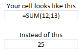
Formula not working – showing as text?
If you don’t see any error, but instead of seeing the result, all you see is your formula (like below), then check out Formulas not working page for information how to fix the problem.
Further Reading on Excel Formula Debugging
Formula Debugging using F9 Key
Learn to work with Circular References
Understand the difference between absolute and relative references
How to work with tables & structural references
Detect errors in your formulas [Office.com]
How to use new ERROR.TYPE formula to work with errors
Tell me how you debug formulas? What is the most common error you get?
What is the strangest and most confusing error you have seen? Please share in the comments so we can all have a laugh and find a way to fix the problem.


33 Responses
Good post. But I think you could improve the #DIV/0 section by explaining how to avoid this error. Simply not dividing by zero, is not always that simple.
One answer is to use error handling similar to the ones you describe in other sections.
For example
=if(b1=0,0,a1/b1)
@Gerald: Agree with you. Error handling is a good suggestion.
A few months back Jimmy Penna hosted a VBA Code competition and the winning post (by myself) featured a formula error check routine. It checks all formulas on the active sheet for known errors as featured in your post. Helpful if you have thousand of rows of formulas to check. You can get the routine from:
http://www.codeforexcelandoutlook.com/blog/2008/12/code-contest-submissions-and-voting-information/
Hi Chandoo,
Very interesting post. I think it should be included in the basis teaching of Excel. Lots of my colleague have question when they received an error message because they do not understant the nature of the error. This post will definitively help.
One small remark however is that I would not recommend using the ISERROR function (in the #N/A explanation) but preferably the ISNA. The ISERROR can hide another type of error (misspell of the function for example).
@Tim: Good suggestion. I have seen your code at that time. Thanks for providing the link here.
@Stephane: I agree with you about the iserror() part. I end up using iserror over isna as most of the time NA is the only error I get when I use vlookup. But it is a good practice to catch exceptions at individual error level than at one global level like iserror().
normal I use the Iserror() for vlookup() formula.
thank your tips.
Hi Chandoo.
I’ve understand that when following the IF(ISNA(VLOOKUP…),”Error”,VLOOKUP…) method it can be a bit inefficient in large spreadsheets.
If the first VLOOKUP does NOT return an error, you then force Excel to repeat the VLOOKUP.
If you do the VLOOKUP just once in one cell, then do the IF(ISNA(… in the next cell and point to the cell containing the result of the VLOOKUP, then you only ever do the VLOOKUP once.
I tend to do it the ‘all in one’ way for my smaller spreadsheets. What I don’t know is at what point the spreadsheet becomes so big that it is worth doing it the two-step way? 1000 rows? 10,000 rows? 100,000 rows? Any thoughts?
Hi Chandoo. When interfacing to excel from c#, we’d like to detect and log #REF! errors as our program visits each cell to harvest formulas. Do you know how we can detect that a visited cell has a #REF! issue?
Hi I’m having problems using excel. I have a spreadsheet and the first worksheet sets up fine, with all the formulas adding, multiplying, and updating if I change one of the fields. I then copied the it to make a second worksheet. Now on all the pages, although the formulas are in the forula bar, they do not automatically update. Meaning if I change the quantity of one item, asking it to multiply by the price of a single unit I then have to click onto the formula and press enter before it applies the formula. Obviously this somewhat defies the point of an automated system. If you could help I would be so grateful! I have spent ages setting up this sytem thinking it would be more efficient in the long run and I’ve run out of ideas! Thanks Clare
how to fix #VALUE! Formula Error?
i typed in =A9*E2 and i still get #value
@Bilal
What values are in A9 and E2?
I found this post interesting and was happy to see my particular error – #VALUE! -listed but the fix is unclear. What I am trying to do is create a timesheet with 4 columns of in/out times and then a formula that will compute the total hours worked. I’ve gotten a formula that will work, but unless there are values in the in/out columns, I get the error message until I put values in all four columns (2 in and 2 out times columns). Since some of our employees are part-time, they would probably only use one in/out section. The in/out columns are formatted for Time (13:30 PM) and the formula column is formatted as Custom “hh.mm”
I Googled an error in Excel and got to this page, but can’t find the answer. When I enter a formula, the result displays zeros. When I click on fx the proper formula and result shows up, but it still displays zeros on the spreadsheet. Where can I find the fix for this? Thanks.
_”this site was very helpful…
_”thank you.
How many erros can be found in microsoft excel?
Hiya,
When I copy the cells from an excel sheet downloaded from the Internet into a local Excel sheet (Which has formulas).
The formluas dont work. Is there a remedy for this.
Thanks,
JS
@JS
When you download a file from the internet Excel should prompt you to allow Edit, You must accept this if your trust the file
Next ensure calculation is set to Automatic.
Goto the Data, Calculations tab and select Automatic.
Press F9 to recalculate
All your articles are BEYOND awesome! They’re so helpful and creative, and they’ve definitely made my work life more efficient.
May I suggest a topic you could possibly write about in the future: how to use Excel functions/formulas to minimize or check for data errors when processing/analyzing huge amounts of data.
Thanks!
When saving an excel sheet in formula view and then reopening the saved doc to show the formula view…. the excel sheet shows in normal view? I have repeated the process several times as i need to show the work book in formula view when it opens>>>> any thoughts
When I divide 2 numbers in a particular cell , then apart from said division, excel was automatically redividing the numerator and denominator by another no., showing a smaller resultant.
How should i rectify it?
Hi
May i know the reason for this error,if i enter =1-.78-.22, i get the answer 0. but if i enclose the same in the bracket =(1-.78-.22) then i get an error result -2.77556E-17. May i expect your reply
Thanks for the EXCEL ERROR solutions…
Hi Chandoo! Great post. How do I solve #NAME? issues when a cell that’s being pasted from another file need to link to the named ranges in the target file?
I see that if I press F2 and then intro that link gets restored and the named range is linked to the file properly but I don’t know hot to make this happen by VBA automatically when many many cells have been copied and need the link restored to the name ranges in the target file. Do you get what I mean?
Cheers,
Gerónimo
#NULL! Formula Error
The reason provided example formula is giving the error is not because there is no separator between the provided ranges, but because there is no intersection between the ranges.
Space between two ranges is operator for intersection.
Comma between two ranges is operator for union. And yes, it would provide an answer too, since you can unite non-intersecting ranges.
See section reference operators in link : https://support.office.com/en-gb/article/Calculation-operators-and-precedence-36de9366-46fe-43a3-bfa8-cf6d8068eacc