fbpx
Search
Close this search box.

All articles with 'maps' Tag

Make an Impressive Interactive Map Chart in Excel

Published on May 23, 2023 in Charts and Graphs
Make an Impressive Interactive Map Chart in Excel

Today, let’s learn how to make an impressive map chart with Excel. Something like this.

Continue »

Mapping Spread of Obesity [Chart Critique and Alternatives]

Mapping Spread of Obesity [Chart Critique and Alternatives]

Over at Flowing Data, Nathan has published an interesting visualization about spread of obesity.

While the above chart is quite interesting, it doesn’t offer much insight in to the data. There are a few drawbacks,

  • Understanding obesity trends for a given state over the years is hard due to the layout and format of the chart.
  • Finding which states are experiencing most obesity growth rates is not possible
  • Ironically, the chart itself is obese. It takes too much space to explain the data.

Nevertheless, the chart looks cool and can be reused with smaller data-sets (quarterly trends or just for a few years). So let’s recreate the same in Excel. While we are at it, let’s also build an alternative visualization to explore the obesity data.

Continue »

How to get Maps in to Excel charts & dashboards [Master Class]

Published on Jul 21, 2016 in 3D Maps (Power Maps), Charts and Graphs, Master Class
How to get Maps in to Excel charts & dashboards [Master Class]

This is third episode of our Monthly Master Class.

In this one, you will learn how to get maps in to your Excel workbooks. Understand 5 key techniques for making maps based visualizations in Excel – from regular charts to cell grids to VBA to Power Maps, everything is covered in this intense Master Class.

Continue »

Analyzing half a million customer complaints – Regional Trends [Part 2 of 3]

Analyzing half a million customer complaints – Regional Trends [Part 2 of 3]

This is part two of our three part series on how to analyze half a million customer complaints. Read part 1 here.

Analyzing Regional Trends

As introduced in part 1, our complaints dataset has geographical information too. We know the state & zip code for each complaint. Please note that zip codes are partial or missing for a 10% of the data.

In this article, let’s explore three ways to analyze regional trends.

  1. Regional trends by state, product & issue
  2. Complaints per million by state
  3. Complaints by zip code
Continue »

Excel Dashboards – 49 dashboards to visualize US State to State migration trends

Hello everyone. Stop reading further and go fetch your helmet. Because what lies ahead is mind-blowingly awesome.

About a month and half ago, we held our annual dashboard contest. This time the theme is to visualize state to state migration in USA. You can find the contest data-set & details here.

We received 49 outstanding entries for this. Most of the entries are truly inspiring. They are loaded with powerful analysis, stunning visualizations, amazing display of Excel skill and design finesse. It took me almost 2 weeks to process the results and present them here.

49 Dashboards to visualize State to State Migration - Chandoo.orgExcel Dashboard Examples - Visualizing state to state migration trends - Chandoo.org

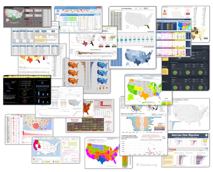
Click on the image to see the entries.

Continue »

Last day for enrollments – Join our Power Pivot class & become awesome analyst

Published on Aug 16, 2013 in Power Pivot

Hurry up, Enrollments for Power Pivot online classes closing in few hours - Join nowHi folks,

I have a quick announcement & a creative dashboard to share with you. First the announcement.

Only few hours left to join our Power Pivot course…

As you may know, I have opened enrollments for our 2nd batch of Power Pivot course few days ago. The aim of this course is to make you awesome in Excel, Advanced Excel, Dashboards, Power Pivot & Advanced Power Pivot.

We will be closing the doors of this program at midnight, today (11:59 PM, Pacific time, Friday, 16th of August).

If you want to join us, click here and enroll now.

Continue »

Are you ready for 2,000 miles, 15 days & 10 Excel tips road trip?

Published on Jun 24, 2013 in Charts and Graphs, personal
Are you ready for 2,000 miles, 15 days & 10 Excel tips road trip?

Finally my Excel classes in USA are over. It was a lot of fun traveling to new cities, teaching Excel & dashboards to enthusiastic crowds and making new friends. As if that is not fun enough, we (Jo, kids & I) are going on a 2,000 mile, 2 week road trip starting today.

Although I am enjoying all this, I also feel bad for not taking enough time to share new tricks, ideas & techniques with you here. So, I have a wacky, wild & awesome plan for you. Join us on our road trip.

That is right. You can join me on our road trip and see what I see, learn some pretty cool Excel tricks, all while sipping coffee and stretching legs in the comfort of your office cubicle.

Continue »

Visualize Excel salaries around world with these 66 Dashboards

Visualize Excel salaries around world with these 66 Dashboards

Ladies & gentleman, put on your helmets. This is going to be mind-blowingly awesome.

See how many different ways are there to analyze Excel salary data. Look at these 66 fantastic, beautifully crafted dashboards and learn how to one up your dashboard awesomeness quotient.

Continue »

Excel Links – After a long time edition

Published on Oct 24, 2011 in excel links

Long time readers of Chandoo.org know that we have a regular featured called as “Excel Links“, where I share some interesting Excel articles published around the web. This used to be a weekly feature, then became a monthly thing and later once a few months thing. As I had a hectic weekend, when I got […]

Continue »

Our VBA Class Registrations Close in Few Hours, Join Now & Learn Excel VBA

Published on Sep 16, 2011 in Training Programs, VBA Macros
Our VBA Class Registrations Close in Few Hours, Join Now & Learn Excel VBA

Hi everyone, I have a quick announcement for you.

Registrations for our VBA class will be closing in a few hours

As you may know, we have re-opened the doors for our VBA Class on September 5th. This program is aimed at beginners & intermediate level users. The aim of our VBA class is to make you awesome in Excel & VBA.

We will be closing registrations for this program in few more hours (exactly at 11:59 PM, Pacific time, on 16th September, 2011)

Click here to join our VBA Class now.

Continue »

VBA Classes Registration Closing in a Few Hours – Join Now!

Published on May 20, 2011 in Charts and Graphs, VBA Macros
VBA Classes Registration Closing in a Few Hours – Join Now!

I have a quick announcement for you.

Registrations for our VBA Class will be closing in a few hours

As you may know, we have opened registrations for our first batch of Online VBA classes on May 9th. This program is aimed at beginners & intermediate level VBA users. The aim of this course is to make you awesome in VBA. We will be closing registrations for this program in few more hours (exactly at 11:59 PM, Pacific time, on 20th May 2011)

Click here to join our VBA Class now.

Continue »

Count-down Timer App in VBA to Remind you about the VBAClasses Closing Time!!!

Published on May 18, 2011 in products, VBA Macros
Count-down Timer App in VBA to Remind you about the VBAClasses Closing Time!!!

Here is a cool count-down timer application made in VBA to remind you about our VBAClasses registration closing time!
Read the rest of this post to learn how this particular app is built.

If you want to learn VBA, then click here to join our class.

Continue »

Excel School Closing in a Few Hours – Join Now!

Published on Sep 29, 2010 in Charts and Graphs, products
Excel School Closing in a Few Hours – Join Now!

As some of you know, I run an online Excel Training Program called as Excel School. I have opened registrations for 3rd batch of this program on September 14th. Thank you very much for supporting this program wildly. In a few hours, I will be closing the registrations for Excel School.

Click here to sign up for Excel School

Read the rest of the post to learn more about Excel School and also download time across world chart template.

Continue »

9 Excel Tips & Downloads Submitted by Our Readers [Reader Awesomeness Week]

Published on Aug 9, 2010 in Charts and Graphs, Excel Howtos, Learn Excel, VBA Macros
9 Excel Tips & Downloads Submitted by Our Readers [Reader Awesomeness Week]

Last week I announced Reader Awesomeness Week to celebrate the passion, attitude and knowledge of our little community here. I got 9 interesting and beautiful entries from our readers. In this post you can see 9 tips & downloads submitted by our readers. These include a project management template, a macro to remove blanks, a technique to make Google Earth maps using Excel and several other interesting tips & tricks.

Go ahead and read them, download attached workbooks and become awesome in Excel. 🙂

Continue »

We cant Cure Cancer, But we can Cure this Medicare Chart [Chart Busters]

Published on Jul 24, 2009 in Charts and Graphs, Posts by Jeff
We cant Cure Cancer, But we can Cure this Medicare Chart [Chart Busters]

In this installment of Chartbusters, we take a look at a poorly constructed choropleth of medicare reimbursements in US and suggest cure for it. The post is from our Guest Buster – Jeff.

Continue »