Visualize Excel salaries around world with these 66 Dashboards
Ladies & gentleman, put on your helmets. This is going to be mind-blowingly awesome.
See how many different ways are there to analyze Excel salary data. Look at these 66 fantastic, beautifully crafted dashboards and learn how to one up your dashboard awesomeness quotient.
Excel Links – After a long time edition
Long time readers of Chandoo.org know that we have a regular featured called as “Excel Links“, where I share some interesting Excel articles published around the web. This used to be a weekly feature, then became a monthly thing and later once a few months thing. As I had a hectic weekend, when I got […]
Our VBA Class Registrations Close in Few Hours, Join Now & Learn Excel VBA
Hi everyone, I have a quick announcement for you.
Registrations for our VBA class will be closing in a few hours
As you may know, we have re-opened the doors for our VBA Class on September 5th. This program is aimed at beginners & intermediate level users. The aim of our VBA class is to make you awesome in Excel & VBA.
We will be closing registrations for this program in few more hours (exactly at 11:59 PM, Pacific time, on 16th September, 2011)
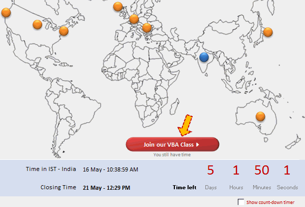
VBA Classes Registration Closing in a Few Hours – Join Now!
I have a quick announcement for you.
Registrations for our VBA Class will be closing in a few hours
As you may know, we have opened registrations for our first batch of Online VBA classes on May 9th. This program is aimed at beginners & intermediate level VBA users. The aim of this course is to make you awesome in VBA. We will be closing registrations for this program in few more hours (exactly at 11:59 PM, Pacific time, on 20th May 2011)
Count-down Timer App in VBA to Remind you about the VBAClasses Closing Time!!!
Here is a cool count-down timer application made in VBA to remind you about our VBAClasses registration closing time!
Read the rest of this post to learn how this particular app is built.
If you want to learn VBA, then click here to join our class.
Excel School Closing in a Few Hours – Join Now!
As some of you know, I run an online Excel Training Program called as Excel School. I have opened registrations for 3rd batch of this program on September 14th. Thank you very much for supporting this program wildly. In a few hours, I will be closing the registrations for Excel School.
Click here to sign up for Excel School
Read the rest of the post to learn more about Excel School and also download time across world chart template.
9 Excel Tips & Downloads Submitted by Our Readers [Reader Awesomeness Week]
Last week I announced Reader Awesomeness Week to celebrate the passion, attitude and knowledge of our little community here. I got 9 interesting and beautiful entries from our readers. In this post you can see 9 tips & downloads submitted by our readers. These include a project management template, a macro to remove blanks, a technique to make Google Earth maps using Excel and several other interesting tips & tricks.
Go ahead and read them, download attached workbooks and become awesome in Excel. 🙂