
You have been there before.
Trying to compare last year numbers with this year, or last quarter with this quarter.
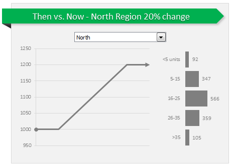
Today, let us learn how to create an interactive to chart to understand then vs. now.
Demo of Then vs. Now interactive chart
First, take a look the completed chart below. This is what you will be creating.
Inspiration for this chart
Before we jump in to Excel and understand how this is done, let me thank NY Times for providing the inspiration for this chart. I saw a similar chart in their climbing income ladder visualization.
Creating Then vs. Now chart in Excel
1. Arrange data
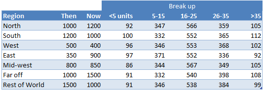
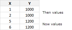
As usual, the first step is to get the data in to Excel. Structure your data like this.
2. Insert a combo box control to select a region
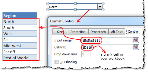 Since our chart will display values for one region at a time, we need a mechanism to let user control which region is displayed. We will use a combo box control do this. Follow these steps.
- Go to developer ribbon and insert combo box form control.
- Right click on the combo box and go to format control.
- Set up input range to list of regions in your data.
- Set up cell link to a blank cell in your workbook.
Related: Introduction to form controls.
3. Fetch selected region’s data
Now that we have a combo box to select which region to show in the chart, next step is to fetch data for selected region. You can use either VLOOKUP or INDEX formulas to do it.
Using VLOOKUP formula:
Assuming region name is in D17, and data is in values table, write:
=VLOOKUP(D17, values, 2, false)
to get 2nd column (then sales) value.
Using INDEX formula:
Assuming region number is in D16, and data is in values table, write:
=INDEX(values[then],D16)
4. Create a chart showing then to now movement
Next step is to create a chart that would show a line going from then value to now value. Lets take a closer look the line to understand how to make it in Excel.
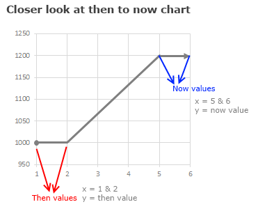
We can create this chart with either XY (scatter) plot or line chart. Lets go with scatter plot.
In your workbook, set up a table like this:
Then, select the above and create a scatter plot. Select the scatter plot with connecting lines.
5. Formatting the chart
Since we want to show a thick circle at the beginning of then value and arrow at the end of now value, lets go ahead and do the formatting song and dance.
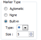 Formatting the first point:
- Select the first point of then values (you need to click once on it, take 3 deep breaths, click again and sacrifice a goat).
- Press CTRL+1 to format the data point.
- Go to Marker options and select built in marker and use the circle symbol.
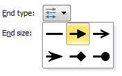 Formatting the last point:
- Select the last point (same as above, but this time sacrifice a chicken)
- Format the data point.
- Go to line style, select End type and choose arrow.
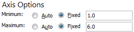 Formatting the horizontal axis:
- Select horizontal (x) axis and press CTRL+1
- Set axis minimum to 1, maximum to 6.
- Click ok and delete the axis as we do not need it on the chart.
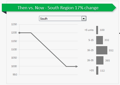
6. Adding “Break-up” of now values chart
This is easy, Just select fetched break-up values for selected region and create a bar chart. Format it as per your fancy.
7. Put everything together
Place the combo box, scatter plot and bar chart together in a nice fashion. Add a surrounding box shape so that everything looks like one report.
Add a descriptive title on the top. If possible, make chart title dynamic so that you can show the selected region name and % change in it.
8. Your Then vs. Now chart is ready
That is all. Your Then vs. Now chart is ready. Go ahead and flaunt it.
Download the chart workbook
Click here to download the chart workbook and play with it. Examine the formulas, chart settings and shapes to understand how this is set up.
Do you make then vs. now charts?
I think about half the charts made businesses around the world fall in to this category. I make these type of charts all the time. I use a variety of chart types to convey this information. Thermometer chart, waterfall chart and conditionally formatted tables are some of my favorite techniques.
What about you? Do you create then vs. now charts? what type of charts do you use? Please share your techniques and ideas using comments.
Learn more…
If you are not working in a cave or behind a huge stack of desks, chances are your job involves communicating for a living. Go ahead and read-up below articles to learn how to communicate with charts better, when it comes to then vs. now situations.


40 Responses
Great method! I think that this will prove useful when comparing to sets of the same data. Thanks Chandoo!
Hi Chandoo,
Sorry, but I don’t understand the purpose of the information on the right side of the chart. What data is it displaying?
@David R
Your sort of right
The total of the Bars (1469) doesn’t equal the value of 1200 shown in the Chart
It is purely showing some breakdown of the 1200 into sub categories, which don’t Total 1200 and probably should be labelled better
This technique taken to extremes results in:
https://sites.google.com/site/e90e50fx/home/new-emotion-Excel-charts-for-linea
Good tip
Wow, what a great idea, thank your for this Workaround,
Kind regards, Mike
wow, what a chart.
i want to use this for my work as well.
suppose i have planned fore cast & actual date in a report whose week is ending on 10/08/2013.
if i want to compare this with the report whose week was ending on 03/08/2013.
rgrds
saransh
Nifty approach!
I’d be more inclined to use data validation for the selection box — with the data range the first column of data from the table. That way, there’s no “blank cell” needed (and combo boxes in Excel always seem a bit inelegant to me, since they can be moved around anywhere and sized — I’ll use them if I need to, but prefer to stay with the “cell grid” when possible).
The whole approach is pretty slick!
Thank you Chandoo,
I used it today for my work, wow a beautiful summarize
thanks chandoo !!!
just one question
how can i do detailing of “then” values like you did for “now” values,
i mean making bar chart RHS to LHS
Thanks again.
just to make myself happy
http://prashant99.wordpress.com/2013/08/09/bar-chart-right-to-left-side/
Thank you so much for a brilliant site. Very generous. I have one question regarding this tutorial… How do you have a data table and not show the drop down arrows next to each of the table headings?
Regards
Colin
Hi Colin ,
See here :
http://www.excelforum.com/excel-general/713889-disable-and-hide-filter-drop-down-menu-from-table-excel-2007-a.html
Narayan
Hi Narayan
Thank you for the answer. Like many things – so easy (and obvious) when you know how 🙂
Regards
Colin
I had a silly question. When copy the interactive chart to powerpoint, does it work still? Or it only works in excel to display.
Thanks!:)
@Iceplant
The chart will appear in PowerPoint but you won’t have the interactiveness facility available to you.
Is this possible through any form of OLE copy? Interactive charts on PowerPoint (linked to excel) make them very powerful.
Thanks a lot for great idea .
thank you sir.
Fantastic tip but where am I going to get a goat? 😛
Thanks Chandoo. One question with respect to the pentagon which has the heading “Then vs Now – West Region 20% Change”. I can’t understand how the shape has the cell link to $C$46. Anyone?
Thanks.
When you make any shape, or text box, instead of right clicking and entering your text directly into the shape (or text box), right click and edit text, and then go directly to the formula bar and type =$C$46 (or any other cell reference). This will link the text in the shape (or text box) to whatever is in the cell referenced. It makes a really handy way for dynamic title and label changes on charts and graphs.
How to find particular Word(Text) in excel 2010 through of Formula.
For Example we have data & in data have one word from the name of “RAKESH”. then i want to find that word into the excel data through of formula, How to find it.
Regards
OM TRIPATHI
Thank you so much…simple enough but I just wasn’t aware of it. Another question – I need to know how the range “data[Region]” is being pulled into the INDEX formula. I understand the entire table is named as “data” but how does “data[Region]” come into the picture.
Thanks!!
Awesome. Completely loved doing it following the steps.
Thanks
D: That was my only goat
how to Fetch selected region’s data ???? i don’t understand
I am not able to understand how the percentages have made in Label column, can somebody explain please?
Is it possible to make a chart like this in a PowerPoint (2010) file?
I mean that selecting in a drop-down list (or anything similar) the area, so that the chart would show only the values of the selected area.
Hi Chandoo,
This chart is really good but only one question suppose all the data in numeric but only Mid-West Data is in % (Percentage format), the problem is in axis lable all the data is showing as per numeric I want when Mid-West then Axis lable must show in percentage format % rest all in numeric format kindly give solution to this problem.
@Shayeebur
As the numbers in % will be between say 0 and 1
you can use a custom number format like:
[<1]0.00%;[>-1]0.00;0.00;@
Hi Hui,
Thanks for your reply Hui its working the only thing is in numeric axis where the starting axis is 0 (zero) there it is starting from 0% and rest above axis are showing as numbers, is there any solution for this as for percentage value’s all axis must show in % & all numeric axis value must show in numerical value.
@Shayeebur
Can you post or email the file ?
Hi Hui,
If you select AHT deviation part then you can see the numbers which are less than 0 is showing in % percentage format, as AHT Deviation is a numerical numbers.
http://www64.zippyshare.com/v/48757292/file.html
Hi Chandu,
Can U guide, how to connect combo box with chart, because my combo box is not changing chart according to command.
please guide me!!
I am having one small doubt in Then vs Now interactive chart,
How the value in the cell c33 is getting updated?
Could please resolve my doubt?
Thank you,
Vamshi
I am trying to create the chart, but I am stuck in step 2. I can’t find the “control” in format control. Can you help me pls? Thanks,
Can we have this exactly same thign but in powerpoint? This will be very helpful