All articles with 'budget vs. actual' Tag
How to make a variance chart in Power BI? [Easy & Clean]
![How to make a variance chart in Power BI? [Easy & Clean]](https://chandoo.org/wp/wp-content/uploads/2020/06/variance-chart-in-Power-BI-1.png)
Power BI is great for visualizing and interacting with your data. In this article, let me share a technique for creating variance chart in Power BI. Variance charts are perfect for visualizing performance by comparing Plan vs. Actual or Budget vs. Actual data.
Continue »6 Best charts to show % progress against goal

Back when I was working as a project lead, everyday my project manager would ask me the same question.
“Chandoo, whats the progress?”
He was so punctual about it, even on days when our coffee machine wasn’t working.
As you can see, tracking progress is an obsession we all have. At this very moment, if you pay close attention, you can hear mouse clicks of thousands of analysts and managers all over the world making project progress charts.
So today, lets talk about best charts to show % progress against a goal.
Continue »
I have been playing Zelda: Breath of the wild a lot these days and I LOVE the game. Considered one of the BEST video games all time, BOTW is beautifully designed and offers a lot of entertainment. Don’t freak out yet, Chandoo.org hasn’t suddenly branched into a video gaming blog. Instead, I am here to talk about Stamina Wheel Chart.
Continue »Beautiful Budget vs. Actual chart to make your boss love you

Call them by any name – Budget vs. Actual, Target vs. Actual, Goal vs. Progress, KPIs, Performance charts, but they are the bread and butter of business charting. So how about a drop dead gorgeous and insightful chart for your next meeting with the folks upstairs? Something like above.
Read on to learn how to create this chart in Excel.
Continue »I won’t eat donut with a thread inside, but lets make one anyway!
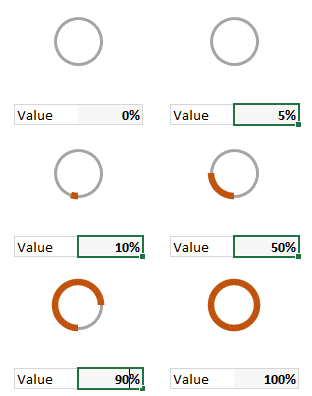
Today lets take a stroll outside what Excel can do and make something fancy, fun and may be useful.
Nowadays, many newspapers, websites and magazines are featuring info-graphics. An info-graphic is a collection of shiny, colorful & data-full charts (or often pieces of text.) In many of these info-graphics, you can see threaded-donut charts. Not sure what that is..? It is not same as the blasphemy of spoiling a soft, sweet, supple donut with a piece of string. No one should be excused for an offense like that.
What I am talking about is shown above
Continue »How to create a Then vs. Now interactive chart in Excel?
You have been there before.
Trying to compare last year numbers with this year, or last quarter with this quarter.
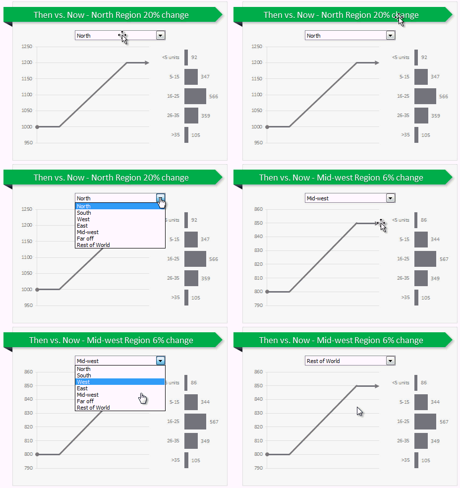
Today, let us learn how to create an interactive to chart to understand then vs. now.
Demo of Then vs. Now interactive chart
First, take a look the completed chart below. This is what you will be creating.
Continue »Use Advances vs. Declines chart to understand change in values
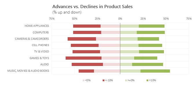
Lets say you are responsible for sales of 100s of products (which belong to handful of categories). You are looking at sales of each product in last month & this month. And you want to understand whether sales are improving or declining by category. How would you do it?
Turns out, this is not a difficult problem. In fact, this question is asked every day & answered using Advances vs. Declines chart.
You may have seen this chart in financial newspapers or websites. Shown above, Advances vs. Declines chart tells us how many items have advanced & how many have declined.
Read on to learn how to create this chart using Excel.
Continue »Shading above or below a line in Excel charts [tutorial]
![Shading above or below a line in Excel charts [tutorial]](https://img.chandoo.org/c/shaded-line-charts-tell-a-better-story.png)
When comparing 2 sets of data, one question we always ask is,
- How is first set of numbers different from second set?
A classic example of this is, lets say you are comparing productivity figures of your company with industry averages. Merely seeing both your series as lines (or columns etc.) is not going to tell you the full story. But if we can shade our productivity line in red or green when it is under or above industry average… now that would be awesome! Something like above.
Continue »Designing a Project Portfolio Dashboard [Part 1 of 2]
![Designing a Project Portfolio Dashboard [Part 1 of 2]](https://img.chandoo.org/pm/project-portfolio-dashboard-mockup.png)
In this 2 part tutorial, we will learn how to design a project portfolio dashboard. Part 1 will focus on user needs & design. Part 2 on Excel implementation.
Background
As you may know, we sell a set of Excel Project Management templates. These templates help plan, track, manage & report a project right from Excel.
While these templates good, they have one limitation. They work for one project at a time. Many customers have asked me if I come up with a project portfolio dashboard that can tell what is going on in a set of projects in one view.
And that is where we begin.
Continue »Thermo-meter chart with Marker for Last Year Value

During a recent training program, one of the students asked,
Thermo-meter chart is very good to show how actual value compares with target (or budget). But how can we add another point for say Last Year value to the chart with out cluttering it.
Something like above.
Sounds interesting? Read on
Continue »Budget vs. Actual Profit Loss Report using Pivot Tables
This is continuation of our earlier post Preparing Quarterly and Half yearly P&L using grouping option. You can also do budget v/s actual comparison using Pivot Tables. For this we will use calculated items feature of Excel PivotTables.
To begin, we have to add one more column to our data. I have added column Data Source to the end of data table. Existing data is marked as Actual and I have added more data rows which are marked as Budget. You can download new file with updated data and basic Pivot P&L.
Continue »Annual Goals Tracker Sheet [awesome ways to use excel]
Marko, who is a long time PHD reader and an excel ninja sent this via email, I work at an insurance company in Slovenia. At the beginning of each year we have a conversation with our superiors to review our work in the past year and to set new goals (main activities) that we’re gonna […]
Continue »Best Charts to Compare Actual Values with Targets – What is your take?
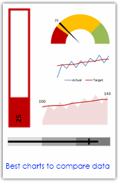
Comparing values is one of the main reasons we make charts. Yesterday we have a post on using thermometer charts to quickly compare actual values with targets. Today we follow up the post with 10 charting ideas you can use to compare actual values with targets. Check out how bullet charts, thermometer charts, traffic lights, gauges, column charts, area charts can help you compare targets with actual performances. A review of best charting options when you need to compare.
Read the rest of the post to see the options and participate in poll.
Continue »Make a Quick Thermometer Chart to Compare Targets and Actuals
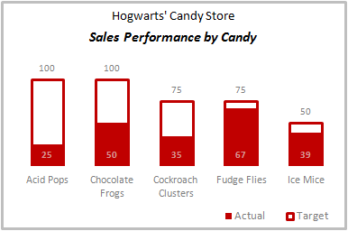
Comparing values is one of the reasons why we make charts. So today I am going to teach you a handy little trick to make a thermometer like chart to compare targets with actuals. This type of chart is very useful when you have a bunch of sales targets and you want to measure how the performance has been.
Continue »Use burn down Charts in your project management reports [bonus post]
![Use burn down Charts in your project management reports [bonus post]](https://chandoo.org/img/pm/burn-down-chart.png)
A burn down chart is a good way to understand the progress of a project. It is like a run chart that describes work left to do versus time. In this tutorial we will learn how to make a burn down chart using excel. This is a bonus installment to the project management using excel series.
Continue »

