As the gentleman at immigration counter stamped my passport & said, “Welcome to Australia”, I could barely contain my excitement. You see, Australia has been on my list of places to visit as far back as I can remember. It finally happened on On Sunday, 29th of April 2012.
After collecting my baggage, I walked out of Sydney Kingsford Smith Airport. My friend Danielle (from Plum Solutions) is waiting for me there. Thus began my Australian adventure and it was fantastic. (Aussies so fondly use this word).
Grab a fine cup of coffee, sit back and read to know how the whole experience went.
Back story: How the opportunity came
I am not sure how the fascination with Australia began. But as I grew up the desire to visit land down under grew up too. So much that during my MBA placement season, I even applied for Macquarie Bank to work as an analyst in Sydney. Despite not knowing how to balance a balance sheet. It was a good thing they did not hire me, or else I would have been blamed for the global financial mess.
When I quit my job to work on Chandoo.org full time, I pushed the Australian trip further in to future, as I wanted to focus on running business.
Almost one year ago, on 30th June, a brilliant idea crossed my mind, “why not conduct a set of classes in Australia. That would give me an excuse to visit the place while not paying for the trip out of my pocket.”
Danielle’s name immediate came to my mind. So I emailed her “Excel workshops in Australia …?” and we got talking.
In March this year I have applied for Australian Visa & announced about the session on Chandoo.org. We got tremendous response for the session with many early sing-ups.
Initially I have planned to travel with Jo & kids. But after discussing about it, we realized that it may not be a good idea to travel with kids given that I would have to visit a new city every week to conduct the trainings. So I left for Australia alone with mixed feelings. Sad to leave kids & Jo behind, excited to visit it finally.
Response for our Excel & Dashboards Masterclasses
We conducted 4 Masterclasses – 1 each in Sydney & Brisbane and 2 in Melbourne. A total of 64 people attended the sessions. We also conducted 3 masterclasses for KPMG for their offices in Sydney, Perth & Melbourne. Around 30 people from financial modeling, risk management, auditing teams of KPMG attended these. And we did a 1 day training program (shorter version of masterclass) for SEEK.COM.AU in their Melbourne office.
I received very positive & happy feedback from delegates everywhere. This shows the generosity of Aussies. I felt fortunate to have eager, enthusiastic & excellent participants for all the classes. Few testimonials from the attendees,
Chandoo’s personality makes learning advanced excel techniques actually _fun_. I think that says a lot. You don’t often say to yourself “Wow, I had fun playing with Excel today!”, do you?
– Tom Hubbard, Manufacturing (Sydney)
Great useful content focused on real world examples. Emphasis on planning aswell as actual excel examples which means content can be applied to any dashboards e.g. BI or other software.
… very knowledgeable both about excel and business scenarios. Clear simple instructions with excellent knowledge across all versions of excel.
– Sinead Starrs, Marketing (Sydney)
chandoo is like a ‘drug’, that keep you want to get even more for excel 🙂 no wonder why he’s a CEO for this. I think from professional point of view .. Chandoo is helping us to get into the skill sets where the reporting level should be more straight forward, lively, and help the decision maker to make a good decision. I strongly recommend this training for any excel savvy just to enhance knowledge and found a ‘new love’ to excel.
– Chandra Jong, Financial Services (Sydney)
Chandoo was fantastic. He was very easy to understand and made everyone feel comfortable to any raise questions. Chandoo’s knowledge about Excel is unbelievable – I wish I had his brain! I would recommend this course to everyone who works with Excel to prepare data/reports. Excel is forever changing and unless you keep up to date it’s hard to know about new techniques. Chandoo also gave some useful tips on keeping our Excel knowledge up to date. I was never a big fan of Excel but after this course I absolutely love it!! It’s amazing what we can use Excel for.
– Anonymous, Mining (Brisbane)
Presenter very knowledgeable and ran through alot of topics. I have been on other excel courses, and they always teach to the lowest common denominator. This was very fast paced, so I was never bored.
– Anonymous, Telecommunications (Brisbane)
Business-oriented. In our country, there are many PC schools, but the instructor has little business backgrounds and presentation skill.
– Anonymous, Teaching (Melbourne) – Flew from Japan to attend this.Â
Just wanted to say thank you for the fantastic course you conducted at KPMG in Melbourne. Some of the ideas you presented were fantastic and I will definitely incorporate them into client work in the future.
The course exceeded my expectations. The method and format you presented the course in was absolutely brilliant. I especially loved the help function you created by using a SHOW/HIDE macro on text-boxes and bubble-boxes. So simple but so powerful! I hope we can get you back out here again and teach us some more cool tricks and ideas that will impress our clients!
– Adam, Consulting (Melbourne)
I have managed to collect few video testimonials too. I will share them some other time.
I was a little worried before starting my first class, mainly because,
- I never charged $1000 per class, so I am not sure if the participants would be happy with what they get.
- Most of them had very high expectations as they have been reading Chandoo.org for a while and wanted to learn even more.
But I felt happy knowing that majority liked the course and immensely benefited from it.
What I learned by conducting the classes
Many things. Training 100 people from different industries, experience levels & skills in a short span of 6 weeks proved to be both a challenge & an excellent opportunity. The best things I learned are,
- Slow down during my explanations: Because we had a steep task of designing powerful dashboards in 2 days, I had to rush thru some concepts like INDEX+MATCH combination, SUMIFS, Conditional formats etc. While this worked well for many, there are a few people in each class who felt lost. I modified my style and pace for each session to make sure delegates get the best out of it. Next time when we plan a public training, I will make sure we cover fewer topics so that everyone can enjoy it.
- Most of my explanations work alright: Since I do very few live classes every year, this trip gave me confidence as almost every one told me they liked the explanations & examples.
- Add some printable material to the course: Quite a few people asked for print outs to take back home. I will be including several documents & detailed tutorials in my next courses so that delegates can carry the instructions back.
I have also learned various simple things & tips during this trip. I will be implementing them to make my future training programs even more awesome.
About Australia
Now what do I say. It certainly was worth the wait.
In Sydney, I loved the long walks on harbor bridge, excellent food & coffee near rocks, flowers & greenery in Royal botanical gardens, the magic of opera house, the bustling shops & arcades at Pitt & Hay streets. I loved the warm, smiling people. Everyone I met welcomed me to Sydney.
In Perth, I loved meeting Hui after all the time, loved their family (Eva, Lovely, Jhuvy & Leonard), enjoyed the majestic views from kings park, liked running next to Swan river, savored delicious fish & chips at Fremantle beach cafes. Perth was sunny & blue all the while I was there.
In Brisbane, I loved meeting Kurt (from Plum Solutions), enjoyed excellent food & coffee, Sprawling views from Roma street gardens, bustling shopping malls in down town, walking besides Brisbane river. It was a pity that I stayed only 2 days in Brisbane.
In Melbourne, I loved the vibrant culture, the criss-crossing trams, amazing national gallery of Victoria, walking on Bourke & Swanston streets amidst a sea of humanity, having coffee at Federation square. I spent a whole day exploring MCG, Rod Laver arena. I learned the rules of Australian Rules Football. Even though it rained, remained cold, Melbourne felt like a lovely place all along.
I felt bad not bringing Jo & kids to enjoy all this. But I know for sure that I will be in Australia next year. And we will fly together.
Thank you
I could not have done any of this on my own. Many thanks to,
- Danielle for planning these masterclasses & relentlessly pushing it so that I could fly there.
- Kurt & Susan from Plum Solutions who helped me conduct the classes
- Hui & family for showing me good time while I am in Perth
- KPMG & SEEK for having me at their offices so that I could share some of my knowledge with their teams.
- All the 64 (+1 who paid, but missed) delegates who attended my Masterclass and took time to learn. You are fabulous.
- Special thanks to people who flew in from different places to attend – from Hobart, from Adelaide, from Canberra, from Tokyo – Your eagerness to learn makes you awesome.
- Hugs & lots of love to all the people who spared an evening to have drinks with me in Sydney, Perth, Brisbane, Melbourne.
- Special thanks to Crystal, who bought me lovely breakfast in Sydney.
- Thanks also to Saxons training institute for taking care of all the arrangements for our public classes.
- Ravindra, Sameer & Vijay for holding the fort at Chandoo.org while I am away
- Last but not least – thanks to you. Because you take time to read Chandoo.org, I find the confidence & support to dream something like this and achieve. Thank you.
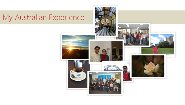
Few Pics
Here are some pics from the last 6 weeks.
Have a good weekend.
56 Responses to “Creating in-cell bar charts / histograms in excel”
Ay jhakkas!!!
Man, you're on a roll. A true-blue Excel innovator. What you're writing makes me think - why didn't anyone else think of this before?
Now that I've showered all the praises on you, it won't hurt to have a few comments on my blaag 😉
PS. I meant the innovator part.
@Amit ... thanks, I was also curious why this one was not explored, but again, I havent really searched a lot to ensure that I am posting the same ideas again. My intent is to make few people to benefit from this, if that happens I would be happy...
btw, posted a comment on your blaag... hope you are happy now 😀
Don't worry about repeating the ideas in the online world. As long as you are not copying it off anyone else and it is helpful for the readers, it's fine.
PS. the comment does not count.
The idea actually is not a new one :).
Check out MicroCharts
http://www.bonavistasystems.com/
to see how far you can get with font based in-cell charting
[...] can never get tired of in-cell charts, whenever I get sometime, I try to experiment something on them. Here is an idea to design true [...]
[...] Since we can insert any character in to a cell using formula, by installing a custom bar chart / pie font in our computer we can create incell graphs in excel with ease. Click here to see example pie chart, line chart. [...]
Where is the file? I can't seem to locate it. I want to donwload it. Thanks Chandoo!
Found it.
Great job, Chandoo. Love the site - and the fact that you provide downloads to help us (me) learn your secrets faster. I downloaded the font but can't figure out how to add it to my font library... Any hints? Thanks! Keep up the fantastic work.
@Mahqooi: Thank you and welcome to PHD 🙂
This is how you can install a font in a windows machine:
unzip the font files (if needed)
select and copy the font file to clip board by pressing ctrl+c
go to control panel > fonts
paste the file by pressing ctrl +v
repeat this procedure for other font files if any
if you are using mac, just right click on the font file and select install option.
let me know if you have some issues with this.
Hi Chandoo,
is there any mirrors for the bargraph font?
it seems that fontstruct.com is down for maintenance.
thanks!
@Cybsych: I am not sure if they have any mirrors. I will look in to my backup to see if a copy of the font can be located and ping you back. Thanks.
hi Chandoo, fontstruct is back online 😉
BTW, I am wondering about this in-cell chart.
How do I apply an automated conditional formatting to only a bar/point?
For example, the first image in this post, whereby RED = highest, BLUE=lowest.
Chandoo,
I guess this bars only work with positive numbers? so if you a list of costs per month, but one month you have negative cost meaning income due to let's say vendor credits. This incell bar could despict the month with a negative digit. or could it?
hi Chandoo, guess that you missed out my query 😀
is there a way to highlight the MAX and MIN bar based on the actual data (not the normalized)?
@Pedro, for that you need to have another set of characters (may be A-J for 0-9 and K-S for -1 to -9 and then use them to show the bars. It is a bit tricky, but achievable.
@Cybpsych: The highlighting was done manually (As you can see, there is probably no easy way to highlight / change colors of a portion of cell using Conditional formatting etc.). I am sorry, but you need to use someother sparkline technique to achieve this (or, write your own macro)
http://chandoo.org/wp/2008/09/05/microcharting-excel-howto/
thanks chandoo!
I love this simple and quick way of visualization results. I would like to learn more about normalizing values (i.e. the use of linear normalization). Can someone kindly point me in a good direction for this beginner? Much thanks to everyone (especially Chandoo) for the wealth of information provided. Long live the internet age!
@Jason: you can use simple excel formulas to normalize a set of values. If the list of values is in say a1: a10 and you want them to be normalized from 1 to 100, you can do that with a formula like: =A1/max($A$1:$A$10) * 100. Also, you can use the RANK formula to calculate the percentile of any value in the list.
[...] Bar | Sparklines | Pie charts | Bullet Graphs | w/ Conditional [...]
Nifty way to normalize the data....I'll have to take that into account when working with my charts.
One thing I'd like to add, you can eliminate the need for custom fonts with the bar charts by using a REPT function and using a small "g" set to the Webdings font. It's more likely anybody opening the file will have access to that font than the custom one you've provided. (More portability is a good thing 🙂 )
Portability is great.
I don't quite see how the REPT formula and the webding fonts can combine to solve the portability issue.
Mind you, i see that +REPT("g",1) will give you a bar, but we would need several bars of unequal lenght.
Can you elaborate?
Thank you
@Matt: I almost forgot about this comment. Thanks to Pedro for the bump.
As he points, portability is a good idea, but we will not be able to get bars of variable height using webdings font.
We can ofcourse use that along with text rotation and char(10) to create a pseudo incell bars. Here is a tutorial: http://chandoo.org/wp/2008/07/15/incell-bar-charts-revisited/
@Chandoo: Yep, that's exactly what I meant, use your text rotation and char(10) trick with REPT("G",) (then set the font to Webdings) to get your string of bars with variable height.
@Pedro: REPT("g",1) will give you one "g" (or in Webdings a bar of 1 height).
REPT("g",B2) will repeat for the value in B2... 🙂 Use that with Chandoo's take on linear normalizing, and yer all set.
Wingdings with an "n" character would be even more portable, but just doesn't look quite as cool...but pretty much everybody has that font, so it'd be portable.
You may have to adjust the font size in order to get all the bars to show correctly, perhaps some sizing of the row heights as well...
You can fake an incell line chart by using:
REPT(" ",B2-1)&REPT("n",B2)
where B2 is the value in the cell you want as a data point.
Wow, the formatting was horrid, let's elaborate a bit more...
REPT("",-1)&REPT("n",) - would give you a line graph, where could be a reference to each cell you'd like as a data point.
REPT just repeats a text string a number of times, it can be either a hard number (like Pedro's example), or a reference to a value in another cell (more handy). I believe Webdings is a common font in the MS Office suites I'm familiar with (2000 thru 2003), but I'm not sure of 2007's suite.
@Matt A: I am sorry for the formatting mishap. I am afraid of using too many plug ins, but I guess a simple HTML based comment box seems like a good idea now that lot more commenters are typing formulas and vba code in the comment box.
Coming to the formula.. thanks for sharing it. And yes, you are right, webdings is common to Office 2007 too. But even better solution would be to use good old pipe | symbol. When the font is Arial, the pipe character spacing looks optimum and subtle enough to look like an incell histogram / column chart.
After some searching through the character maps in Arial I noticed that there's a box symbol --> ? (created by holding ALT then typing 5595 on the numpad) that would work perfectly as another character to use for column charts. It looks just like the Webdings "g" character.
Is there a way to change the colour of the bars based upon the data. eg. 1-5 = red, 6-7 = amber, 8-10 = Green
@Ben... you can change the color of all bars in a cell using conditional formatting. But selectively changing color of bars inside cell is not possible unless you do it manually or through VBA.
[...] Creating in-cell bar charts / histograms in excel @ Pointy Haired Dilbert Filed under: Stuff [...]
Is this work only for the numbers or will it work for % data also. I tried to do the same for % data, but i didnt get. Pls let me know the formula for % data.
[...] trick is to use Incell Charts. [...]
Hello Chandoo,
I really like this, but I have Office for Mac 2011 and for the life of me I cannot figure out how to see the bargraph as an available font.
I have followed all the instructions for adding a font, but it does not appear. Do you have any suggestions?
Thanks
prb
Thanks. This one was cool and helpful. Can we experiment the same with "in cell" line graph as well? 🙂
Chandoo,
How do you "manually" change the color of the last bar in the series?
Lawrence
@Lawrence
Select the chart
Select the series
Select the last point/column of the series
Ctrl 1 or right click Format Point
Select a color
Hui,
Thanks!
I should have been more descriptive. What I meant to ask was about the in-cell bar graph created with the REPT function described above. How do I get the last REPT (the last bar) to be a different color than the rest?
Lawrence
@Lawrence
You cannot change colors in a cell using formula
You can use either VBA code or do it manually
Select the cell
Copy and paste it as values
Edit the cell F2
using the arrows move to the character you want to color
Shift and select the cell by arrow keying over it
with the characyer selected
Ctrl 1 (Format Cells)
Change the Font Color to suit
It won't be a color change per se...but you can set an IF statement in your REPT formulas for different characters to show as the bars. The characters "c" and "g" in Webdings are both boxes, one is a solid block, the other an outline.
For example, say I wanted to highlight the highest bar in my REPT formulas...my formula to translate the numeric cells A2:A15 to characters would be:
IF(A7=MAX($A$2:$A15),REPT("c",B7),REPT("g",B7))
so if the cell I'm checking (here it happened to be A7), is the highest number...its bar would display differently further along down in the concatenations...
@Hui...THANKS!
@ Matt A... Very cool idea. What formatting do you recommend for the cell? The Webdings "c" hollow box is very faded and hard to read even if bolded and bigger font size is used. If I could just punch it up a bit it would be perfect with 5 "c" columns followed by a single solid "g" column...as in showing the trend in the trailing 6 months of data.
Lawrence
@ Lawrence
Good question...lately I've been using ? (which you get from holding ALT then typing 5595 on the numeric keypad) for most of my bars. Unfortunately the character map doesn't lead me to a differently "shaded" box of the same size. Reason I use this nowadays...it's part of arial font...just a special char map character I can rapidly input w/o any formatting nonsense.
I'll check to see if I can replicate another box of same size that may have different shading using the same method...no luck as of yet.
I've just built the in cell bargraph and was trying to create a pop up window which would display the Monthly Sales for Last 12 months when they click on any of the bargraph cells
[...] Reference:Â http://chandoo.org/wp/2008/05/13/creating-in-cell-bar-charts-histograms-in-excel/ Like this:LikeBe the first to like this. [...]
[...] To quickly insert an in cell micro-chart, use REPT() function… Get Full Tip [...]
Hi, there is a problem with the Bargraph font. On my win7 machine it works perfectly but when I try to install it on my boss's mac it returns an error called " 'Name' Table Structure"
I tried to install on two different macs and the same error resulted. As a result the font does not show up as an option in any program.
Â
Just an FYI. I don't use macs but I know some people do.
Whats up! I just wish to give a huge thumbs up for the good info you might have right here on this post. I can be coming back to your weblog for extra soon.
[...] like .docx, .htaccess etc.) 43. To quickly insert an in cell micro-chart, use REPT() function… Get Full Tip 44. COUNT() only counts number of cells with numbers in them, if you want to count number of cells [...]
Thanks Chandoo for the font!! It works great once installed on my machine, but is there any way (besides printing and scanning the doc) that I can get the graphs to show up on other peoples' machines without going through the font install process? My file has to be sent out to clients that don't have that font installed.
Sarah, Excel doesn't allow embedding of fonts (aside from a workaround using a macro). The font will need to be sent to all who want to view the file. I went through the same question with my boss. I ultimately just installed the font on her computer.
If the data is only to be viewed, and not modified, moved, etc. you can save the file as a pdf. The font can be viewed that way.
Hello every one there is a problem I need auto update summary formula from other sheets data pick please give me sample file and also auto up grate summary sheet format.................
@Joesali
I'd suggest asking this type of question at the Chandoo.org Forums
I'd suggest uploading a sample file also
Hi chandu,
Apart from excel, i need the formula to find bar graph height dynamically when using with log scale, for example for linear graph i would take the maximum value to height of the panel as
(value divided by maxvalue) * height.
Now , i am using a logarithimic graph can you tell me the right formula which fits perfectly.
Thanks in advance
Nice info... Thanks... very hepfull... 🙂
The font does not seem to be available at fontshop. Is there somewhere else to download the bargraph font?
@Amber
Try doing a Google search for Bargraph Font
it returns several possibilities
Is there a way to do this without using bar graph font? We have a financial report to be published to stakeholders and they will not have this font installed, so probably will not be able to view the bar chart as well.