Using external software packages to manage your spreadsheet risk [Part 4 of 4]
Share

Facebook
Twitter
LinkedIn

This series of articles will give you an overview of how to manage spreadsheet risk. These articles are written by Myles Arnott from Excel Audit

Introduction to Spreadsheet Risk Management

Background – Spreadsheet Risk Management

In the Managing Spreadsheet Risk series so far we have looked at the concept of spreadsheet risk and how to manage it both at a company level and at a spreadsheet level using Excel functionality. In this final article we are going to have a quick look at an example of spreadsheet auditing software.

What to look for in a Spreadsheet Risk Management Software

First off I should state that there is a wide range of spreadsheet auditing solutions in the marketplace of different types and styles and at a variety of costs. In this section I would like to take a little time to explain the criteria we applied when we were sourcing auditing software.

These were our requirements:

  • Robust, well proven software rated by its existing users and the industry
  • A stand-alone solution rather than an Excel add-in
  • Functionality:
    • Produce a list of spreadsheets within a directory and provide details of their key attributes to enable prioritization by complexity profile
    • Perform the core audit checks and provide facility to record audit notes
    • Compare two spreadsheets in order to identify changes

Our Recommendation

Based on these requirements we chose EXChecker from Finsbury Solutions. The functionality and screen shots below are of EXChecker being used to audit the spreadsheet that we reviewed in part 3 of this series. (Download Part 3 Excel Workbook)

Auditing software in action

The first thing to note is that EXChecker opens a copy of the spreadsheet within the EXChecker program and stores your audited version in a specified directory, the original is untouched.

Once you open the spreadsheet the software automatically un-hides hidden rows and columns and hidden (and very hidden) workbooks. This can be seen in row 15 which the software has unhidden and highlighted in red:
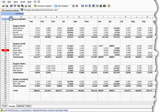
Unhide all rows & columns - Spreadsheet Risk Management

EXChecker enables you to carry out a wide range of auditing tests such as: identifying errors; spreadsheet links; macros; numbers stored as text; hard coded numeric; high risk functions; and duplicated formulas.

We will focus on three pieces of functionality so that we can compare them to the Excel functions that we used in Part 3 of this series.

Map cell Input/Outputs

Selecting “Map cell Input/Outputs” applies a color format to the cells containing constants and formulas as we achieved via my macro in Part 3. The formatting is applied to all worksheets automatically.
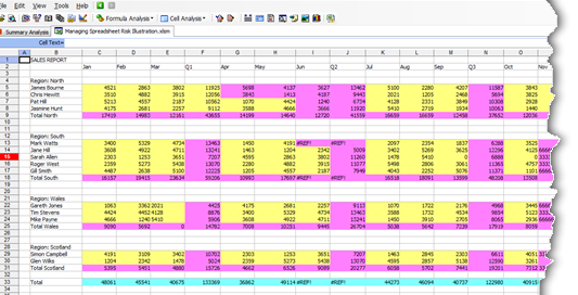
Map Cell Inputs and color them accordingly

Highlight Formulas

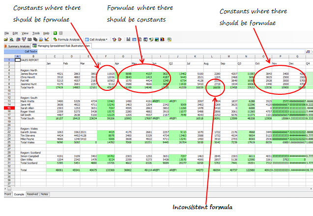
Selecting “Highlight formulas” identifies the cells containing formulas as achieved by my macro but also applies different textures to indicate where a formula is not consistent with those around it:
Highlight Formulas in an Excel Workbook

Workbook Summary

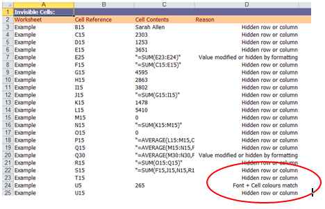
The Workbook Summary function performs a full audit of the spreadsheet and then outputs the results in a separate spreadsheet that can be incorporated into the audit report.

This is a comprehensive set of audit checks and a very powerful tool. It very quickly provides you with essential information that would take considerably more time to achieve manually.
Workbook Summary as displayed by EXChecker - Spreadsheet Risk Management

One important check within the Workbook Summary function that I would draw your attention to is the “Show all invisible/masked cells” analysis. This returns all of the cells that have been made invisible in some way. The comment against cell U5 below should set alarm bells ringing: “Font + Cell colours match”.

I’ve purposefully avoided the “F word” so far in this series as the vast majority of spreadsheet errors are just that, errors. Some people do innocently hide cell contents using white on white formatting (please don’t!) but this is a strong indicator for potential fraud and worth reviewing in further detail.

Conclusion

Hopefully this series has given you an insight into the potential risks that spreadsheets pose and also some methods for mitigating those risks. Whilst the articles have only been a brief introduction to the topic of spreadsheet risk management, I would like to think that it has given you the tools to implement a safer spreadsheet environment and the appetite to learn more about the subject.

What about you?

Do you use any external tools or software to manage spreadsheet risk? What is your experience with them? How do you use these tools? Please share your recommendations & tips thru comments.

Thank you Myles

Many thanks to Myles for writing this series. Your experience in this area is invaluable. If you enjoy this series, drop a note of thanks to Myles thru comments. You can also reach him at Excel Audit or his linkedin profile.

Disclosure

Chandoo.org is not affiliated with Finsbury Solutions. Our review of EXChecker is purely based on what Myles thought about it.

Facebook
Twitter
LinkedIn

Share this tip with your colleagues

Excel and Power BI tips - Chandoo.org Newsletter

Get FREE Excel + Power BI Tips

Simple, fun and useful emails, once per week.

Learn & be awesome.

Welcome to Chandoo.org

Thank you so much for visiting. My aim is to make you awesome in Excel & Power BI. I do this by sharing videos, tips, examples and downloads on this website. There are more than 1,000 pages with all things Excel, Power BI, Dashboards & VBA here. Go ahead and spend few minutes to be AWESOME.

Read my storyFREE Excel tips book

Overall I learned a lot and I thought you did a great job of explaining how to do things. This will definitely elevate my reporting in the future.
Rebekah S
Reporting Analyst
Excel formula list - 100+ examples and howto guide for you

From simple to complex, there is a formula for every occasion. Check out the list now.

Calendars, invoices, trackers and much more. All free, fun and fantastic.

Advanced Pivot Table tricks

Power Query, Data model, DAX, Filters, Slicers, Conditional formats and beautiful charts. It's all here.

Still on fence about Power BI? In this getting started guide, learn what is Power BI, how to get it and how to create your first report from scratch.

15 Responses to “A Gantt Chart Alternative – Gantt Box Chart”

  1. Kenjin says:

    That's a great idea.
    Maybe the planned End Date should be highlight more.
    I don't know how it would look like (nor how to do it yet), but what if instead of finishing the bold line to the best case End Date, it finishes to the realistic End Date?

  2. ross says:

    The idea is ok, I think other project management tools have this, already? Maybe not.

    Gantt charts in my view are about the signal most unless thing in the world, theres no way you can look at one thats more that a little complex and understand what it's telling you. I'm going to write a diatribe on project management at some point, its one of my pet areas I think!! 😉

    The issue I have with this chart Chandoo, is that Tasks need to be linked to each other, so they should inherit the uncertainty, which would mean the as you moved down chart the lines would be miles apart for later tasks, and you might have to add lots of lines for subsequent tasks to cover the various outcome of it's parents.

    Having said that, for the high level board summary, it's a nice way to go, it it appeals to the management 😉

    thanks Chandoo, great post.

    Ross

  3. Cyril Z. says:

    Whoooa !!! That's a very clever idea Chandoo. I really love it.
    I think i'll update my gantt project sheet with that idea soon (remember my template ?)
    @ross : you can link start date to the end date of the previous task in your data. The only problem I still se is to which end date (real ? planned ? best ?) in order to have average amount of information.

    If best end date, you'll tend to increase uncertainty at the end of chain, although if you link to real end date, uncertainty will be decreased too much, leading in both cases to wrong management direction.

    Maybe planned till the task is finished then real will do the job ?

  4. Vijesh says:

    Hey chandoo, this looks good and this would definite add value in production planning / scheduling. Uncertainity in finishing a task is very high in production scheduling and this could give an insight or a bird eye view of possible shipments we can have....

  5. PK says:

    I've always been frustrated by the limitations of gantt charts. Will definitely use this, I've always struggled with how to succinctly communicate the uncertainty of certain tasks without confusing stakeholders.

  6. Andy says:

    I like this, I think it's a very effective way of showing how a timeline can change and which parts of a project need close attention.
    @Cyril / @Ross: I would intially link the the start date to the planned end date of the previous task, with the chart updating when a task has been completed to reflect the true end date.

    Or what about giving a drop-down selection box to allow the user to see the chart based on planned/best-case/worst-case end dates?

  7. Eric says:

    Like the idea. Have found that Excel is more flexible than MS Project for graphical solutions. The "Best Case"\"Worst Case" metrics are theoretically appealing but once the project and\or phase commences their reliability diminishes. A chart like the above that showed Planned Start, Planned End, Replan End Start, Replan End Date, Number of Replans the Start and End Dates, and Actual would provide an active, actionable view of each task\phase. It would also highlight the areas which are riskiest.

  8. Bob says:

    It is always amazing how flexible excel can be.

    My question is how would the chart show a scenario where the date moved up? If a task is dropped or the duration of the task is significantly reduced by applying more people or machinery to the task, the dates will move up.

    The gantt chart has been around for a long time, but it is still quite useful to show progress.

    Cheers,
    B

  9. Shyam says:

    I like the idea but seems bit complicated in case of long projects involving numerous activity.

    Also, reading and explaining is required hence not feasible where plans are just send to audience for approval.

    Cheers
    SY

  10. Peter says:

    Great idea Chandoo,

    When I was reading this idea regarding delivery dates, another thought popped into my mind, how can you show the uncertainty with MONEY!!

    In this case, applies to cost management or even a normal budget, you think?

    Would Box Chart and Gannt Chart help to understand the best case, middle case and worst case when money is spend or planned with these three risks are involved?

    I imagine that this chart could help people who write their budgets get a better understanding of risks affecting their spending.

    Peter

  11. Matthew Galman says:

    Chandoo,

    I like it. How would you display an entry once it has been completed (actual)?

    Thank you,

    Matt

  12. Phil says:

    From what you have shown so far I think that this box Gantt chart is awesome! I think that this could be an extremely useful tool.

    I can't wait to learn how to make my own charts in Excel.

    Will the methods that you are going to teach us work in 2003 as well?

  13. [...] Firday, we proposed a new chart for showing project plans. I chose an ugly name for it and called it Gantt Box [...]

  14. TommyZ says:

    You need to read Eli Goldratt's Critical Chain. The uncertainty you are looking for should be accounted for in a project buffer. Not at each task level.

    Further you should spend time understanding Agile Development. This would have you plan only in 1-3week iterations. This allows you to embrace changes to work not yet started, and for your customer to re-direct your course at regular intervals (after each iteration) throughout your project. keyword search: Agile Scrum

    These items will show you that you are solving a tracking problem for something that you can entirely avoid!

  15. […] Chandoo.org’s  Gantt Box Chart. […]

Leave a Reply