How to Look up Based on Multiple Conditions

Share

Facebook
Twitter
LinkedIn
This article is part of our VLOOKUP Week. Read more.

Situation

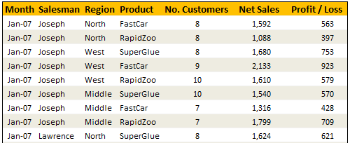
Not always we want to lookup values based on one search parameter. For eg. Imagine you have data like below and you want to find how much sales Joseph made in January 2007 in North region for product “Fast car”?

Data:

Data for this Example -Looing up Based on More than One Value

Solution

Simple, use your index finger to scan the list and find the match 😉

Of course, that wouldn’t be scalable. Plus, you may want to put your index finger to better use, like typing . So, lets come up with some formulas that do this for us.

You can extract items from a table that match multiple criteria in multiple ways. See the examples to understand the techniques:

Using SUMIFS Formula [help]
Formula =SUMIFS(lstSales, lstSalesman,valSalesman, lstMonths,valMonth, lstRegion,valRegion, lstProduct,valProduct)
Result 1592
Using SUMPRODUCT Formula [help]
Formula =SUMPRODUCT(lstSales,(lstSalesman=valSalesman)*(lstMonths=valMonth)*(lstRegion=valRegion)* (lstProduct=valProduct))
Result 1592
Using INDEX & Match Formulas (Array Formula) [help]
Formula {=INDEX(lstSales,MATCH(valSalesman&valMonth&valRegion&valProduct, lstSalesman&lstMonths&lstRegion&lstProduct,0))}
Result 1592
Using VLOOKUP Formula [help]
Formula =VLOOKUP(valMonth&valSalesman&valRegion&valProduct,tblData2,7,FALSE)
Result 1592
Conditions: A helper column that concatenates month, salesman, region & product in the left most column of tblData2
Using SUM (Array Formula) [help]
Formula {=SUM(lstSales*(lstSalesman=valSalesman)*(lstMonths=valMonth)* (lstRegion=valRegion)*(lstProduct=valProduct))}
Result 1592

Sample File

Download Example File – Looking up Based on More than One Value

Go ahead and download the file. It also has some homework for you to practice these formula tricks.

Also checkout the examples Vinod has prepared.

Special Thanks to

Rohit1409, dan l, John, Godzilla, Vinod

Similar Tips

VLOOKUP Week @ Chandoo.org - Learn tips on lookup formulas in Excel

Facebook
Twitter
LinkedIn

Share this tip with your colleagues

Excel and Power BI tips - Chandoo.org Newsletter

Get FREE Excel + Power BI Tips

Simple, fun and useful emails, once per week.

Learn & be awesome.

Welcome to Chandoo.org

Thank you so much for visiting. My aim is to make you awesome in Excel & Power BI. I do this by sharing videos, tips, examples and downloads on this website. There are more than 1,000 pages with all things Excel, Power BI, Dashboards & VBA here. Go ahead and spend few minutes to be AWESOME.

Read my storyFREE Excel tips book

Overall I learned a lot and I thought you did a great job of explaining how to do things. This will definitely elevate my reporting in the future.
Rebekah S
Reporting Analyst
Excel formula list - 100+ examples and howto guide for you

From simple to complex, there is a formula for every occasion. Check out the list now.

Calendars, invoices, trackers and much more. All free, fun and fantastic.

Advanced Pivot Table tricks

Power Query, Data model, DAX, Filters, Slicers, Conditional formats and beautiful charts. It's all here.

Still on fence about Power BI? In this getting started guide, learn what is Power BI, how to get it and how to create your first report from scratch.

14 Responses to “Group Smaller Slices in Pie Charts to Improve Readability”

  1. jerome says:

    I think the virtue of pie charts is precisely that they are difficult to decode. In many contexts, you have to release information but you don't want the relationship between values to jump at your reader. That's when pie charts are most useful.

  2. Martin says:

    Chandoo,

    millions of ants cannot be mistaken.....There should be a reason why everybody continues using Pie charts, despite what gurus like you or Jon and others say.

    one reason could be because we are just used to, so that's what we need to change, the "comfort zone"...

    i absolutely agree, since I've been "converted", I just find out that bar charts are clearer, and nicer to the view...

    Regards,

    Martin

  3. [...] says we can Group Smaller Slices in Pie Charts to Improve Readability. Such a pie has too many labels to fit into a tight space, so you need ro move the labels around [...]

  4. Jon Peltier says:

    Chandoo -
     
    You ask "Can I use an alternative to pie chart?"
     
    I answer in You Say “Pie”, I Say “Bar”.

  5. Karl says:

    This visualization was created because it was easy to print before computers. In this day and age, it should not exist.

  6. DMurphy says:

    I think the 100% Bar Chart is just as useless/unreadable as Pies - we should rename them something like Mama's Strudel Charts - how big a slice would you like, Dear?
    My money's with Jon on this topic.

  7. Mark says:

    The primary function of any pie chart with more than 2 or 3 data points is to obfuscate. But maybe that is the main purpose, as @Jerome suggests...

  8. Chandoo says:

    @Jerome.. Good point. Also sometimes, there is just no relationship at all.

    @Martin... Organized religion is finding it tough to get converts even after 2000+ years of struggle. Jon, Stephen, countless others (and me) are a small army, it would take atleast 5000 more years before pie charts vanish... patience and good to have you here 🙂

    @Jon .. very well done sir, very well done.

    good points every one...

  9. Tim Wilson says:

    I've got to throw my vote into Jon's camp (which is also Stephen Few's camp) -- bars just tend to work better. One observation about when we say "what people are used to." There are two distinct groups here (depending on the situation, a person can fall in either one): the person who *creates* the chart and the person who *consumes* the chart. Granted, the consumers are "used to" pie charts. But, it's not like a bar chart is something they would struggle to understand or that would require explanation (like sparklines and bullet graphs). Chart consumers are "used to" consuming whatever is put in front of them. Chart creators, on the other hand, may be "used to" creating pie charts, but that isn't an excuse for them to continue to do so -- many people are used to driving without a seatbelt, leaving lights on in their house needlessly, and forwarding not-all-that-funny anecdotes via email. That doesn't mean the practice shouldn't be discouraged!

  10. [...] example that Chandoo used recently is counting uses of words. Clearly, there are other meanings of “bar” (take bar mitzvah or bar none, for [...]

  11. Good article. Is it possible to do that with line charts?

  12. Michaela says:

    Hi,

    Is this available in excel 2013?

Leave a Reply