
This article is part of our VLOOKUP Week. Read more.
Situation
Sometimes we don’t know what we want. If this happens when I am in a bar, I usually order a cocktail. Just a mix of everything. The same will work in Excel too.
For eg. If you have lots of data, but the value you want to look up needs to change based on whims and fancies of your users, then you can resort to a cocktail. A mix of VLOOKUP with Drop down lists (Data validation)
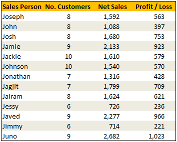
Data:
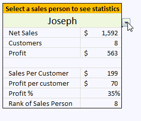
Solution
The recipe for VLOOKUP cocktail is relatively simple. We just take the list of sales person names and use it as a source for our input cell’s data validation drop down list. Rest is left to your imagination. Here is an example in action.
Examples:
Sample File
Download Example File – Mix VLOOKUP with Data Validation for Some Magic
Similar Tips
- Excel Basics – Add Drop Down List using Data Validations
- Generating Invoice Numbers in Excel – An example of VLOOKUP use
- Excel SUBTOTAL Formula – What is it, how to use it & examples


19 Responses
Oooooo and don’t forget: Using an identical method, one can build a dynamic chart…..
This is a classic use of the VLOOKUP function, that of being tied to a drop-down list with data validation.
I learned about he RANK Function and while looking it up in Help, noticed the newer functions RANK.AVG and RAND.EQ which seems to be overkill.
I would have probably used H7=0 instead of NOT(H7) simply because of less typing, but hadn’t considered using the NOT function in that situation. Interesting.
hi chandoo,
im currently practicing excel formulas especially doing some reports for my boss.
I really find your website informative, really appreciate you put effort on helping
newbie like us understand better.
Anyway, I tried to explore this Vlookup example and made me scratch my head.
pasted below is your example, my question is that re:tblData and valSalesPerson which i wonder how the it directs to the data table or certain cell.
Also how to write a cell number in a formual if that cell is being merge like in your example.
thanks.
baynoli
=IF(valSalesPerson=$B$4,0,VLOOKUP(valSalesPerson,tblData,3,FALSE))
Good Morning,
Please help me in excel over subject vlook up.
@Surbhi have a look at http://chandoo.org/wp/tag/vlookup-week/
@Chandoo:
Does Vlookup only work when we try to find the value linked to the 1st column of an array?
I have the following columns and I am trying to use the same format you have above to showing clients values for thier stocks.
1. Scrip Number
2. Scrip Name
3. Buy PX
4. Sell Px
Now I want the client to have a drop down of the Scrip Name (column 2), but when I try to use what you have shown above to display say the Buy Px and Sell Px and Profit the values dont show up.
The way it does work is if i define my array to start from Scrip Name instead of Scrip Number.
I am wondering if there is another way besides to the patch I just made.
Thanks
PM
@PM
You don’t have to include your First Column in the array, leave it out
Then Column 2 will be the first column, Buy will be Col 2 and Sell Col 3
Hi,
I know basic excel. I downloaded this file and try to make a similler for my data ..but it dosent work. Is there a vb code , because when i type =if(it shows a valSalesPerson option in the dropdown. How can i make it work for my data.
Thanks
Rajesh
@Rajesh
There is no VBA in that file
valSalesPerson is a Named Formula which refers to G5
that is if you select the cell in G5 and select a value from the validation drop down
the Named Formula valSalesPerson will be equal to that Name and can be used elsewhere
Thanks , it helped.
Great site for excel lovers .
I have a question on the formula used. Why is the IF part needed here: =IF(valSalesPerson=$B$4,0,VLOOKUP(valSalesPerson,tblData,2,FALSE))
If I remove that and leave only =(VLOOKUP(valSalesPerson,tblData,2,FALSE)
it will work as well, so not sure whay the IF part was added?
thanks.
Thank you, i’m really appreciate that
hi chandoo,
im currently practicing excel formulas especially doing some reports for my boss.
I really find your website informative, really appreciate you put effort on helping
newbie like us understand better.
Anyway, I tried to explore this Vlookup example and made me scratch my head.
pasted below is your example, my question is that re:tblData and valSalesPerson which i wonder how the it directs to the data table or certain cell.
Also how to write a cell number in a formual if that cell is being merge like in your example.
thanks.
sachin
=IF(valSalesPerson=$B$4,0,VLOOKUP(valSalesPerson,tblData,3,FALSE))
Hi chandoo.
i have question. i have spreadsheet has lot of date say. Part number and description, i want to do once i type just only part number the descripition auto populated in other cell. please help me thank you
Good example, but what happens if there are 2 sales people with the same name it will always pick up the data for the first one.
Good Day to you,
These examples contain managable data – inconsistencies such as duplicates in a vlookup are problematic in larger data – as you don’t see it. Depending on what your data shows/contains and your main “feature” is vlookup, it is ALWAYS advisable to devise a plausability check – in this case, I would personally use a countif function =COUNTIF($B$5:$B$17;B5) – in column A; conditional format in column A to highlight values >0 in Red….
I’m Creating a list of state of india with City belong with State in first cell I use data validation for state list I want city name display in second cell of select state only. is this possible please help.
If find list Dept . i need select of dept appear names employees
Why is it?
PLEZ
Just want to learn what is the use of “” function in Rank of Sale Peson.
Thanks & Regards,
Vishal