
 I have a quick announcement and an awesome graph for you.
First the announcement:
As you may know, I run an online Excel Training Program called as Excel School. I have opened registrations for 3rd batch of this program on September 14th. Thank you very much for supporting this program wildly. In a few hours, I will be closing the registrations for Excel School.
Click here to sign up for Excel School
(if you don’t want to join Excel School, we are still cool. Here is a free excel school. It is as awesome as morning coffee & donuts and totally healthy.)
How many students have joined so far?
At the time of writing this post (around 10 AM Indian time on 29th), we have 211 students signed up for Excel School 3. This is certainly quite a bit more than what I expected. But, I am also confident and eager to help as many of you as possible. So go ahead and join the program, because, you want to be awesome.
New content in Excel School 3 – Two hours on Dashboards
Apart from all the great and fun lessons in Excel School, I will be adding 2 more hours on Excel Dashboards. In this lesson you will learn,
1. What is a dashboard? – Definition, examples
2. Simple process for creating Dashboards using Excel
3. Making a dashboard using Excel in a step-by-step video
4. Tricks of the trade – tips, ideas and concepts you should learn to make awesome dashboards
When do the registrations close?
I will be closing new registrations by 11:59 PM (Pacific Time) Today. Pacific (Day) Time is 7 hours behind GMT (UTC). See the below graph to know when registrations close in your timezone:

(if you are still lost, see this handy table to know what time Excel School closes in your timezone.)
When is Excel School 4 coming up?
I will not be re-opening excel school this year. I am planning to spend time with students, answer their questions and have fun with my kids. I will be re-opening registrations during Jan 2011.
Now the awesome graph
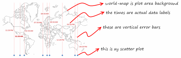
You see the world map with closing times above? Your guess is right. It is made in Excel.
Here is how I constructed it
- First I downloaded an outline map of world (here is one).
- Then I calculated the closing times in various timezones using simple data formulas (here is a how-to – scroll to end)
- Then I made a scatter plot with Y as zero and X as horizontal position of the country with some random values.
- Then I set the world outline map as background for the plot area.
- Now, I adjusted x values so that the scatter points align with various countries
- Then I added 100% vertical error bars on plus side to show the vertical lines.
- Finally I added the closing times as data labels (you need to manually point each label to the source, but its ok)
See this illustration to understand the chart:
Download Time Across world – Graph template
I have made a template to show time across various places in world.
Thank you
Thank you so much for making Excel School 3 happen. Your support and quest for knowledge motivates me. Thank you.


5 Responses to “Excel School Closing in a Few Hours – Join Now!”
@ Chandoo I was just thinking to myself i wonder how that graph was constructed. Then sure enough there is your explaination!
This is the reason i love this blog!
@Godzilla... You are welcome. I wouldnt want a sale pitch like this to be less than awesome.
Me too!
I thought, "that is exactly what I have been looking for", but "how2do"?
And of course, UNLIKE other XLS consultants, Chandoo actually has a template URL and some screens shots on how to do, wow.
This is an example why you have our attention, your messages are opened, and your referring links are clicked through. Well done.
Dear Chandoo Sir,
First of all i would like to appreciate your hardwork and dedication towards Excel training and making us awesome in Excel. I am a junior accountant working here in UAE and struggling for my future. I know the importance of Excel and that is why willing to make myself awesome in EXCEL. I do not have credit card to pay online for your helping material please let me know if there is any other medium of payment.
I appreciate if you can give me some discount as i can not afford much.
Regards
God bless you
Haroon
hello chandoo. i wasn't aware of your Excel School until i read this post. i feel sorry for not seeing this post before, so that i could have joined our 3rd batch