
Here is an interesting use of Excel. Use it to design User Interface Prototypes.
A UI Prototype is one of the steps we do while developing systems. It contains a clear and detailed user interface mocked up so that we can clearly find-out how end-users would react to such a system.
Now, there are a ton of great tools to build UI prototypes, easiest of them being pencil and paper. But I have been using Excel (ahem!) for creating UI prototypes for the last few years with great success.
In almost all the projects where I worked as a business analyst, I used Excel (or Powerpoint) to create clear, well defined UI mockups to show what the end system would look like. This has helped greatly in understanding various unstated needs of users and speeded up system development.
A Practical Example of UI Prototypes made in Excel
Today I want to show you a practical example of how UI prototypes designed in Excel helped me choose one alternative over other.
While creating Excel School sales page, I needed to clearly show both options and provide a way to select one of them for the prospective students. I had 2 ideas in mind. I wasn’t sure which one would work. My initial thought is to draw both of them on paper and show it to my wife and find-out which one she would prefer. But then, my drawing is as good as my skateboarding. Just plain awful.
Even though I cannot draw a peanut on paper, I can create a whole peach tree in excel. So I turned to it and created 2 exact mockups of what I had in mind.

Then I showed both of them to my wife. She pointed to the one on left.
So I went with that option and designed it in HTML / CSS later that night.
But, this is a lame example. What if I want to make a complex UI in Excel?
Of course my example is lame. But you can make complex UIs in Excel with same ease. Remember form controls? You can use them to quickly create a mock up of almost any system and show it to your users to get instant feedback.
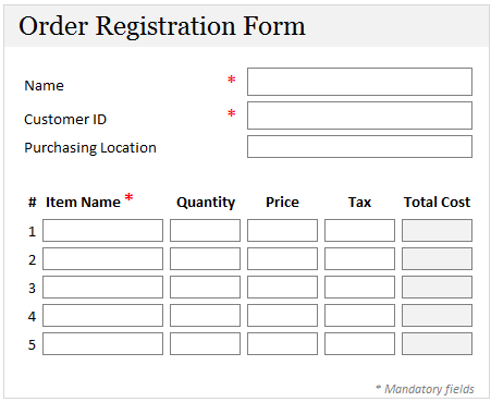
Here is an example:
Download Excel UI Prototype Examples Workbook:
In this workbook, you can find above 3 examples. See them, play with them, poke them to get inspiration for your next UI prototype.
Do you use Excel for Prototyping?
As I said, I have more than once impressed my customers by quickly churning out a mockup using excel. You can easily add drawing shapes, icons, form controls and place them on the grid layout to give perfect alignment and look. I think this is a great use of Excel.
What about you? Do you use excel for UI Prototyping? Share your experiences using comments.


16 Responses
We often use Excel and/or Access for mock ups and prototyping.
Often an Excel or Access based prototype can help to highlight and iron out issues. This tends to lead to a much better functional specification document. Having a model that already generate the numbers also helps with User Acceptance Testing as you can easily compare the outputs as a simple first test.
Glad to hear that your wife has the final say 🙂
As with Clarity comment,
Use heavily in UAT – break UAT into components and then have an excel model(s) which replicate these.
This means outcomes can be easily and quickly tested with confidence.
Also have to agree with Chandoo – I’m a great artist with Excel….. once a pen gets into my hands, that’s anoter story – So I use excel a lot to show mock ups.
Christian
When we do this to assist with UAT we call it a harness.
Because it captures/ replicates the details we are using in the development system, and also because it fits over, or with the dev system – just like a harness.
I use EXCEL for forms and PowerPoint for GUI + interactivity (easier)
Great article Chandoo…
Cyril.
I’m with Cyril! Think about PowerPoint as a container which can hold all your photos, vectors and videos from other packages. It’s a lot better than Excel for GUI and interactivity. Hyperlink the different pages together, hit F5 and boom! You get a passable imitation of the finished project!
I must be dumb, but can you pl tell me how you managed the following on sheet 1:
1. The sign showing the $67 and $97 with the arrows.
2. The merging of cells on rows 15 to 17, with text on 2 separate rows.
Is this doable in Excel 2003?
I made a snakes and ladders game for my son, many years ago.
I’ve also used it to calculate and chart how fast a car would need to go to fly x meters off a ramp.
I tried to simulate differential equations for the acceleration of the space shuttle.
I converted a visual basic model for fermentation of beer into a Quattro Pro model that could generate graphs, etc.
Memory lane,
were you in elementary school when you did all this?
Not elementary school.
Some of this stuff is from 20 years ago. I used Lotus 123 1A as my first ss.
MK,
For point 2, use ALT + Enter instead of just Enter to start a new line
HTH
Ooo, my first post! I’ve used excel to create audit tools which are RAG rated (red, amber, green – very popular in the NHS!) and calculate the % score, then printed off to send to the audited property. It has saved at least half a day’s work for the nurses that audit – and when they’re doing around 100 a year its a lot of time! This has now expanded to 4 other departments, saving them similar amounts of time so that they can be doing something more useful than report writing too.
But more interesting – an American friend created a weight-loss spreadsheet for pet rats!
Chandoo,
Can you give me your definition of a Business Analyst? What is expected and what skill level is necessary?
Question:
Can i use excel to create to a picture of say a blank box and use formulas to direct copy i punch into certain cells to populate on the mockup of the box in a designated area?
thanks
Hi All,
I have had alot of success in using MS Excel linking into different source databases (SQL Server, MySQL etc) to develop and get sign of on the user interface functionality, the presentation layer loyout and the actual contents within the presentation layer (eg chart types, tables & reports). This is as well as testing and accuracy of the data being presented and having it reconciled. All this is achieved at a fraction of the cost and significantly compressing development time frames. Have impressed many developers with all these as well as mitigating risk to the respective projects and managing stakeholders and their expectations accordingly.
Any questions please let me know or you can reach me through http://www.insightfocus.com.au.
Cheers
Arthur