While I was working Denmark, there is one thing I noticed. Danes are one hell of football lovers. The football (soccer) enthusiasm is over the top when there is a match between Denmark and Sweden.
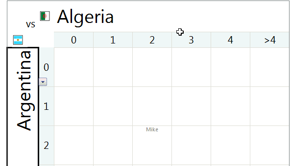
A common practice in many offices is a football pool. This is how it works:
- When there is a match between 2 countries, say Denmark and Sweden, the pool will be open.
- You can bet any amount on any goal combination (say 10 Kr on 1-2 Denmark vs. Sweden)
- Your name is written against the cell combination that denotes 1-2
- Once the match is over, the people who guessed the scores right will share the total pool money
- No matter who wins, everyone drinks a few beers and gossip about the match
Since FIFA 2010 Worldcup is around the corner, I thought it might be fun to create a football betting sheet template in excel that all football lovers can use to bet.
Download the football betting sheet template
Here is how it works:
- Select both countries from drop-downs
- Specify the names of people against goal combinations (for. eg. if Stacey bets for 1-2, her name will be against row 2 and column 3).
- Now, take a printout of this
- Watch the match
- Distribute the money to winners
- Repeat!

As a bonus, you can see the flags of country based on selection. This mild awesomeness uses excel camera tool.
Go ahead and download the file. I bet that you are going to enjoy the file, even if you don’t bet. 😛
More football madness: Balls used in Fifa Worldcups since 1930 – Visualization.


18 Responses to “Best Charts to Compare Actual Values with Targets – What is your take?”
Great post. I can't vote, though, because the answer I want to put down is "it depends". As with all visualisations, you've got to take into account your audience, your purpose, technical skills, where it will be viewed, etc.
I'm with Andy: It depends. Some I would use, some I might use, some I won't touch with a barge pole.
Naturally I have comments 🙂
The dial gauge, though familiar, is less easy to read than a linear type of chart (thermometer or bullet). It's really no better than the traffic lights, because all it can really tell you is which category the point falls in: red, yellow, or green.
By the same token, pie charts are so familiar, people don't know they can't read them. Remember how long it takes kids to learn to read an analog clock?
Bullet charts don't show trends.
With any of the charts that have a filled component and a marker or ine component, it makes more sense to use the filled component (area/ column) for target, and the lines or markers for actual.
[...] Best Charts to Compare Actual values with Targets (or Budgets … [...]
I voted for #6 even though I agree with the other comments that it depends.
The majority of the votes are for the #2, thermometer chart. I still have yet to understand what happens when you are above plan/goal, which was brought up in yesterday's post.
Also, I agree with Jon in that it would be better to flip the series and make the filled part the target or goal and the line or marker the actual.
I am also a fan of using text when appropriate if the data is among other metrics in a type of dashboard. Calling it out by saying actual and % achievement is a good option.
Another "it depends" vote. Are you just looking at one or are you comparing a number of targets with actuals? You didn't include a text box. The problem with sentences is that they can get lost in a page of gray text. A text box can call attention to the numbers and line them up effectively.
I'm with Jon: "Some I would use, some I might use, some I won’t touch with a barge pole" and I'm surprised that some of your readers voted for the last group.
Jon says:
With any of the charts that have a filled component and a marker or line component, it makes more sense to use the filled component (area/ column) for target, and the lines or markers for actual.
Why does this make more sense? I like 6 the way it is, although I would use a heavy dash for the plan/target marker.
"It depends" is also my take. What I usually try to drill into my clients dashboard design is the fu ndamental difference between spot results (am I on target for this month) and long term trends.. I always try to create 3 different set of graphs to represent real perormance:
- spot results vs objectives
- cumulative results vs objectives
- long-term trend (moving average) mostly) to see where we're going
[...] Best Charts to Compare Actual Values with Targets – What is your take? (tags: excel charts) [...]
[...] Related: Charting Principles, How to compare actual values with budgets [...]
[...] Excel Charting Alternatives to compare values [...]
Jon says:
With any of the charts that have a filled component and a marker or line component, it makes more sense to use the filled component (area/ column) for target, and the lines or markers for actual.
Why does this make more sense? I like 6 the way it is, although I would use a heavy dash for the plan/target marker.
I totally agree, Bob. I would normally favour a line for the target and a column for the actual, you can see quite easily then which columns break through the line, then.
[...] best charts to compare actual values with targets — den Status mal anders zeigen, z. B. als Tacho [...]
Thermometer charts: "Not appropriate when actual values exceed targets" - this is easily solved by making the "mercury" portion a different color from the border, then you can clearly see where the expected range ends and the actual values keep going.
People seem to knock gauges quite a bit in dashboarding, but trying to show comparison of realtime data between operating sites and targets for each site can easily be done with a bank of gauges that have the optimal operating points at 12 o'clock.
The human eye is great at pattern stripping, and any deviation of a gauge from the expected 12 position will quickly register with an operator and attract his attention. Using a colour background, or meter edge, will also indicate the sensitivity of a particular site.
[…] Best charts to compare actual with target values […]
[…] Best charts to compare actual with target values […]
[…] work laptop I have a favorites folder just dedicated to Excel charts. Its got things like “Best Charts to Compare Actuals vs Targets” and “Best charts to show progress“. I love me some charts […]
I am wondering how will the plotting work, for some of the targets which may have been achieved before time. E.g. for the month of Jul the target was 226 and the actual was 219. So the chart will show a deficit in meeting the target by 7 points but what if this 7 may have been completed earlier in month of June. So ideally it not a deficit.