

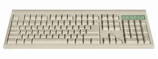
When I published the comprehensive list of excel shortcuts few weeks back, I thought I had them all. Boy, I was wrong. I am pleasantly surprised to find a new shortcut, one that takes away my manic mouse scrolling in one feel swoop. Often, when I am working with large tables of data, I scroll down or right and want to get back to active cell. This is where CTRL+Back Space is very useful. It will bring you back to active cell.
Other keys you can use to quickly jump around:
- Use CTRL+Arrow keys to last cells in the direction of arrow (if you have blanks in between, you go to the cell before blank)
- Press CTRL+G and type the address of a cell you want to go to
- Use CTRL+Page Dn, Page Up to access next and previous sheets
- CTRL+Tab, CTRL+SHIFT+Tab to access next and previous workbooks
- More navigation shortcuts
What are your favorite shortcuts for navigation?
Learning how to navigate with keyboard alone can be a huge time saver. I would love to know what shortcuts you use to navigate faster when you are working with excel sheets. Please share your tips using comments.


10 Responses
CTRL+PageDn (CTRL+PageUp) also works in Firefox for moving to the next (previous) tab, so that I need only one shortcut for my two most frequently used applications.
Hi,
this one is great for Excel.
long time ago, i used to love the Shift+F10 combination, it triggers the contextual menu (like when your mouse is knocked out and your keyboard’s an elder one).
ctrl + home and ctrl + end to jump to the beginning and end
Just a suggestion that please if it’s possible start using video presentations vis-a-vis written instructions as by watching a small video we can understand the same concept quickly & easily than by just reading a long list of instructions
Thanks
Your tip requires both hands to perform it… when I want to return to the active cell, I simply press the right arrow key followed by the left arrow key (only requires one hand). Of course, this won’t work correctly if you are in the last column (although in that case, you could press the left arrow key followed by the right arrow key).
Okay, let me restate what I posted… sure, you could perform the Ctrl+Backspace with just your right hand (although I always use my left hand for pressing the Ctrl key), but it is sort of an an awkward maneuver to perform whereas pressing the right/left arrow keys in succession is pretty easy to do.
@Rick.. I agree that using arrow keys is another elegant and simple way to jump to active cell.
Hi Chandoo,
A navigation tool I like is to disable the EDIT IN CELL option. This means that when you double click in the cell, you are taken to the first mentioned cell reference in the formula. This can be VERY useful, because it works across the whole workbook. It will even open a closed workbook. To return to the cell, just press F5 and enter. Construct you formulas with this in mind, and navigation to the source of the calculation in a cell is simple.
The only downside is the need to enter in the FORMULR BAR, but for me, the benefits outway this minor disadvantage.
Regards,
David
Hi,
I want to submit an excel tip but not sure whether it has been published earlier or not so pls ignore if it has been already published.
Tip Name: Showing the comment as part of the formula
Procedure: = + N(“Insert the comment here”)
I found this as a good technique to reference something related to your formula specially when you don’t want to show an usual excel comment.
Thanks.
Is there a way for Excel to do CTRL+Backspace automatically when clicking the sheet tab or viewing the sheet?
If not, is there a macro that can be created to will do this automatically?