
We all know that SUMIF formula can be used to find the sum of values meeting a criteria. Like this,

But I was pleasantly surprised to realize that SUMIF works equally well for 2D ranges too, like this:
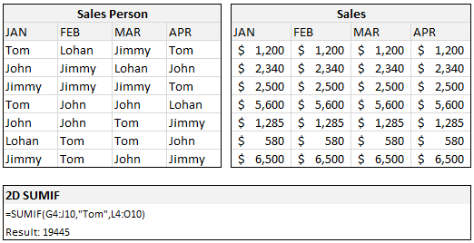
During a recent consulting work with a client I had a requirement to sum up values that meet some criteria across columns and I wasn’t sure if the SUMIF would hold. Boy, I was wrong. It worked nicely and I still stand by my statement “If I get a dollar for every COUNTIF / SUMIF I write, I will have million dollar bills.“.
Did you try 2D SUMIF?
Share your tips and ideas thru comments.
Bonus: This should work for COUNTIF, SUMIFS, COUNTIFS etc too. But you already knew it.


14 Responses
Great tip, as usual. Will be sure to use first chance I get :))
Regards from Bucharest,
Radu
Anyone know an easy way to do multiple conditions SUMIF/COUNTIF Thanks!
@ Eric: in Excel 2007 you have SUMIFS and COUNTIFS which accept multiple conditions. Otherwise you should try and find out more about SUMPRODUCT.
@ Chandoo: it’s also interesting to use SUMPRODUCT to sum a 2D range on both row and column criteria. That might sound a bit confusing but I’m not sure how to explain it 🙂
Is there a way to do sumif and? I am a teacher and would like to create category averages for all the quizzes that are > = 0 (unfortunately, A counts as a 0)
Great tip. Tks.
Eric: Check out http://www.excelhero.com/blog/2010/01/i-heart-if.html where you learn how to do this kind of stuff using either sumproduct or array formulas.
If you only want to sum up the values for Tom, you could use:
=SUM(- -(G4:J10=”Tom”)*L4:O10)
…which you would have to array enter (i.e. copy this to the formula bar, put the cursor somewhere within the formula bar, and press Cntr+Shift+Enter at the same time. Note the double minus (I’ve added a space between them, but Excel doesn’t care whether there is a space or not)
Excel will then add some curly brackets around it, so it will look like this:
{ =SUM(- -(G4:J10=”Tom”)*L4:O10)
If you want to sum up the values for Tom OR for Lohan , you could use:
=SUM(- -(G4:J10=”Tom”)*- -(G4:J10=”Lohan”)*L4:O10)
@Eric: Pls. read these articles as well to get examples on multi conditions sums ( and counts )
– http://chandoo.org/wp/2009/07/22/sumif-with-multiple-conditions/
– http://chandoo.org/wp/2009/11/10/excel-sumproduct-formula/
– http://chandoo.org/wp/2010/04/20/introduction-to-excel-sumifs-formula/
If you have excel 2007, close your eyes and use SUMIFS. Otherwise use either SUMPRODUCT or SUM formula (array entered). Both these techniques take a while to sink in, but work well.
also, see if you can enable “Conditional SUM Wizard” from Excel Addin menus. If so, you can use that to write these array formulas for you.
=SUMPRODUCT(+1*(G4:J10=”Tom”),(L4:O10) )
also works
Shame they don’t work across multiple pages
Boss… knowingly or unknowingly I have learnt excel through you…..
thanks a lot….. keep teaching us…. God Bless you….
Venkat
@Hui,
your formula can be streamlined to
=SUMPRODUCT((G4:J10=”Tom”)*(L4:O10) )
There is absolutely no reason to use the + sign, unless you want to broadcast that you’re still longing for Lotus123. The multiplication with 1 will coerce the TRUE/FALSE values of the first array into 1/0 values, but you can achieve that by using the * operator instead of the comma.
Another way would be with double unary, which in many cases is a bit more robust
=SUMPRODUCT(–(G4:J10=”Tom”),(L4:O10) )
Here is a link to a discussion about Sumproduct and the differences and error messages occurring depending on the coercion method used:
http://spreadsheet-toolbox.com/library/excel-functions/sumproduct-and-its-error-message/
cheers, teylyn
Wow! Another stellar find Chandoo, thank you for sharing this one.
Awesome!
What if the criteria range is two dimensions but the sum range is one dimension? I tried that and I could not get it to work. For example: =SUMIF($A$2:$C$3,$A6,$A$1:$C$1). In this case it seem to only look at the criteria values in $A2:$C$2 and ignored $A$3:$C$3. For the criteria values in the second row of the criteria range the formula returned a zero.