
Over the last few years, there has been much debate about the merits and perils of Microsoft Ribbon UI in Excel 2007. Personally I think ribbon is a good way to explore an application. I have gotten used to it since I tested excel 2007 for first time. Now, during the rare occasions I work on excel 2003, I feel strange navigating through a bunch of menus to do even the simplest things (like aligning cell content vertically).
 As more and more people are migrating to excel 2007 (and eventually to excel 2010) it is very important to master the ribbon UI to be productive with spreadsheets.
So to make you an excel guru, I am releasing a free learning guide to excel 2007 ribbon interface.
The learning guide has 10 pages. It explains 7 ribbons and has 3 more pages of ribbon tips. The ribbon tabs explained are,
- Home ribbon tab
- Insert ribbon tab
- Page Layout ribbon tab
- Formulas ribbon tab
- Data ribbon tab
- View ribbon tab
- Review ribbon tab
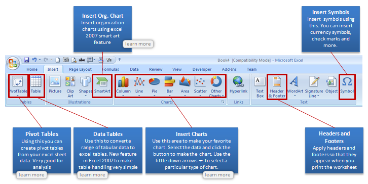
See the sample page for insert tab (click on it to see at higher resolution)
Download the free Excel 2007 learning guide now
Click here to download the Using Excel 2007 Ribbon – Learning Guide.
What is the catch?
There is no catch, except that, I am in a generous and becoming-a-daddy mood.
But if you must catch, just go ahead and sign-up for our e-mail news letter. It is free, awesome and packed with super-cool tips. And as if there is not enough free, you will also get a 25 page free e-book on using excel when you sign-up. It has 95 really fun and productive excel & charting tips.
Go…


22 Responses
Thank you, kind sir. Well done with the baby making.
I cannot get signed up for your newsletter. I tied both this email address and churchill2001@hotmail.com. never a response.
I cannot get signed up for your newsletter. I tied both this email address and churchill2001_at_hotmail_dot_com. never a response for either attempt.
@Doug, it shows that your email address is pending verification. Can you check your inbox (and may be spam folder too) for an email from me? The subject will be “Activate Subscription to Get your Free Excel Tips E-book”
Very Useful Info..Keep it up..
@Ajay.. you are welcome 🙂
how do u download microsoft excel for free?
http://www.microsoft.com/en-us/default.aspx
Select Office
Free Trial
I can’t open this pdf. I get the error message:
You do not have the required license to open this file.
Please request a license from the creator of the file, and add it using the license manager and they try opening it again.
What gives??
I downloaded the file again and it worked this time. Strange. (First file was 116 KB, second was 1644 KB… ???)
Hi Chandoo,
thanks for sharing your Excel 2007 learning experience with us; unfortunately the link to the pdf of the free Excel 2007 learning guide seems broken: my Acrobate Readers flags: “Unkown file type or corrupte data”.
Have a nice day
Michael
well done this is great
Can somebody just provide a link the classic TAB exportedUI files for MS Office 2003 for us to use in office 2007/2010?. searching online, everybody just wnats to make a buck online with silly Classic Tab installers which do nothing more than inport exportedUI files for you.
Don’t give me a ribbon how to guide, just give me free exportedUI files. I should not have to pay anyone for this, it is free XML, MS should have included this to begin with.
thanks
Dear.
There are a set of debit values and a set ot credit values in a column. I want a vba code by whcich the debit value plus a single / multiple credit value is zero that needs to be marked .
finally i will come to know out of the avaibale debits which cannot be used the with avilable credits either single or multiple values.
If multiple matching sets are available let it take the 1st or the 2nd one its not an issue.
Column A Ref
-1000 A
-5000 B
-8000 C
800 A
100 A
100 A
2000 B
3000 B
13000
15000
hi…
how to make this add-ins and display in ribbon… check this sample : http://www.cprsoft.com/GCDemo01.htm
thank you sir…
Please tell me format painter short cut key In excel ?
Thanks In Advance
thankfully.likeeeeeeeeeeeeeeeeeeeeeeeeeeeeeee
I am very much happy for such a great opportunity given to excel learners to advance their skills for the betterment of the future. I am a great user of this site and feel proud to have come across this web site.
I appreciate this, because I didn’t do much works in my project management studies using gantt chart. As of now are have now learned some advancement.