
Excel has very powerful formulas and add-ins for performing almost any kind of statistical analysis. Today we will learn how you can make a statistical distribution of test scores using excel.
This is a part of our spreadcheats series of posts where we aim to solve 30 common work related excel problems, one at a time. Read the earlier spreadcheats here.
Just follow the below 2 steps to create statistical distribution / frequency of any set of values using excel. Also, download the statistical distributions example workbook and play with it.
1. Define the bands for distribution
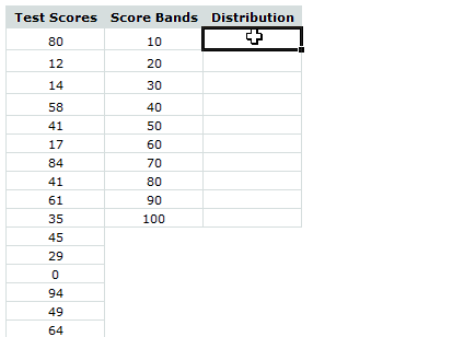
Assuming the test scores range from 0 to 100, you can define score bands like 10,20,30,40,50,60,70,80,90,100
2. Create a frequency formula and array enter it in to the spreadsheet
This part is even easier.
Assuming the test scores are in the range B6:B105 and bands are in the range c6:c15:
First select the cells D6:D16 (10 cells, 1 each for the frequency between 0-10, 10-20, 20-30, … 90-100) and then enter the FREQUENCY() formula.
What is FREQUENCY() formula?
FREQUENCY is an excel function that takes a range of values and a range of bands and tells you how the values are distributed in the bands. As you can guess, the formula returns an array of frequencies, so it must be entered in a bunch of cells together.
How do you do that? Simple, select a range of cells, enter the formula in the first cell by start typing =frequency… and when you are done, just press ctrl+shift+enter and excel takes care of the rest.
The formula we need to enter in our case is, =FREQUENCY(B6:B105,C6:C15) and when you press ctrl+shift+enter instead of just enter. The frequency values for each band will be entered in the corresponding row.
See the screencast below to understand it better.
That is all. So simple isn’ t it?
Download the statistical distributions example workbook and play with the formulas yourself.
More on statistics and excel:


72 Responses
My pet peeve with Excel when it comes to frequency count is that it does not do a true frequency count. You have to specify bands rather like that of a histogram.
What does one do when all you want to do is check how many 80’s there are and how many 79’s there are. The thing is that be specifying the banding beforehand you have an idea of the distribution (or min/max values for example) – I’d prefer a brute force way of checking the counts of each number rather than having them banded.
I know Pivot Table is a workaround, but it’s strange that Excel has very useful functions – just not this elemental one.
Fine print: I know this is all achievable in stats related software. Just called it my rant with Excel. 🙂
@Adam: You can check the counts of individual items in two ways:
countif() for a specific number
or countif() with array formula so that you can check it for a range of numbers.
for eg. =countif(range, row(1:100)) would count all the frequencies for values between 1 to 100 and returns an array (you must ctrl+shift+enter it)
One of things that I couldnt solve is, passing this formula output to a chart without having to enter them in a range of cells. For eg. in excel you can define a named range like freqCounts and refer it to the above formula. But when you try to make a distribution chart and pass the named range freqcount as one of the series parameters, it returns an error..
Does any one know how to handle this?
Thanks Chandoo…this is an interesting hack! I have never thought to look at frequencies like this.
excel. Also, download the statistical distributions example workbook and play with it.
This download does not work. I get the following message when I click on it.
The compressed zipped folder is invalid or corrupt.
i don’t know why it is doing this, I have never had any probkem opening any of th folders before.
Thanks
Geeta
@Geeta.. it seems to work alright for me. Can you try downloading from another connection?
salam! am so upset 1 din k baad mera buisness math n statics ka paper hai mai BBA ker rhi hoon plz chandoo bhai saab agr aap meri help ker dain tu aapki buhat buhat mehrbani ho giii. buisness mathn statics (302). agr aap k pass solve MCQs hain tu plz woh bhi meri id pe send ker dain aapki buhat buhat nawazish ho gii
best n regardz
shazia hassan
I am so dumb at this that even this simple explanation is not working for me. Only the first one was counted right and then it just doesn’t seem to work or show all. I’m using Office 2007.
I take it back – I’ve done it – yay hooray thank you thank you thank you!
Ya, for some reason when i do it it counts everything below it not sure why instead of counting inbetween the range.
does this make any sense to anyone?
i have office 2010 64 bit. i feel like it has a bug because when i do it in google docs it works perfect.
@Edwin
After you enter your formula eg: =FREQUENCY($B$3:$B$32,E3:E13)
you have to make sure you press Ctrl Shift Enter to enter the formula, not Enter by itself
.
In the formula bar you will see {=FREQUENCY($B$3:$B$32,E3:E13)}
You don’t enter the {} brackets, Excel does that when you press Ctrl Shift Enter
I’m having the same problem but the brackets don’t help. A frequency only appears in my first band; all the other are empty. I allowed an extra cell for the “overs”. Not sure what I’m doing wrong. Thanks!
Hi Jessica,
Can you share the data with us? you can email me your workbook or post it online and share a link thru comment.
How do you create the score bands?????
@CJ
Manually
Often start with:
1. Min(range)
2. Value of 1. +(max(range)-min(Range) )/n
3. copy down until you get to the max value
n = No. Bins you want
Hi
The formula was great help to me on frequency I am studen at Durack
Many thanks
R Allan
Thanks man. You are the best. Really helpful.
this is suprb formula.thank you very much
Thanks this website was so much more useful than the microsoft help.
Thanks for all the great tips. I am trying to do something like a frequency chart or table but haven’t been able to figure it out.
I have a list of orders shipped out and the boxes that were used to package them. For example, Order 1 might be put in a 202 size box. Order 2 might need a 202 size box and a 216 size box. Order 3 could need 2 of the 202 size boxes. Order 4 might need 2 of the 202 size boxes and one of the 216 size.
There are 13 sizes all together.
I am trying to find the top 10 combinations. For example, 30 of the orders used one 216 size box. 25 orders used one 216 and one 202 size box. 20 orders used two 202 size boxes and one 216 size box.
I have only seen formulas that return results where items/numbers are not duplicated within a row.
Any suggestions are greatly appreciated!
@Ann
Can you post your data with a brief description of what you want to achieve
Sure,
Sure:
Boxes Used to Box Order
Order # Box 200 Box 201 Box 202 Box 207 Box 208 Box 216 Box 501
2157 0 0 0 1 1 0 0
2448 0 0 1 2 0 1 0
0588 0 0 0 1 1 0 0
0867 0 0 0 1 1 0 0
2459 1 1 0 0 0 0 1
0657 0 0 0 1 1 0 0
2409 0 0 1 2 0 1 0
Order # is on left. So for order 2157 we used 1 of the Box Size 207 and one of Box Size 208. But for order 2448 we used one of Box Size 202 and TWO of Box Size 207 and one of Box Size 216.
Out of the data shown below the most common box combination needed is one Box 207 and one Box 208 (3 orders have it). The next most common combo is one Box 202, two Box 207 adn one Box 216 (2 orders).
I have a set of data with 13 types of boxes overall and at least 300 orders w/box info on them. I am trying to find distribution frequencies for the various box combinations. Most formulas seem to assume only 1 of each type of product (box in my case), but some orders have 2 or 3 of the same type of boxes in them.
Numbers showed up bad on last post. Last Box is Box 501 but lines got split.
the four digit numbers starting w/2157 are the order numbers.
You could use what is known as Shopping Basket Analysis (thanx Sam).
I have done a quick example of a 2 item shopping basket, but it can be extended to 3 or 4 relatively easily:
.
https://rapidshare.com/files/4076594276/Boxes.xlsx
.
Look forward to your thoughts
Thanks. I couldn’t get the file to open, but I did some searching on Shopping Basket Analysis. It does seem to do what I am looking for based on the videos I found. Unfortunately I don’t have SQL server. Is there any other method to do this?
Hello Hui,
I got your file to open. It looks like it works, but I have 13 types of boxes (or 13 products in terms of shopping analysis). Also, there is no limit to the amount products that can be in one order, for example, there could be 1,2,3, or even 10 of the same box in one order (although I think 10 (maybe even 5) would be enough for my analysis.
Many thanks for your help so far, I am getting closer to a solution!
@Ann & Sam
.
I had a revelation this morning at about 2:30am whilst thinking about your Boxes problem.
Don’t as why I think about these sort of problems at 2:30am?
And after 5 minutes this morning it has proven fruitful
.
What I realised is that if we can determine a Unique ID Number for each order (Not the order No.) but a single number that is unique to the combination of items ordered, all we need to do is count the number of times that unique ID occurs and that will tell us what combination of boxes sold the most.
.
The clever part I think is how I thought about getting a unique ID No.
If the Boxes are listed 1 per Column from Col B to Col N (13 Boxes) we can assign a number to each column, and then just add the numbers up where there is a box in that column.
But you may ask that 5+2=3+4 and so the numbers aren’t unique? True.
The good bit is that if you use the numbers 1, 2, 4, 8, 16 eg 2^n where n is the column Number, the numbers are unique and can’t be added up to make another number in the sequence eg 1+2+4=7 not 8
.
It turns out that this is easy to do in Excel
=SUMPRODUCT((B3:N3>0)*(2^(COLUMN($B$2:$N$2)-2)))
.
(B3:N3>0) this takes the sales data and converts it to a True (1) of False (0) if that box was sold
(2^(COLUMN($B$2:$N$2)-2)), This raises 2 to the (Column No -2)
and
Sumproduct multiplies the two numbers and adds them up.
.
I have mocked up an example of this at:
https://rapidshare.com/files/1009927509/Boxes2.xlsx
.
@Sam, This is directly applicable to your problem except that your sales data doesn’t occur as a single row. Extracting a unique list of Sales ID and put them in a row and with teh products across the top as a matrix will lend itself to this solution.
.
Look forward to your comments.
Hui…
Excellent work Hui! Thank you so much. I checked out your file and it seems to work great. While I am not an expert at arrays and sumproduct, I understand how you used the formulas to set it up.
Thank you again! I never would have figured this out on my own. I had thought somewhat of giving each box it’s own ID # but couldn’t figure out how to solve the duplicate part of it.
How about frequency of something much more random, such as license plates? License plates are a random combination of letters, numbers and letters-and-numbers, and consequently they seem to have no logical array or band. Any ideas?
I am trying to figure out how to do a freq dist chart I have 101 pieces of info in colume A, ranging from 178.00 to 424.00. I am to use class widths of 25 dollars so that the first class is 175<x<=200, the 2nd is 200<x<=225 continuing as high as needed to include all data. Im using 2007 can you please help me Don
@Don
Assuming your data is in A2:A102
.
D1: ‘Bin
D2 put 162.5
D3: =D2+25
Copy D3 down to D14
E1: ‘Count
E2: =SUMPRODUCT(($A$2:$A$102>=D2-12.5)*($A$2:$A$102
@Paul
.
You could use something like:
=CHAR(IF(RAND()<0.278,RANDBETWEEN(48,57),RANDBETWEEN(65,90)))
This will give you a single random Character in 0-9 & A-Z
.
You can string several together to make a string
eg: for 6 characters
=CHAR(IF(RAND()<0.278,RANDBETWEEN(48,57), RANDBETWEEN(65,90))) &CHAR(IF(RAND()<0.278,RANDBETWEEN(48,57), RANDBETWEEN(65,90))) &CHAR(IF(RAND()<0.278,RANDBETWEEN(48,57),RANDBETWEEN(65,90)))
&CHAR(IF(RAND()<0.278,RANDBETWEEN(48,57), RANDBETWEEN(65,90)))
&CHAR(IF(RAND()<0.278,RANDBETWEEN(48,57), RANDBETWEEN(65,90)))
&CHAR(IF(RAND()<0.278,RANDBETWEEN(48,57), RANDBETWEEN(65,90)))
.
Or you could setup a list of Numbers in a column 1 - 36 with the Letter A-Z and 0-9 Besides it
and then use a Lookup to extract characters
like:
=VLOOKUP(RANDBETWEEN(1,36)
.
or for 6 characters
=VLOOKUP(RANDBETWEEN(1,36),J2:K37,2) &VLOOKUP(RANDBETWEEN(1,36),J2:K37,2) &VLOOKUP(RANDBETWEEN(1,36),J2:K37,2) &VLOOKUP(RANDBETWEEN(1,36),J2:K37,2) &VLOOKUP(RANDBETWEEN(1,36),J2:K37,2) &VLOOKUP(RANDBETWEEN(1,36),J2:K37,2)
I am having the same problem as the person above – I can get the first one to work, but not in subsequent cells (i.e. bands 20 to >100). Thanks for the help…
@test
I just figured this out today (assuming you have office 2010). Once you have the first cell finished, highlight it and the rest of the cells you want it applied to. Press F2, then CTRL+SHIFT+ENTER and done!
i need a help.
how can i introduce the Gaussian Distribution to compare with frequency distribution obtained from test score and score bins?
hello, any help wellcome, I know the frequency alway go like TEST, SCORE AND DISTRIBUTION. I need in a different way, test, distribution and the test.
I want to be clear what I really need about the frequency, is not the same beside the score see how many times certain number are, example what I need:
test ( the answer I am looking for is in front of the distribution shows the score. )
1 freq-score .
1 1- 2,4
2 2- 1,3 as you see is less space and easy to read. how can I get this. one time was
3 2 and 4 and two time 1 and 3, .
3
4
5
Thank you!!!
0 Times
18 23 54 55 56 57 58 59
1 Time
14 30 35 47
2 Times
6 12 19 20 21 25 27 33 36 40 41 46 49 53
3 Times
1 2 5 7 8 13 17 29 31 32 43 50
how can I get this frequency report. the regular frequency function give you next to each number the times that number shows up, what I need is beside the times all the numbers with the same frequency like the example above.
@Matwe
Can you please clarify your requirements using an example as I’m unclear what your after?
Hello Hui… thank you for reading my post. my original problem is. =frequency(A1:A1860,C1:C303)} so you imagin this I have to go down 303 numbers and beside each one the frequency, so I need instead, summarise by frequency, means like the example in the other post. example ( cero times) all the numbers with 0 frequency. (1time) and all the numbers with frequency 1 etc.
@Matwe
That makes more sense
Why not just put the whole table into a Pivot Table
and set the filed value to Count
I did and do not work. I have been searching all over and nobody knows,
I have this: =SQRT(A3^2+A4^2)-1 ; result is in H4 what really need is IF H4>53; H4-53 how is possible to do this.
@Matew
in H4 put:
=SQRT(A3^2+A4^2)-1-IF(SQRT(A3^2+A4^2)-1>53,53,0)Hi everyone, I am trying to get the all trigonometric functions of the number from 1 to 20 in one time, I need to see the list. how is possible that. I mean write a formula, and bingo I have the table of the numbers from 1 to 20 and sin, cos, tan etc. thanks.
@Ollehydob
You can setup a Table as described below:
In A2 type = Row()-1
In B2 type =Cos(A2)
In C2 type =Sin(A2)
In D2 type =Tan(A2)
In E2 type =Cosh(A2)
In F2 type =Sinh(A2)
In G2 type =Tanh(A2)
Select A2:G2
Copy it down to row 20
Don’t forget that Excel works in radians not Degrees
So if you want to use degrees
Change the formulas as below
In B2 type =Cos(Radians(A2))
In C2 type =Sin(Radians(A2))
In D2 type =Tan(Radians(A2))
In E2 type =Cosh(Radians(A2))
In F2 type =Sinh(Radians(A2))
In G2 type =Tanh(Radians(A2))
I have a list of websites citing sources for various features in my research. Some of these features use the same website (URL links are the same) and I’m wondering if there is a way to sort through the list to get a a “Bin” of URL’s to make a frequency chart? Right now, I’m going through each feature one by one and checking the link against the list I have been populating to make sure I don’t add something that is already in the list. I know there has got to be a faster way to do this in excel, I just have not figured it out yet.
Ah, I just figured it out! Using pivot tables solves this problem. Got the idea from here.
http://stackoverflow.com/questions/5972947/frequency-of-strings-in-an-excel-column-pretty-sure-this-requires-vbscript
Thank you Mr.Chandu. I am going to use that to compile all the assets in my hedge fund
Hi Chandu, i’ve gone through many tutorials regarding FREQUENCY function. Am following exactly the same steps mentioned in ur tutorial but it doesnt seem to be working. I selected the cells, entered the formula but the output is not returned in array but just a single value. Am using excel 2007. Is there any difference in versions? Am i missing something? Can u pls send me any tips/suggestions to hari.vatsava@gmail.com?
Thanks a ton!
Normal
0
MicrosoftInternetExplorer4
/* Style Definitions */
table.MsoNormalTable
{mso-style-name:”Table Normal”;
mso-tstyle-rowband-size:0;
mso-tstyle-colband-size:0;
mso-style-noshow:yes;
mso-style-parent:””;
mso-padding-alt:0in 5.4pt 0in 5.4pt;
mso-para-margin:0in;
mso-para-margin-bottom:.0001pt;
mso-pagination:widow-orphan;
font-size:10.0pt;
font-family:”Times New Roman”;}
How to CONSTRUCT A BUSINESS PROBLEM WHICH SHOWS A POSITIVE RELATIONSHIP BETWEEN INDEPENDENT AND DEPENDENT VARIABLES USING REGRESSION ANALYSIS
Thanks a lot. It was really of help.
I would however need to know more.
I have in Column A a list of 300 customers and their purchase quantity in Column B. The frequency helps me in getting how many parties by in what quantity range. But how do I get their total purchase as well. Parties who bought 10 to 20, bought how much in total?
@Vivek
try:
=SUMPRODUCT(($B$16:$B$28>=10)*(B16:B28<=20),B16:B28)or
=SUMIFS(B16:B28,B16:B28,">="&10,B16:B28,"<="&20)Hi, when I try to use frequency I receive an error of too many arguments used. Where would I find the amount of arguments I am able to use in this formula?
Thanks!
@TMike
Can you please post an example of your formula here
Actually, I figured out the issue. My selections were not lumped together and frequency would only allow 3 selections separated. I created a separate sheet and put the data together and it works great. Thanks for your time.
🙂
Hi
I am looking for solution i need to get frequency distribution and summing the frequency as well. Please help me.
CallingPartyNumber
Minutes
718495795
147
717739751
24
712880902
81
717786110
919
712989791
331
718527906
23
718980722
195
717641898
497
711038002
315
712056807
191
712429177
112
718261394
136
You can create a pivot table from this data to get all different numbers and the total minutes they have called.
See here for help: http://chandoo.org/wp/excel-pivot-tables/
I am attempting to split a budget amount among 125 programs based on the performance of that program. I have scores for each program, and minimum and maximum budgets allowed. I am just struggling with this. For example – let’s say I have 125 programs, $190k to spend, and must spend the budget according to program score (scores range from 3.0-5.0), where each program cannot receive less than 500 but no more than $6000. Help…
ie:
Program Score
A 3.89
B 4.72
C 3.32
D 4.24
E 3.89
@Deo
Based on a lineal distribution where the minimum score 3.0 gets $500 and the maximum score 5.0 gets $6000 and if you have 125 programs you will need much more than $190k
Doing a random distribution of 125 samples between 3 and 5 the minimum will get $0 and the maximum $2,966 to spend $190k
that’s what I was afraid of – I used an interval calculation and came up to about $300k total. But I don’t know if this is really the true cost.
Can you share with me what formula you used when you refered to “Based on a lineal distribution where the minimum score 3.0 gets $500 and the maximum score 5.0 gets $6000 and if you have 125 programs you will need much more than $190k”
@Deo
Have a look at:
https://www.dropbox.com/s/8wct5fc09dniso7/Deo.xlsx
Column D distributes $190,000 prorata based on a lineal distribution
Column F distributes prorata based on a minimum of $500 and max $3000 but spends more than $190,000
there are Totals and Min/Max in Row 127-130
Thanks!!!
Thank you. First site that both helped and was straight to the point.
This was excellent.
I can’t thank you enough!
Ned
is there a way to analyze the text data using Excel ?
A deposit of Rs. 6000 in a Bank account earns interest 5% compounded monthly for four years. How
much amount is accumulated in the account after 4 years?
A 55-inch segment is divided into three parts whose lengths have the ratio 2 : 4 : 5. What is the length of the longest part?
Suppose that you establish an IRA (Individual Retirement Account) at age 43 and you will retire
after 22 years hence at age 65. You plan to make annual payments of Rs1000 into the IRA at the
beginning of each year. If you assume a rate of return of 8.5 percent a year, calculate the future
value of your IRA when you will retire at age 65