
After a really long wait finally I have used … Excel 2007 (drum roll) and contrary to what many people think, I have found Excel 2007 to be a very well designed piece of software. Of course there are various issues with it and I am sure folks at MS are working on them so that next versions of MS Office are much more pleasant and simpler to use.
I wanted to share 10 wow factors in Excel 2007 that may convince you to try it.
1. The interface is gorgeous and easy on eyes
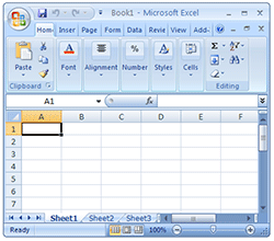
The Excel 2007 interface is very well polished and looks neat. It is easy on eyes with simple colors. All the file related activities can be accessed from office button on the top-left corner, while ribbon UI provides access to all excel features.
2. When you right click on a cell it shows formatting options as well

Usually when you right click on a cell (or a range of cells) it is to format them. Now you can do that even faster. When you right click excel 2007 shows the standard formatting options as well.
3. Status bar now shows average and count as well

Remember how you can select a bunch of cells in excel 2003 and earlier and findout out their sum (or average or count) quickly by looking at status bar ? Well, now you can find out average, count and sum from status bar (actually you can add more options, just right click on status bar and choose the statistics you want)
4. Improved conditional formatting with micro charts

One of the significant new features of Excel 2007 is improved conditional formatting. It has all the goodness of excel 2003’s conditional formatting and on top added new features like incell micro charts. They are very easy to use.
5. You can format tables in a jiffy

One of the most common formatting tasks is table formatting. Excel 2007 totally automated it with some gorgeous table formats. You can customized these styles very easily.
6. They have a Remove Duplicates button !!!

That is right, finally a remove duplicates button. Select the data, press this button and mention whether you want to overwrite or paste in another place and that is all. Now, if only they could add other common data clean up tasks as buttons…
7. The default chart formatting is way better than that of Excel 2003

The default charts look much much better than those generated in earlier versions of Excel. What more, they have disabled annoyances like font-scaling by default. 🙂
8. Better and Visually Appealing Color Scheme

The default color scheme is very good and provides excellent contrast when used in charts and tables. What more, the colors are no longer limited to 56 but you can add your own colors with much ease.
9. Ribbon is not that difficult to use

The Ribbon UI has been criticized by lot of people. But it is not really that difficult to use and get used to. Although you would need 2-3 clicks for activities that previously took 1-2 clicks. It would have been excellent if MS had provided an option to switch to classic menu navigation.
10. Despite the new look most of the dialogs are same

Even though Excel 2007 may seem like a huge leap from Excel 2003, the underlying dialog boxes, customization options are all same as that of Excel 2003. For eg. you can see that Ctrl + 1 on a cell produces the above “format cells” dialog box which is almost same what you get in 2003 version of excel.
Another thing is all the excel 2003 keyboard shortcuts work in excel 2007, so power users who have learned the shortcuts over a period need not worry about productivity loss.
All in all, I found Excel 2007 pretty ok except for few glitches. I am planning to install (not upgrade) it on my personal computer as well so that I can experiment and learn more.
What is your take on Excel 2007 ? What are the features that wowed you?
PS: This review is based on my first look at the Excel 2007 and not an exhaustive review. I haven’t tested features like pivot tables, VBA, new formulas etc. Stay tuned for more excel 2007 articles in the coming weeks.


66 Responses
Hey, better late than never!
It’s very easy to trash Excel 2007, but it definitely has a few good things going for it. Consider it the beta for for Excel 2009 (or whatever it’s called). Hopefully, the major problems will be fixed and other usability tweaks will be incorporated. I don’t expect too many major new features.
Use it exclusively for 4-5 months, and Excel 2003 will seem like an ugly old dinosaur. At least that’s how it went for me.
To paraphrase John’s esteemed opinion, it’s very easy to be distracted by the updated visual appearance of Excel 2007. And I will not deny that Excel 2007 does have some good features going for it. However, the drawbacks far outweigh any of these improvements. I have really tried very hard to like Excel 2007, starting in 2005 in the late alpha testing stages, and I can say that experienced hard-core users will find themselves less productive in Excel 2007, even after they know where their favorite commands have been moved to.
The ribbon puts many commands out of sight on the inactive tabs. In all honesty it seems like the new charting machine was never completed. The dialogs which have been redesigned, particularly the chart and shape formatting ones, cannot be used as efficiently as the old dialogs. Moving some options from chart formatting dialogs to charting contextual tabs makes them harder to find and harder to use. If you have any charts with more than a few thousand points, which is not a large total by any means, and Excel bogs down whenever it decides to refresh the charts.
I’ve blogged about several aspects of Excel 2007:
A Belated Review of Excel 2007
Changes to Charting in Excel 2007
What happened to my favorite Excel 2003 Chart feature?
Excel 2007 Chart Performance – Revisited
Error Bars in Excel 2007
Wow, Excel ’07 looks much better than I thought it would. For some reason I had this picture in my head of it being this ugly monstrosity. Now if only my company would upgrade. We just went from 2000 to 2003 about a year ago, so I doubt it’s going to happen soon . . . .
@ Chandoo :
Cud u pls inform the merits and demerits of “OpenOffice.org Calc” w.r.t. excel.
@John: That is what I am planning to do. Thanks.
@Jon: Thanks for the pointers. As I mentioned this post is first look review only and I might as well discover some problems with Excel 2007 ( I am hoping not though 😀 )
@Rich: It is a surprise for me too, but the overall feel of excel 2007 is far better than expected. Try it sometime and find your reasons to like / test it.
@Ketan: sure, I have already installed Open Office Calc and been thinking about a review for a while. Will do it in the next few weeks.
I also liked the charting features of 2007, initially. But, I have to work with others who have earlier versions of Excel. There is a huge problem in compatibility: a chart drawn in 2007 will not display fully in earlier versions: the left or right edges of the chart will be partly cropped, making them unreadable. They have to recreate the chart with their older versions.
There is also a danger that if you install 2007 on top of 2003 or earlier versions, your Windows installation will be corrupted, and you will never be able to access your older Excel version with OLE ever again (I have had to reformat one of my Windows machines to get rid of 2007). My experience has been that Office 2007 is one of the nastiest viruses out there: once you install it, all registry references to other versions of Office are eliminated, and you will not be able to regain full use of your older Office versions, even if you uninstall 2007 and reinstall the older Office version.
I hope you have better luck than I did with the 2007 install, especially if you use OLE. If you can get the 2 versions to co-exist, write about how you did it.
Chandoo, Excel 2007 is a dumb blonde. You saw the blonde, now prepare for the dumb.
Rene –
I have heard from many users who have installed multiple versions of Office on their computers with no problems (including one person with Excel 95, 97, 2000, 2002, 2003, and 2007). The trick they say is to install in order from the oldest to the newest, in different directories (e.g., C:\Program Files\Microsoft Office 97, \Microsoft Office 2000, etc.).
Perhaps it’s my own usage patterns, but I have in fact had issues with multiple versions. I suspect some of the problems arise from the shared resources, especially for me the user defined chart gallery. Another source of problems which I think relates to your issue of 2007 settings persisting past uninstallation, is registry settings. I also don’t think you can reliably control which version of Office is summoned for OLE interactions, just as you can’t relaibly control which version is opened when you launch a file from Explorer.
Lately I’m seeing some issues with userforms on computers with fresh installs of 2007 and with Excel 2003 freshly updated to SP3. It is a sporadic problem, most people don’t experience it, some who do can be relieved with simple remedies, and some defy all countermeasures. Unfortunately the error message is “Unspecified Error” (no joke!) and searching Google brings up earlier unrelated instances of this error.
@Rene: I came across the chart compatibility issues as we have partially migrated to excel 2007 in office and most of us are running that compatibility mode to avoid surprises.
Thanks for the warning on co-existence of 2003 and 2007. I will write another post if the installation is successful.
@Jorge: 😀
@Jon: thanks for explaining this and few other glitches. I will probably do more research before installing 2007 on top of 2003 as any disruption to 2003 would be very bad for me.
“It would have been excellent if MS had provided an option to switch to classic menu navigation.”
Chandoo- They Have…. You just have to turn it ON 🙂 ….and we should be thankful that they are allowing us to customize the Ribbon to display the Classic UI…
http://i41.tinypic.com/20jk01t.jpg
After reading several reviews of version 2007. I am still waiting to upgrade, my priority is productivity.
Of course there are things in the 2003 that needed improvement, but
I will consider the upgrade when I can customize the UI and when some of the 2003 lost features are added to the new Excel version.
@Gabriela Cerra: I agree. Sometimes I use Excel 2007 on my father’s PC for 4 months and still I can’t get used to it.
The only thing I really appreciate is “3. Status bar now shows average and count as well” mentioned by Chandoo. I really miss this feature in Excel 2003, which I use most of the time. :’-(
I’m not sure, if “most of the dialogs are same”. I find them too big and work with them is less effective.
Even though the conditional formatting is pretty now, it is buggy too. I rely heavily on conditional formatting, and I dislike the globalness of it in 2007. If I just want to remove formatting on a specific area, it is confusing to do so, and sometimes it applies the conditions to cells that I did not intend. The relative references get messy as well (if you want the cells in column B to change color if they match their corresponding cell in column A, and then add then you add data and apply it to more rows, you end up with too many “Applies to” references after a while, hard to clean up).
@Sam: Thank you. I am aware of a VBA based tweak for this (http://blog.livedoor.jp/andrewe/archives/50820196.html) but I dont know if there is a straight forward way to enable old style menus in 2007. Do you know any easy way to do this ? please … please tell me 🙂
@Gabriela: I am not sure how much MS would allow users to roll back classic UI, because I heard they have added ribbon UI to MS paint and wordpad (the free stuff that comes with windows) in their latest beta version of windows.
@Struzak: “I find them too big and work with them is less effective.”, you are right, the dialogs are unusually large. May be MS is hoping to add few more additional features in the coming versions and getting us ready for bigger dialogs.
@Spashi: That is some what disturbing to know. Even I use Cond. formatting alot.
Let me do some more research on this so that I wont accidentally add conditional formatting in a wrong way and send the file to a customer.
The tweaks that allow us to emulate the classic menus in the ribbon are not very elegant. In fact, the ribbon is pretty easy to control, once you get over the initial fear of the unknown. It’s way easier to customize using XML than it is to use within the user interface.
I would expect MS to be strongly reluctant to roll back to an earlier interface (menus and toolbars), despite their effectiveness and the strong backlash against the ribbon. They went through months of blogging and explaining, justifying how they used incomplete automated user feedback and faulty logic to develop the new system. Apparently we users are too stupid to be trusted with something as flexible and customizable as the toolbars and menus, and we will be happier and more productive with a system that’s much less flexible and almost completely uncustomizable. Um, or at least that’s what we were told.
The large new dialogs for the charts (for example) seem to have loads of empty space which could be put to more effective use. To format lines and markers for a chart series in Excel 2003, I need visit only a single tab of a dialog, whereas in Excel 2007, I must visit up to six tabs. If I need something special from one of these tabs, like 3D effect or something equally gaudy, the options appear right on the same tab. The equivalent in 2003 would be shown on a child dialog, and only when the user had called it. But in 2007 they shun child dialogs, except where they make life less efficient: how else to explain the need to pop up a dialog to select data ranges for chart series, custom error bars, etc.? These worked rather nicely on the same tab in 2003.
Looks like I’m ranting. Again. But these are the things that have caused me to feel trapped in an inefficient user environment in 2007. The feeling of constraint makes it impossible to enjoy the real improvements that were made.
I don’t expect to roll back the classic UI, only some EASY customization, few lost things like a floating toolbar and not to do 6 clicks instead of one.
@Jon: “to format lines and markers for a chart series in Excel 2003, I need visit only a single tab of a dialog, whereas in Excel 2007, I must visit up to six tabs.” I totally agree with you, I couldnt understand the rationale behind this either. They have separated things in to multiple tabs when they were working excellent in one place.
Chandoo:
I have suspected (without any real information) that the designers and programmers of the new charting user interface did not actually use this interface in daily battle. I only make small utilities, admitteedly, nothing as massive as part of an Excel-size application, but they are easy to use because I designed them so I could do things more easily.
NO VBA – JUST XML –
1st Hide all built in Tabs except the Addins Tab
2 Create a New Tab called – Menus
On this you can put one rows of menus + 2 Rows of buttons… the ribbon just allows for 3 – another stupid limitation
sam
sir i requested that Please sent me excel formula.
thank you.
your respectfully Ramesh Kumar tripathi .from opk eservices.
@Ramesh:
Can you please explain what formulas you were looking for?
Hi there,
I am trying to figure out if there is a way to get other color schemes for Office 2007. I know there are Black, Blue and Silver included in the pack, but there must be a way to edit them. My boss is having difficulty in seeing the difference between active tabs and inactive tabs in the Blue theme, and the Black and Silver are not really much better. Any ideas??
Thanks
When opening an Excel 2007 file in 2003, the colors change, even if I save it in 2003 format, and even if I use the same RGB colors in 2007 as I use in 2003. How can I keep the same colors when opening in different versions?
When opening an Excel 2007 file in 2003, the colors of filled cells change, even if I save it in 2003 format. How can I keep the same colors when opening files in different versions?
Barry –
I think the only reliable way to do this is to use white and black, and maybe primary colors. There is minimal compatibility between color models between Classic and New Excel.
Stephanie –
These are the only schemes available, and I don’t think they can be modified. Microsoft seems not to allow for 40+ year old eyes in their interfaces. There is a Windows option for enhanced contrast, I think buried in the display settings, but it makes everything else stark and ugly.
I don’t mind the 2007 ribbon except for two reasons:
– I have certain tools I use and when I consistantly use a function, I want it available on a customizable bar.
– Tools I never or rarely use, I take off the bar.
It’s that simple. I’ve gone back to Excel 2003 and have started using Open Office as well. The future for Excel, on the current path is dismal for the experienced user, IMO.
I hated the new ribbon when I first saw it on beta versions in 2006, after using 2007 for the last 2 1/2 years It grows on me, while some options I cant find, overall I find it faster to use.
The new tables and improved pivot tables have saved me hours of work!
Perhaps microsoft has spent some of the time on office 2010 in speeding it up!
And if you would like my 2cents on a feature for the next version!
The ability to define a repeated part of a formula IE
=if(sum(range)>0,sum(range),0 (simple example but sometimes the parts can be big)
it would be nice to do
=define(Form1,”sum(range)”) IF(form1,Form1,0)
or similar to cut down on repetition!
I totally agree with Jon Peltier. I love Excel 2003 and hate 2007. All my work has been affected by installing 2007. Most good reviews regarding excel 2007 are about its looks but productivity has been definetly affected. I regret upgrading from 2003.
User interface is just one of productivity to consider. What about after the weeks you took to re-learn the new look-and-feel?
Microsoft Excel 2007 is a major rewrite so it is justified to wait a lot from it.
It really brings great benefits, to name just a few:
1. Forget inserting a column/row to exclude adjacent data in Autofilter with new Excel Table
2. Filter discrete items. Use check boxes to select or deselect items
3. Don’t guess anymore when picking arguments (blocked cells or unknown cells because a blocked column header due to a flooding formula bar). Formula bar content is automatically wrapped
4. Delete multiple names at once
5. Dual-processors and multithreaded chipsets to perform faster calculations in large, formula-intensive spreadsheets
6. Focus on data analysis as you add data. Excel Table AutoExpansion
7. Delete duplicates intuitively and by field
8. Better charting and Pivot Table experience
9. And more…
Read this article about what makes Excel 2007 better than Excel 2003: http://www.excel-spreadsheet-authors.com/excel-2007.html
John –
Your points 1 and 6 re Tables in 2007 were true of Lists in 2003. Lists already had much of the capabilities of Tables, but they were a well kept secret. Lists were the killer feature which got me to upgrade from 2000 to 2003.
Half of your point 8 is false. The charting experience has been mostly much less pleasant. The default formatting is less ugly (note I didn’t say “not ugly”), and the process of formatting a chart has become tedious and obscure.
The items you mention which are new have not been sufficient to entice me to upgrade for my own work. I will have to admit that 2007 has given me a lot of conversion work, but much of this work has been unpleasant, both for me and for the clients who had to relearn how to use Excel.
One more point for Excel 2007 worth mention is the no. of rows;
from 65536 to 1048576. Phew! That’s great!
“One more point for Excel 2007 worth mention is the no. of rows;
from 65536 to 1048576. Phew! That’s great!”
Hah, wow.. how did it take soo long for this comment to appear, IMO this IS the reason to get Excel 2007.
I have been using 2007 for a couple months now and I am absolutey disgusted by it. Clearly Microsoft wanted to create a program that was beautiful for novice users, however, as someone who knew Excel inside out I find the new appearance and layout to be very inefficient. The way we describe it around our office is 2003 was the girl you wanted to marry, 2007 is a one night stand.
“2003 was the girl you wanted to marry, 2007 is a one night stand”
I think 2007 is what Rodney Dangerfield had in mind when he coined the phrase “two-bagger”.
From google:
Two-bagger: An extremely unattractive person (usually female), the insinuation being that one bag covering her face would not be adequate. Within this joke, the second bag is often understood to cover the male’s head in case the female’s bag were to fall off
Jon.. are you sure you have a bag on? 😛
On a more serious note, I found Excel 2007 pretty ok. Infact I have been using it since new year 2009 and so far I havent had any major complaints about it. It is different w/ people like Jon who make commercial tools based out of excel as several things have changed in 2007.
I am a power user of Excel and have been trying for a year to make XL2007 work as effectively as 2003. Definitely the million rows, the PDF add-on, and expanded chart types help. But the problems for serious users like me are major.
– I get frequent warnings that “data may have been lost or corrrupted.”
– Almost every workbook has “minor loss of fidelity.”
– Date records in columns that are used as chart X axes get replaced with a weird string.
– Many keyboard shortcuts like Alt E A (Edit Select All) do not work or involve an extra step. Worse, here Excel pretends to recognize what you want but does not do it.
– Some VBA macros would not work until I declared all variable types.
– XL’07 reports “invalid names” were changed to “#REF!” but then I could not find any such.
– Prompt for passwords suddenly stops appearing; workbook just opens.
– PDF writer within Excel (via MS Add-In) worked fine at first then started to produce mostly gibberish; now useless.
– As some mentioned above, the tooolbars are much less flexible and useful than before (I am surprised the backlash has not been more severe on this); that is a major step backward.
– One critical workboook suddely started to take five times longer to save. Can’t tell why.
– Print Preview button stopped working altogether.
I have nothing agains change. But this has been a real productivity killer. Takes an hour sometimes to do what used to take minutes. Again, I am surprised more people are not up in arms at the changes.
Fear not Berferd
A lot of the issues you discussed have been addressed in 2010
But I still agree with your opening line that 2007 and even 2010 is not as effective as 2003
My old Laptop and I have been using another office laptop with XL 2007. What a disaster this software is – sure there is a learning curve with new things – but as many observe even after you figure out by trial and error where the functions are hidden, it takes more clicks to get to the function you need than the old version – How about a classic toobar option – why should everyone’s productivity crash so that Microsoft can roll out software that benefits only themselves with new sales and a comparatively small number of users.
As a long time user of Excel (since version 2) I first tried 2007 as a CTP version at first I thought the ribbon was designed for new users and was an annoyance. After daily use of it for the last 3+years I wouldnt go back (I had to use Excel2002 recently for 6 months).
2010 which I am using on my laptop now has resolved some of the niggles I had, now I can edit the ribbon quickly and create tabs which suit me! The only complaint I have about excel is the fact that Visual Basic is not improving, it would be nice to work in VBA in a more visual studio like environment (yes i know about VSTO)!
@John… Most of the experienced xl 2003 users have similar comments. I think MS is addressing a few with xl 2010. But Ribbon seems to take a firm position in future plans of MS Office so you might as well get on with it and try to benefit from the implementation…
@Squiggler… I have been using xl 2007 at work and home for last year and half and I must say I love the UI now. For some customer projects I use xl 2003 and it does feel a bit difficult now to search in excel 2003 menus…
Even allowing for the novelty factor I find that the increase in key strokes & the inability to have favourite tools annoying.
I frequently get “minor loss of fidelity” messages.
Tabs do not always copy.
Sometimes when one presses Shift+2 instead of getting ” which you need for =text(D4,”0000″) you get @ =text(D4,@0000@) . The only solution to the later being to save the file. close it, close Excel, close machine 7 reboot. It is simpler to go back to Excel 2003.
It is true 2003 was the girl you wanted to marry & 2007 was the dumb bleached blonde, who makes one want to say “Just going to the bar/loo” & then make a run for it.
I’m hoping 2010 will get back alot of the customisation but I’m fearful the people who give it good reviews gave 2007 good reviews too.
Hey ho, not all change is progress
I am firmly in the favoring Excel 2003 camp. Agree with the comments that talk about how the changes are visual, but productivity is actually impaired. Also found what seems to be a 2003/2007 compatibility issue. I have a spreadsheet created in 2003. Normally it has the “freeze panes” active. When I bring it into 2007 (compatibility mode & converted both). I can’t unfreeze the panes. When I went back to unfreeze panes in 2003 then bring it back, I couldn’t freeze the panes.
Go figure.
I’ve been using 2007 for 6 months now and it is disgusting how awful it is – even the Help section is an ineffective mess. Everytime I need to do anything slightly signficant, I have to google for Help and troll various websites. It’s two steps forward – about ten steps backwards. My productivity with the application is down about 50%.
Advantage of Columns – 16,384 and Rows – 1,048,576 raised from 256-C, 65536-R.
Worth for large range user.
excel2007 good for use but when i seek this new version come it s boundries are large
Is password protecting a document (or spreadsheet) more secure in 2007 than 2003? Or is it the same?
I have a couple of excel files that I password protect. The files are in compatibility mode (2003 format). Since the data in those files is very critical I want to be absolutely sure if it is safe to be kept in there. Else I will start hunting for a more suitable way to hold sensitive data.
Awaiting your thoughts. Thanks.
Password protection was one area improved upon in Excel 2007
I’m note sure about when your working in compatibility mode though
If you want to be secure, definitely change to Excel 2007 file formats
I agree with all the comments about productivity. I use a lot of shortcuts in 2003 version and even though I know most of them by memory, once in while I need to refresh my memory and look into the menus for they right keys. Since 2007/2010 don’t have the same menu, now it is impossible for me to know a short-cut if I don’t remember the exact keys or I need to learn the new keys which they are longer paths.
In addition pivot tables /filters I used shortcuts to make selections in 2003, can’t do that in 2007. I heat it because productivity decreased for me.
The thing which wowed me was colour filtering & Sorting
Love how all the “wow” is eye-candy crap.
Sorry, but I finally let the IT department upgrade to 2007 from 2003 (yeah, I know how old all this is) and apart from the (expected) difficulties with the “intuitive” UI redesign (which literally takes me twice as long to find and do anything) I’ve hit a HUGE unexpected roadblock…
The 20MB database/iteration-machine I’ve been maintaining for the last three years has gone from taking 5-10 minutes to run a number-crunching session to, wait for it, 90 minutes!!!
I was able to reduce it to 50 mins by changing to xlsm format, but this is still around ten times as long as before. Unbelievable!
This is so bad, that I’m probably going to have to ask IT to install a separate copy of Excel2003 (or maybe run it in a VM or something) just to carry out this task.
well, no offense, but excel 2007 sucks. 2003 is much more convenience when it comes to data processing and graphing. Can I install excel 2003 in window 7?
@Anson
That is a common reaction of people who have used Excel pre 2007 when they change to 2007.
My advise is to skip 2007 and go straight to 2010.
Yes it has the same interface, which trust me once your used to, is actually easier to navigate, but it has the problems that 2007 has mostly resolved as well as all the niceties Chandoo has described above included.
Why, if all the “wow” seems to be about graphics and formatting, is it now so bloody hard to make a good graph?!? Why can’t I use cursor keys to move text boxes? Why can’t I copy/paste information in graph data selection? And the real killer: why can’t I use cursor keys to edit data ranges for graph input?!?!?
I have submitted a request to downgrade to 2003.
Hi;
I have a problem with “New Comment” in Review tab, in Excel 2007.
It is inactive and I couldn’t find how to activate it.
Any comments?
@Shandiz,
Check to see if your worksheet / workbook has any Protection… if yes you would need to remove that first before being able to add comments.
~VijaySharma
Hadn’t done a lot of serious database connections and queries with pivot tables and graphs for a few years so was very shocked today to see that office 2007 is incapable of correctly making a simple graph.
I’m done with this and don’t even feel like an IT pro should be re-educated every single time MS decides to release a so called new and improved version full of bugs.
Going back to 2003 and will leave the new 2010 version I have lying here for what it is.
Excel 2007 is an attempt to dumb-down excel for beginners, but infuriate power-users. 1) macro-recorder skips over various steps it used to record. It used to be a very powerful tool to kit-bash together VBA code very quickly. Now, you’re left filling in all kinds of gaps from whatever it skipped over. EG: Insert a chart or picture into a worksheet (not as a sheet, but as an object into a sheet). Macro record you deleting that chart/picture. Look at what it record… nothing. This is sloppy. 2) Due to ribbon, they replaced the easy-to-use custom toolbar creation and functionality with bend-over-backwards XML coding and other junk you have to do just to get custom buttons up and running. It’s ridiculously user-unfriendly, and a slap in the face to power-users stuck maintaining old toolbars from previous versions. 3) They reorganized some things for the sake or reorganizing. There’s no longer “Tools”, which was basically a quarantine of advanced functionality for power users. Instead, they shuffled all of those things around to other locations. EG: instead of Tools > Macros, you now have View > Macros. However, they got rid of some of the most useful tools, like the Print Preview button. Look under Page Layout … no Print Preview. Views? Nope. 4) Office Help flat out sucks. In offline mode, it’s about as useful as a tick on a dog’s ass, b/c it only glances over the most basic of functions. You can hook to online mode for more robust help, but all that does is put you into “Bing” search engine mode. It’s as if you opened up Google to ask your question… and when I ask quesitons and some of the top “answers” that come back are NOT help files written explicityly by microsoft, but instead independant forums where people are scratching their heads asking how to do something, and you have to read 20 people discuss what the problem is, is it this, is it that, will this help, maybe if you try this… Did MS fire their technical writers? The help files from Excel 95 & 97 were amazingly useful and detailed. Excel 2000 saw the quality of help files sliding, and I almost always used Google first. Now… they basically don’t have a help file, they just make you go right to “Bing” if you want some answers. In my opinion, they basically charged customers to reinvent a wheel, break things as they went, and did away with any useful help whatsoever, leaving the customer left searching the internet for valid help. This is ridiculously sloppy coming from a multi-BILLION dollar software company that’s been churning out the same office software suite for 20 YEARS. Calling 1 step forward and 2 steps backward “progress” is ridiculous, and I think you’re being overly generous and sympathetic to MS by doing so. If you want to say you like this new product…fine. Everyone’s entitled to an opinion. But, when I upgrade to a new product and LOSE functionality, that is NOT and upgrade, and it’s insulting they charged people money to downgrade like this.
I guess as a side-note, what really soured my opinon of 2007 from the start was how I converted some 2003 reports into 2007 format in order to take advantage of 2007’s file compression. However, opening one report a couple of times, it would blow up, then Excel would say “hey, I can recover this for you…would you like me to?” If I click “no”, it won’t open at all. If I click “yes”, it basically wipes out ALL of the formuals in my workbook (and we’re talking a lot of formulas!), and replaces them with hard values. I got to spend 1/2 my day rebuilding the formulas in the workbook. Saved it back to 2003 format, and left it alone. I tried using 2007 format a few more times, and had the same periodic blow-ups / recovers that would hose up my work. Like I said, this is not progress. It’s infuriating losing work, b/c of the tool you’re using. It’s the 21st century. MS should be doing better than this… WAY better, seeing as they seem to be regressing instead of progressing ever since 2000.
Graphing is significantly more cumbersome in 2007 than 2003. th e”Wizard” stepped through the build of the graph, and editing it after was also more straight-forward.
Considering usability, you would think that 2007 was the predecessor to 2003 and not the reverse.
If you use graphing whatsoever, I would not upgrade.
Agree totally, Greg. I’ve been coping with 2007 for a year or so now so I can confirm what you say and add to what I mentioned a few months ago (further up the thread).
Graphs are harder to tune, they’re uglier (wasn’t the point to make them “prettier”?!), they’re less clear if you’re plotting serious science instead of acting the powerpoint jockey (i.e. more than a dozen points), and bizarrely I found out its the graphs which are slowing everything down in my large database. I can *SEE THE REDRAWING* when I switch to a graph after changing the data!!!
I’ve had to completely rebuild and reprogram my database in order to bring the calculation speed back to something like it used to be in 2003, and I’ve spent several months learning tricks and workarounds to be able to deal with all of 2007’s many quirks. I mentioned the cursor key thing in my previous comment… that might be some kind of installation problem since no-one else mentions it (it’s a work PC so I can’t re-install it myself) but in my case the cursor keys *always* move the cell on the sheet when I’m trying to edit in dialogue boxes. That means using the mouse to place the cursor at various points in the text when selecting graph ranges, defining conditional formatting, etc. The moment I touch the cursor all my editing is wiped out! Also, CTRL-V doesn’t work in these cases. It’s the most incredibly annoying PitA, and I’ve had to train my brain to reach for the mouse to click, edit, move, click, edit, right-click, paste, etc. instead of my instinctive cursor left/right, CTRL-C, CTRL-V – which used to be at least twice as fast.
Oh yeah – and bugs. I’m continually finding bugs… even now when it’s a five-year-old product!
sorry if this was already posted somewhere else, but I found this Tool to be a great resource when converting from 2003 to 2007.
Graphically shows exactly where to find a command using Ribbon – just need to select using old (2003) method thru Excel Menus.
http://office.microsoft.com/en-us/excel-help/interactive-excel-2003-to-excel-2007-command-reference-guide-HA010149151.aspx