
Recently, I wrote a tutorial on tax burden in USA chart.
Jared, One of our readers liked this chart very much. Jared works as a workforce scheduler and has data similar to our chart. So he applied the same technique to analyze monthly service levels for last 7 years & sent me the file so that I can share it with all of you.
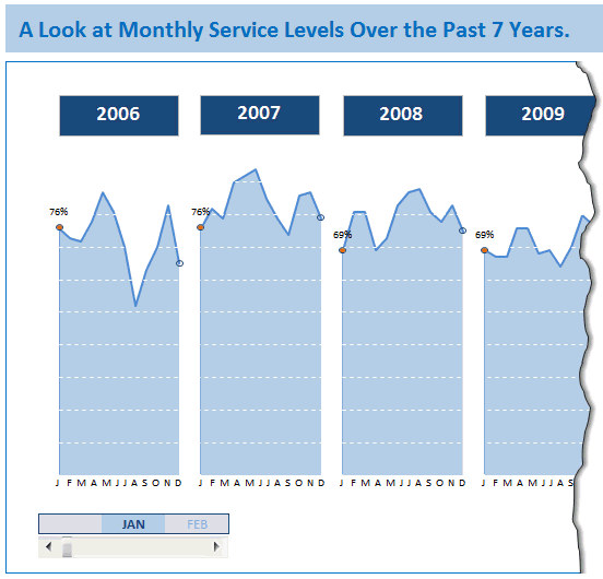
Monthly service levels in last 7 years – Demo:
First take a look at the demo of Jared’s chart.
Recipe of this chart
This chart construction is similar to our Tax burden chart. Only addition is the cool scroll bar at bottom to see any month’s service level across years.
How does the scroll bar work?
- If you have never used scroll bar or any other form controls, read our introduction to form controls page.
- The chart has one extra series that shows selected month’s value and a bunch of #N/As.
- Scroll bar is setup to have minimum 1, maximum 12 and is linked to a cell.
- Based on scroll-bar selection, we turn on one of the months and make the rest of values NA()
- Using a simple IF formula
- For this extra series, Jared added 100% negative error bar so that a nice drop line is shown when you select a month.
That is all.
Download Jared’s Example and get inspired
Click here to download this workbook. Play with it to learn more. Use this idea in your work and impress someone. Become awesome.
Do you like this example? Say thanks to Jared…
I really loved Jared’s creativity and simple solution. Not to mention his kindness to share this with me and all of you. This shows that by using easy features like scroll bars, slicers, regular charts we can create something that is stunning, meaningful and powerful – right inside Excel.
What about you? Do you like this example? If you learned something new, say thanks to Jared for sharing this with us.
PS: If you want to share your story of how you use Excel to do something awesome, please email me. I am eager to learn from your examples and share your stories on Chandoo.org.


33 Responses to “Monitoring Monthly Service Levels using Excel Charts [Example]”
Beautiful work out jared, thanks.
Many many thanks. So cool!!!!!
Very cool, great implementation, easy to understand. Thanks Jared!
Hi Jared ,
Nice work. Instead of highlighting the value on the chart , I would prefer that another set of textboxes is inserted below the years , so that all the values are in one line ; at present the eye has to scan the chart to locate the particular values.
Dear Narayan,
Can we have pleasure to see your chart at Rajmou2010@yahoo.com
Regards,
Raj
Hi Jared,
Thanks for the 'Tax burden' article. I was so impressed with how to display many products and their performance over time that I applied it in my work and immediately found significant trends which are now being analysed. Also, the idea of using a marker and error bar as a pointer is genius. I've been converting my own interactive charts to use this format now.
Thank you very much for giving.
Regards - LeonK
Good day Jared. I haven't used it. But I just looked at how beautiful it is made. Sincerely, L.
Beautiful work Jared...
It is nice charts
Nice one, Jared, thanks.
Thanks Jared.
A really nice extra.
Darren
Thank you Jared – Great work!
Your template is well made and useful. I downloaded a copy, created several scenarios, and shared them with several other managers.
Mike
Fabulous Jared ! It really inspired me in many way. I wish others can also share their ideas and get inspired.
Raj
Great Jared very impressive
Ciao
Very nice, I will attempt to use a similar format for my Utility expense analysis. I like it!
Jared, you have left us jarred
[...] Monitoring Monthly Service Levels using Excel Charts [Example] [...]
Wow, I am flattered by all the comments! Many thanks to Chandoo for his wonderful site that inspires me to build charts for my work and gives great tutorials. My Excel knowledge would still be very minimal without the work Chandoo does and all the great users in the community. I have found help in the forums and have always wanted to share a creation of mine. I still do not consider myself an expert at Excel by any means and continue to learn every day. Very happy that many of you like this. Thank you!
Hi Jared,
I completely understand how you have constructed the above chart. Gr8 work.
I just want to know that how you have hide the "0" in chart ( When value is available with current month and other month showing 0")
i Really want to know it. please help to understand.
Regards
Istiyak
I'm not sure of your question
Great!! It's a true example of Excel amazing capabilities and the incredible creativity of users like Jared, thanks a lot for sharing this recipe with the users.
Would it be possible to created a detail tutorial on how to achieve this graphic? I am new in advanced charting and every help would be useful to learn more. Thanks in advance!
I guess slightly irrelevant but, how do you create the animated examples embedded in your post?
Thanks,
Matt
Hi Matt.. I use Camtasia screen recorder to produce these. Visit http://chandoo.org/wp/about/what-we-use/ to know more about all the tools & software we use.
That's simply awesome! Thank you 😀
Matt
Chandoo,
I've got an interesting idea for you using this same concept.
I'm working on a Earned Value Management Workbook for my work (I'm a project manager). I was first interested interested in looking at slices of time in my date on a graph or table to see what my SV, SPI, CV, CPI, EAC, and EAC(t) are as the projects progressed. I still think this method would be useful for that. But I not think you could have data sets and graphs in parallel from historically similar projects for reference (just as you have the different years beside one another).
You, being the ninja you are, might find this little project interesting.
a great work, thank you very much; I just rebuilt the tax burden with single year selection .. one thing I did not yet understand was the "negative error bar", but I'm working on it .. 😉
Hi Jared,
Thank you very much for sharing your knowledge! Only great men can taken this kind of action! God bless you!
Great work..
thanks chandoo,
but I do not understand how do you make "error bar so that a nice drop line" !!
Please, Can you explain it?
Hi, many thanks for sharing this. I would like to know how to add the drop lines. It is the only thing i cannot include in my chart
Hi guys
Does anyone know how to create the charts on p4 (pdf p 14) of this report (http://www.wssinfo.org/fileadmin/user_upload/resources/JMP_report_2014_webEng.pdf) which shows progress (before and after results) for a number of different items (in this case countries)
I don’t know what you call this type of chart and so have not ben able to search it.
Thanks
Chandoo always surprises me with his amazing website and cool content. Your work has helped me a lot in the last 3 years and I would like to say "many thanks for the outstanding work!"
Jared's template is a nice piece of work and I wanted to congratulate and thank him for sharing it with us. Many thanks and well done!
All the best, guys!
Hi Jared,
I really liked this chart, is quite simple to adapt for other purposes.
I have made some modifications on it and it's almost finished.
I have question for you, my "line" series is almost a constant, (99.1, 99.3, 99.5, etc), how can I customized the scale for it?