
Yesterday we have posted how to use excel combo charts to group related time events. In the comments, Art Johnson says,
This is awesome. I love this blog. I have dealt with this issue before. Usually my issue is monthly anomolies caused by fiscal months of 4 weeks followed by 4 weeks, and then 5 weeks in each quarter. This causes a spike in March, June, Sept., and Dec. It’s one reason I prefer to look at quarterly trends rather than monthly. This chart is quite nice to see these effects. Is there a way to just toggle between two charts? One of weekends and one of weekdays? […]
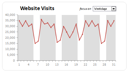
This effect can be easily achieved with a cup of coffee, one combo box form control and the good old IF formula. Look at it yourself.
I am not going to provide the complete recipe. But here is the gist. I am sure you can take the help of that coffee in case you are stuck.
- Add a combo-box form control using forms tool bar or Developer ribbon. (not able to find the developer toolbar in excel 2007? see this)
- Set the input range for combo box to two cells where the values “weekdays” and “weekends” are mentioned.
- Also set the “cell link” for the combo box to some free cell like IV32000
- Now change the dummy series (the range where the column chart values for zebra lines are mentioned) values to a formula.
- The formula should be able to change the dummy values based on the selection in combo box. This is your homework to figure out.
- That is all. You now have a chart that dynamically groups events based on user selection. Pretty cool eh ?
Download the workbook and see it yourself
Click here to download the workbook and play with it.
Where can you use this technique?
Oh, several places. To begin with,
- To highlight new products vs. older products in a product-wise sales chart
- To highlight top 10 vs. bottom 10 values in a big chart
- To highlight values of a certain product / project vis-a-vis the whole set of values
What do you think about this idea?
Have you ever tried similar ideas in a report or dashboard? What is your experience? Personally I find dynamic charts more effective compared to static charts. Users like them, they like to play with the control(s) and make their own observations. Do you agree?
PS: If you are looking for a way to compare 2 KPIs or metrics in charts, see the part 5 of dashboard tutorial


13 Responses to “Gantt Box Chart Tutorial & Template – Download and Try today”
Hi Chandoo
As one of your students I have followed your detailed example through with great success. However, Excel is acting in an unexpected way and I wonder if you could take a look?
http://cid-95d070c79aef808e.office.live.com/self.aspx/.Public/Gantt%20Box%20Chart.xlsm
On my version, I have to type 40239 (Which equates to 2 Mar 2010) to get the chart to display 31 May 2010 (which should be 40329)!!??
Have I done something wrong or is Excel acting up?
Thx
Oli
PS Your example file in 2007 displays correctly.
Hi,
I like this idea a lot, but I agree the name is a little drab.
As an American I may just be seeing things, but to me the combination of lines and bars on your chart looks like a bunch of cricket bats.
Maybe you could work that into a catchier name. 🙂
Cheers!
Here is some code I use to keep the axis synched.
It may be useful to some of your readers
It is based on a comment I saw on Daily Dose of Excel.
Function SynchGanttAxis(Cname, lower, upper)
'Sets the X min and X max for Category axis
Application.Volatile
On Error Resume Next
'
'Top Horizontal Axis
With ActiveSheet.Shapes(Cname).Chart.Axes(xlCategory, 1)
.MinimumScale = lower
.MaximumScale = upper
End With
'Bottom Horizontal Axis
With ActiveSheet.Shapes(Cname).Chart.Axes(xlValue, 2)
.MinimumScale = lower
.MaximumScale = upper
End With
End Function
Function SynchVerticalAxis(Cname, lower, upper)
Application.Volatile
On Error Resume Next
' Excel 2007 only
'Right hand vertical axis
With ActiveSheet.Shapes(Cname).Chart.Axes(xlValue, 1)
.MinimumScale = 0
.MaximumScale = upper
End With
End Function
@Oli.. Can you check your file again.. I see 40329...
@Dave: Even I saw things.. the bars actually looked like lollipops. How about calling this lollipop chart - now that would be yummy and goes along the tradition of naming charts after eatables (bar, pie, donut...)
@Bob: Superb stuff... thanks for sharing 🙂
Hi Chandoo
This looks really good and I think it can also be applied to show project phases / milestones.
Question: Thinking further could this be amended to display a project lifecycle (Idea through to Implementation say 7 phases) on one bar / row? Just imagine 20 projects within a programme all on one chart one bar each showing their respective lifecycle stages i.e. on one page.
Idea: As the Gantt Box Chart this is quite intensive to set up re formatting etc how about the added extra of once you have completed this to "Save as template" i.e. saves the formatting and layout of the chart as a template so you can apply to future charts. Simple to do and will save the time formatting etc again and again and again.
Therefore tip: Click on your chart demo and then click on Save As template icon (2007) - edit file name and click on save. Ready to use / apply via Templates in Change Chart Type window.
Thanks and be very interested if the lifecycle question can be resolved
Mike
How embarrassing.
I was obviously suffering from numerical dyslexia. I was one of those days.
@Mike H: You can easily make this chart to work like a generic project lifecycle plan chart. All you have to do is,
1. in a separate sheet define the steps of lifecycle and various dates in a table (with 5 columns for each of the projects you have).
2. now use a control cell to input the project name you want to show in the chart
3. based on the input, use OFFSET Formulas to get the correct data
4. Rest is same as the tutorial above
For more info on the dynamic charting visit http://chandoo.org/wp/tag/dynamic-charts/ and http://chandoo.org/wp?s=OFFSET
Your solution is really smart but in the en Excel isn't meant to do stuff like this. I, as a former PM, always thought is was frustrating that you had to do stuff like this for something simple like a Gantt chart. So I built Tom's Planner. And would like to plug it here. I think it really solves the problem you are trying to solve in the most efficient way. Check out http://www.tomsplanner.com for a free account or play around with the demo.
Hi there,
Chandoo - this is really a very nice and helpfull chart - I adopted it, so I can report a forecast or the delay of a certain task (coming from my role as an auditor for projects).
One topic I´m currently struggeling with: I do have a project lasting for lets say 12 month. For a management reporting, I want to have kind of snapshot, lets say one month back and 2 month in the future. I tried with the offset formula, but failed. Any idea?
Thx
Lopi
[...] Ein viel geliebter Klassiker ist die Erstellung von GANTT-Diagrammen mit Excel. Wir hatten das Thema wiederholt schon hier. Chandoo.org hat sich mal wieder mit einer neuen Variante hervorgetan: Das GANTT-Box-Chart. [...]
[...] [...]
Hi Chandoo - fantastic xls. One thing I can't figure out how to do is adjust the alignment of the vertical axis. I would like to left align so that I could indent to represent sub tasks. Can that be done? Or is there a better way?
I've been trying to work out if there's a way to show weekends on the graph. The closest thing I've got is to add them on a secondary axis, but then I haven't been able to keep both axis lined up together! Any ideas?
Following on from this - is it possible to show things like holidays?