
We all know that learning a few keyboard shortcuts can speed-up your Excel game. Most pro users rely on a handful shortcuts when working with large spreadsheets. But when it comes to charting, we automatically reach for mouse. But do you know that you can use few simple shortcuts to do most day-to-day chart related things?
Ready for top 5 keyboard shortcuts for Excel charts? Read on.
Format any part of chart with CTRL+1

If there is a contest for most memorable and super helpful shortcuts, then CTRL+1 would win it. It is easy to remember and it is versatile. Select any part of a chart and press CTRL+1 to format it. In older versions of Excel, this would launch format dialog. In newer versions of Excel, you will see the format pane to the right.
Copy formatting from one chart to another with ALT+E S T

This is one of those sequence shortcuts. If you want to copy the formatting of one chart to another, simply select first chart and press CTRL+C. Now select the second chart and press ALT E S T (your press ALT E, leave both keys and press S followed by T in a sequence) and voila your formatting is replicated.
See this demo:
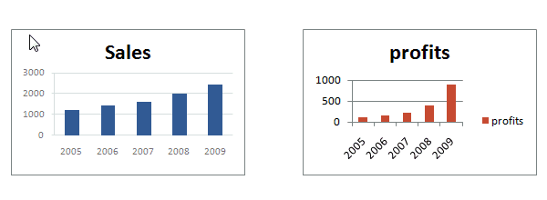
Add new data to a chart with CTRL+C, CTRL+V

Who could forget the trusty copy and paste shortcuts. But do you know that you can use them with charts too? Yes, if you want to add extra series to your chart, simply copy the data, highlight the chart and press CTRL+V to add it.
Repeat last action with F4

When you are working with lots of charts, often we repeat various formatting / customization steps on all of them. You can use F4 to speed up the process. Say you want to change axis color of all charts to dull gray. Do it one, now select the other axes and press F4.
Select various chart elements with TAB key (arrow keys in older version)

When you want to highlight various parts of the chart (title, series, axis, legend etc.) simply use TAB key (or arrow keys in older versions of Excel) to select one at a time. This way, you can avoid paying unnecessary mouse tax.
Bonus: Link chart title to a cell with = key
Nobody likes boring chart titles. So why not make them dynamic and awesome, just like you. Select the chart title, press = and link it to a cell. Of course, you need to have a formula (or typed up value) in the cell first. This way, when your formula changes, your chart’s title changes too.
Read more: Use descriptive titles for awesome charts
See this demo.

Top 5 Charting Shortcuts – Video
Here is a quick video demonstrating these shortcuts. Check it out below or on Chandoo.org YouTube Channel.
What is your favorite charting shortcut?
For me it is CTRL+1. I use it all the time. Next is ALT+EST. Anytime, I am working with more than one chart, chances are, I want to clone formatting.
What about you? What are your favorite charting keyboard shortcuts? Please share in the comments section.
More tips for working with charts and workbooks
Checkout below tips and hints to make better charts.
- 8 Tips to make you a formatting pro
- Tell a better story with smart data labels
- Use drawing shapes to enhance your charts
- Avoid simple numbers in your dashboards and reports
- Complete list of Excel keyboard Shortcuts


8 Responses
As far as I remember (checked, again, 2 minutes ago) in my “Excel 2013” in order to select various chart elements I need to use the Arrow keys and not the TAB key.
Practically, the TAB key does nothing (within a Chart).
—————————-
Michael (Micky) Avidan
Thanks for pointing this out. This is how I remember it too, but when I was recording the video yesterday, only TAB key worked. MS must have changed the keys in Excel 2016. I have edited the post to include both keys.
The key navigation on charts is different in 2016.
TAB cycles through a layer of objects (SHIFT+TAB cycles backwards)
ENTER move down a layer
ESC moves up a layer
So on a column chart with title/legend/data labels if you select the plotarea the TAB will go through Title > Legend > Plotarea.
ENTER at plotarea will then select Vertical axis. Tab will take you through
Horizontal axis > gridlines > Series > Horizontal Axis.
ENTER with series selected will then allow you to TAB through individual data points and data labels.
If you ENTER on datalabels you can TAB through each data label.
ALT + F1 : to create default chart
ALT+E S T = CTRL + ALT + V, T : I find that easier to remember
I second what Michael already said about TAB and arrow keys. I can’t help but think if this is related to the “,” or “;” as separator. I prefer to use the chart tools – layout- drop down box, anyway.
Got to be F11 for instant charting. Highlight your data , hit F11 and voila! ?
Ctrl+1 is the most important chart shortcut. In fact, it works for any Excel object: whatever is selected, Ctrl+1 opens the task pane or dialog to format that object.
Somewhere along the line, maybe when Excel 2016 came out, the arrow keys stopped working to cycle through the elements of a chart. But what works is holding Ctrl while clicking the arrow keys. I haven’t gotten used to the Tab and other keys, but as long as Ctrl+Arrow works, I’m good.
And F4 used to be so helpful when formatting a lot of charts. But since Excel 2007 came out, it has been mostly useless. It used to remember a whole set of changes at once, so I get that the newer modeless dialogs make that impractical. But now it only seems to work with formatting of lines and borders, and maybe fills. I find myself writing a lot of VBA one-liners in the Immediate Window to handle these tedious formatting tasks.
after clicking on a chart, is there a shortcut key to copy it?
Thank you for the Alt E S T – tip. This is more than a time saver. Because of dynamic charts or de-activated external references to data when you make the charts, you often have empty charts that are otherwise impossible to format. So this shortcut helps adressing that. I will work with it more and see if there remain some obstacles.