With 2008 US Presidential elections around the corner everyone is busy including chart makers. There are hundreds of excellent visualizations on the presidential election campaign, speeches, issues, predictions that keeping track of what is best can be a tough task. We at PHD have compiled a list of 35 totally awesome visualizations on the 2008 election. Do check these to get more insights in to this election.
The visualizations are grouped in to these categories:
- Campaigns & Speeches
- Projections
- Primaries & Caucuses
- Other Politics
- Trivia & Fun Facts
Like this list? Browse other cool visualizations here.
Visualizations on Campaigns & Speeches
Article References to Obama & McCain
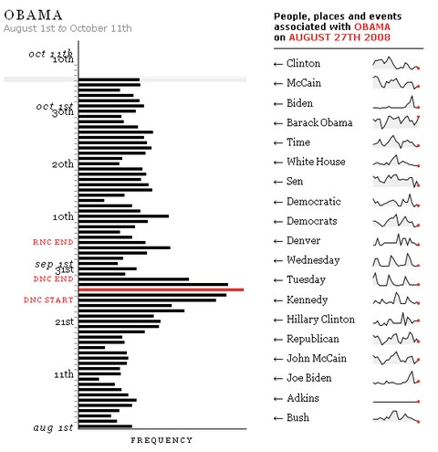
How many articles are referring to Obama and McCain
Donations Made to Political Candidates
Donations received by each candidate. The blue semi-circles in the center describe the size of the overall donations by both Obama and McCain. The lines indicate the amount of donation made.
Anatomy of Speech – Barack Obama’s Acceptance Speech at DNC
Presentation Zen takes a look at Obama’s acceptance speech at DNC and compares it with a symphony.
Wordtree – Obama Speaks at DNC
Obama’s speech, the word “WE” in a word tree.
Sarah Palin in VP Debates – Wordle Tag Cloud
Look at what Palin spoke in the VP debates recently, in a word cloud. More Wordle clouds : McCain, Obama @ DNC, Obama vs. King – the speeches I have a Dream vs. More Perfect Union
Marginal Taxes – Obama vs. McCain
How each candidates taxation policies effects the marginal taxes.
Break up of campaign finance information by NY Times.
How the tax plans of Obama and McCain are going to impact you?
Campaign finances information visualization by BBC
This info-graphic shows which candidate is spending how much in each state in advertising. Looks like Obama beat McCain hands down in most states as far as ad spending is concerned.
Candidate Visits to Each State
This visualization by CNN shows us how many times each candidate has visited each of the 50 states since the campaign has began. You can see that swing states have attracted unusually large amounts visits compared pre-decided states.
Issues and Agendas, What is their Stance?
This stacked chart shows how much each candidate has given preference to the various issues like health care, taxation etc.
Visualizations on 2008 US Presidential Elections – Projections & Polls
Vote Prediction Tracker – US Electoral College
Intrade – 2008 Electoral Projections
Pollster – View & Analyze Polls
Perspctv – another Election Tracking Site
Presidential Watch – what various websites are saying
The Economist’s pole – Economists prefer Obama over McCain
Google Maps Projections Tracker
Primaries & Caucuses
Who names who – Debates leading to Iowa Caucuses
This interactive visualization takes a look at the speeches made during primaries and caucuses and tells us who is naming who.
How they voted in primaries ? – Clinton vs. Obama
This brilliant visualization provides very good analysis of how people voted in democratic primaries.
Visualizations on Trivia & Fun Facts
The Measure of a President – NY Times
The height and weight of presidential candidates since the 1896.
Obama vs. McCain – Google Search Insights
Who is searched more? Obama or McCain, now you can find it with Google Search Insights
Compare Political Quotes – Google Labs
Compare quotations made by candidates on various issues.
Red vs. Blue – Popularity of Books – Amazon
Amazon plots their book sales data to show which states are reading what wrt. political orientation.
This interactive chart shows the life of each president and when he became the White house inhabitant. A fun way to look at who got the opportunity very early and who waited long.
Amazon Halloween Mask Sales – Obama vs. McCain
Can Halloween mask sales predict who is going to be next president. Amazon has built a meter for us to track who is selling more masks – Obama or McCain. Looks like Obama is leading here.
Want to findout more about party head quarters in each city / state? This google maps application is perfect for trivia mongers.
Visualizations on Other Politics
who voted No to the $ 700 Bn Bailout Plan
The NY Times interactive graphic tells the story behind the initial NO vote for the $ 700 Bn bailout package.
How republican and democratic senators voted in 2007
Another look at how both republicans and democrats voted in 2007, you can see why McCain calls him self a maverick. He is the only one not connected to the republican network.
National Debt by Political Party
This graph shows US National Debt by in years since 1975. The bars are colored based on the ruling political party at that time.
Bonus Visualizations – For Fun
Palinworld – New Yorker coverpage
A humorous take by New Yorker on how Palin Sees the world form her home
What your vote helps determine – PHD Comics
PHD Comics takes a look at the irony of what each vote determines.
So which one(s) do you like better?


46 Responses to “6 Best charts to show % progress against goal”
Chandoo, thanks for another interesting post.
One thing I'm missing is the question: What is progress, what does one want to know exactly?
I'm asking the question because I think of progress as not the same as "state of completion." Percentages/bars, etc., as shown above, are great to communicate state of completion, but less so for progress.
That's because project progress is how state of completion *relates to* the resources spent so far. Resources can be things like dollars spent, hours spent or project time passed. For example, 5% would be "good progress" in the first week of a one-year project, but terrible progress in the last week of the project.
The way I prefer to report progress is as a simple line chart with time on the x axis, and maybe a marking for the end point (and maybe an "ideal"/"as planned" line).
If it really must be a single number, you could go a EVA-ish route and divide the current % of completion by the current % of project time passed, which gives you a schedule performance index (1 or bigger than 1 = good; smaller than 1 = bad). For this, your suggested charts should work great!
I avoid 'progress' except where I can objectively assess progress, such as counting bricks laid or concrete poured. For intellectual work, I don't think that its possible to measure progress to completion with any reliability or credibility. I prefer to update forcasts of completion date, because that's where the effect of completion on dependent activities, deliverables and outturn value of the project is felt. This is also referred to as the 0-100 method. An activity is set at 0 complete until its actually finished, when it is set at 100% complete.
Hi Chandoo,
Great post! I have a preference towards thermometer charts too mainly because of the target/actual comparison.
Just an FYI...seems like the the screen shot for the pies #4 are under the #5 heading. Also the pies conditional formatting is something that doesn't accurately portray completion since the pies are segmented into quarters.
AND also a little trivia...those "pies" are called Harvey Balls, named after Harvey Poppel...
Chandoo,
I wonder. Is there a trick to unzipping your files?
I always seem to end up with a series of XML files rather than an XLSX.
Thanks a lot. 🙂
Eric~
Hi Chandoo,
Thank you again for this amazing help you are so resourcefull to make us little bit more amazing everyday.
When I click on the link on the page "http://img.chandoo.org/c/best-charts-for-goal-progress-comparison.xlsx" it is always bringing me to a zip file with all XML files without the XLSX file. I tried with mozilla and IE.
Thank you
[…] http://chandoo.org/wp/2014/03/10/best-charts-to-show-progress/?utm_source=feedburner&utm_medium=… […]
@All having trouble with download file.
1. Download the file.
2. Rename the extension as .xlsx
3. Double click or open it in Excel
Doesn't make any difference Chandoo, still end up with a zip file full of xml related files/folders
@Ian H
Download the zipped file and rename it to *.xlsx
where * is the filename
ps: Great name!
Many thanks for your help Hui but not sure why you are repeating what Chadoo said and which I first posted to because it didn't work for me. I did as he said and it didn't work, hence my post.
Chandoo says:
March 11, 2014 at 1:52 am
@All having trouble with download file.
1. Download the file.
2. Rename the extension as .xlsx
3. Double click or open it in Excel
Also, please note that we are investigating an issue with our webserver settings that may be causing this behavior. Sorry for the inconvenience. I am hoping to get this fixed in next 48 hours.
I used thermometer chart & conditional formatting using traffic lights. I just recently completed a dashboard I hope you can take a look but don't know where to send it. Thanks.
The in-cell bar charts is very interesting. This is not to be used as one can easly do manipulations by changing fonts/ font size etc
Hi..this is really helpful..
but I hve one quick ques..is it possible to hve conditional formating for chart graph based on text value and not the numbers..if I take your example project one bar should be red...if data is project 2 then it should be blue..basically we mke chart based on countries n each countries are assigned specific color...so I want a way where I can use conditionsl formating and not do it manaually each month.
You can set up conditional formatting rules to do this.
See this... it may help
http://chandoo.org/wp/2010/04/01/incell-panel-chart/
Hi Chandoo,
Great article and will be very useful.
One question - is it possible to have in-cell bar chart and the percentage complete (similar to icons)?
Try something like :
=CONCATENER(REPT("|";A1*100);REPT(" ";25-A1*25);"|")
it's quite nice
Hi Chandoo,
I am a great fan of you since i stumbled upon your blog. Your blog is very informative and insightful. I liked the way you presented the 5 steps using thermometer chart. I was very much inspired by that and tried to make my own version with 20 tasks to complete. On and after 17th step it was going downward. So I wanted to ask you that is there any limitation to thermometer chart
[…] shows us the 6 best charts to use, when you want to show your progress against a goal. There’s a sample file to download, so you can experiment on your […]
Is there any xhart is available which can show achivement percentage it may 80% or 120% means more an set target.?
Hi Chandoo,
Love your site. I have a small question regarding plotting data that contains ranking. I have 2 fields - Country, Rank. Note that i don't have the absolute values from which the rank has been calculated. So what is the best way of showing this on a graph given only the above 2 fields. Appreciate it
Regds,
Ross
@Ross
I would assign a set of simple numeric values to your ranks
Even a simple 1 to 10 makes plotting relativities easy
Dear Chandoo Sir,
Really awesome post.
Thanks.
Vignesh.V
We can always rely on Chandoo to explain to us clearly things that perhaps we already knew but weren't putting into practice the best way.
A limit I never liked about data bars was that they are monochrome - one colour for positive values, one colour for negative. So a couple of weeks ago I sat down to figure out a workaround. If anyone's interested...
http://digimac.wordpress.com/2014/06/29/multicoloured-data-bars-in-excel/
Epic fail on my part! After three months I just found out that what worked on my machine, didn't work on others.
Problem solved, more functions added.
The link above at
To hide them use ;;; custom cell formatting code (how to).
appears to be incorrect. However, using the downloaded file and selecting a cell(s) from that example provides the easy answer.
I wondered if the pies could have a color other than black and white (which, of course, would raise the color-blindness issue that you referred to with the traffic lights example).
Hi Chandoo!
Thanks for the informative post!
I have managed to understand and replicate all of the progress graphs except one, the thermo bar. I read up on the tutorial of how to create them, and I understand almost everything about the look and use of the bar, but one problem I am having is that I cannot seem to "center" the bar into the cell like you did. The reason being that even though the highest input (progress) percent is 100%, the program automatically puts in another 20%, so instead of 100% stopping at the end of the graph, it stops 20% short and I have a huge space at the end because of it.
How did you counter that problem? I have been trying for hours to fix it
@Aden
Set the Axis limits to Minimum 0 and maximum 1
Thanks. I started running a project recently, and I found your charts to be really helpful in tracking it's progress. I'm glad I found your page.
Hi Chandoo!
Great stuff for my customized project moving forward. However, when I use the blue block bars, the %ages spark up to smt like 5000% and cannot lower them nor scale them. If I input manually such as 50% without formatting a column, the bar for 50% e.g., will fill the cell completely, so that's kind of odd... what to do?
Thanks!
I guess I have the same problem. When I put 50 and click on the percentage, it is giving me 500%. Can someone help us on this. Thanks in advance
[…] http://chandoo.org/wp/2014/03/10/best-charts-to-show-progress/ […]
Hey,
Thank you for making this page. I do have one problem with the thermo graphs. Whenever I try to drag the graphs from one cell to the cell beneath it, the data remains selected on the former.
For example, if I had a thermo with a target number in A1 and an actual number in B1 with my thermo in C1, when I drag my thermo into C2, C3, etc., all of the graphs show the results from A1 and B1.
Is there a way to have these graphs update automatically as I will be regularly working in an excel file with hundred of entries?
P.S. I removed the $ symbols from 'Select Data', but that did not fix the problem.
Thanks again!
@Lisa
Not sure but it sounds like the new cells have Conditional formats applied
Select just the new cells
Select Conditional formatting, Clear Rules, Clear Rules from selected Cells
Hi Chandoo.
I am charting on some defaulter data where greater than zero is not desirable. Problem is that I have to highlight zero as target and anything above as undesirable. Seek your help
Hi Chandoo
Great post!
But I am wondering why bullet chart is not on this list. Is there a reason for its absence?
Thank you for these instructions. The bonus 5 Step Progress Meter you included would be perfect for my project. Where can I find the instructions?
Hi,
Do you know of any simple way to reduce the Data Bars padding so that they fit within the cells?
Thanks and great posy!
Regards
Appreciating the dedication you put into your website and in depth information you
provide. It's good to come across a blog every once in a while that isn't the same out of date rehashed information. Wonderful
read! I've bookmarked your site and I'm including your
RSS feeds to my Google account.
With #1 and #2, how would you also apply a red amber green to the bars (is it possible within chart formatting or would you need to utilise CF)?
I'm thinking of an in cell bar of some kind which will show against a known goal end date how far along with the goal you are (this is to be used for 'how many of the X number of people that I need to train in X timeframe, have been trained and therefore which of each training group is on track to complete on time or falling behind'.
So there would be knowns of number of people, target end date but I'd want it to reflect accurately as some groups of trainees might only have 50 in so their 50% done would be different to a group of trainees where their group had 200 people in it - but 50% would still be the same. Somewhere there'd probably need to be something which noted that there was a different volume of trainees so it could but the remaining effort to train people into context?
Hope that makes some kind of sense, I could be waffling!
[…] charts. Its got things like “Best Charts to Compare Actuals vs Targets” and “Best charts to show progress“. I love me some charts […]
Thanks a lot my dear.
very Useful it for me.
Another great post, thanks for sharing.
Chandoo, I am just starting an Excel class, and everything in the class is new to me. I am learning how to use all of these great charts but don't know what they are all used for. Thank you for your post and I think I will be able to use this down the road throughout my business career
in the above charts , Chart #2: Conditional Formatting Data Bars
->Assume if we have completed 35% of work it is showing in Blue color ,in the same cell remaining 65% of work should shows in some color , how to show?
Hi Sir,
This is Rachit and I am a big fan of you and your work. This is to request you please make a video for Beverages Sales performance data analysis in Excel.
Regards,