
We have written about dynamic charts several times before. But I think the technique I am going to show you today beats them all. It is so simple, so easy to set up and so beautiful that I am cursing myself for nothing thinking of it earlier.
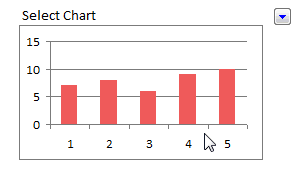
First take a look at the dynamic charts in excel demo:
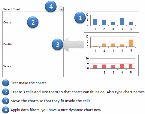
Just follow these 5 steps to create the dynamic chart in excel:
1. Prepare your charts: Make as many charts as you want. Lets say 3.
2. Set up the area where dynamic charts will be loaded: Just take 3 cells in a row and adjust the row height and column width such that the charts can be fit inside snugly. Also, type the chart names (1 for each cell) in the cell. Let us say, the charts you have are for Costs, Sales and Profits, just type these names in the cells.
3. Move and fit charts inside these cells: This should be simple.
4. Finally apply data filter to the cell on top of the 3 cells. Select a filter option and you will see only that chart.
5. Show off your dynamic chart and let people know you kick excel’s butt.
You can see these steps in the dynamic chart tutorial below:
What do you think about this technique?
Which technique you like better? This one or the Dynamic Charts using INDEX() function, Use Data Filters as Chart Filters tips? One issue I can think of with this technique is that, there is no way the filter will tell which chart is selected (as the chart covers the cell text). But this can be overcome with chart titles.
This post is part of our Spreadcheats series, a 30 day online excel training program for office goers and spreadsheet users. Join today.


48 Responses
Hey, this is pretty cool.
Propably the easiest way to make dynamic charts I’ve ever seen. Doesn’t require nor named ranges, nor the knowledge of advanced functions. Well done, Chandoo. 😎
Nice one! 🙂
It’s a nice idea, but there’s one thing I like dynamic charts for that this can’t do: I want charts that are guaranteed to have the same format and different data. The same size, same shape, same text etc. And when I need to alter the formatting I don’t want to have to change it several times and risk making a slip of the mouse; I want to change it once and know that when I paste the multiples into a report, they are guaranteed to be the same except for the data and maybe the y scale.
But it’s still quite clever.
Did you try this in Excel 2007? It looses a lot of its coolness, because it takes more mousework to change a filter than in 2003.
Although I did not try the Dynamic Charts using INDEX() function but this is the easiest and simplest way I ever seen.
As I said I learning new good things from you THANKS AND MANY THANKS
@Jon: If you say this is cool then it IS cool 🙂 yes, I have first tried in 2007, aah, how I wish 2007 had 2003 style filters… they are so simple. Then I installed 2003 over the weekend just so that I could test this. And it worked. I am like, wow, this is big 😀
@Struzak: Thank you 🙂
@Derek: I agree. This is the quick and easy solution to a more complicated problem.
Hey,
Pretty easy !!!
I have also written about dynamic charts in my blog at
http://www.webanalyticsindia.com/2008-12-17/dashboard-design-tricks-using-combo-box-for-a-neat-treat/
Hi Chandoo,
Hats off to you Sir !!!
Well this is by far easier then using INDEX() method, thanks once again for spreading valuable knowledge.
Regards
Rohit
Have to agree with Derek – I much prefer to have the data dynamic rather than the charts themselves. That was the basis of my ChandooChallenge: http://www.box.net/shared/5ny59hc0al
…but a neat trick none-the-less.
thank your idea for data filter.
Hi Chandoo. This tip is absolutely fantastic. I have already implimented into a business report that has many charts running down the page. As always managers want everything to fit in one page and now it can. Also the added ability to be able to group Charts by a theme and filter makes this a very powerful tool indeed. Bueatiful in its simplicity. Outstanding work!
Here is a function to display the filter criteria currently in use. Very handy
Function FilterCriteria(Rng As Range) As String
Dim Filter As String
Filter = “”
On Error GoTo Finish
With Rng.Parent.AutoFilter
If Intersect(Rng, .Range) Is Nothing Then GoTo Finish
With .Filters(Rng.Column – .Range.Column + 1)
If Not .On Then GoTo Finish
Filter = .Criteria1
Select Case .Operator
Case xlAnd
Filter = Filter & ” AND ” & .Criteria2
Case xlOr
Filter = Filter & ” OR ” & .Criteria2
End Select
End With
End With
Finish:
FilterCriteria = Filter
‘ =FilterCriteria(A3)example function
End Function
Very interesting tip. I view this as a “quick & dirty” technique rather than something I’d want to do in a production report. The drawback being the extra filter values that AutoFilter creates that just don’t fit the situation (Top 10, Custom, etc.).
One improvement: put titles on the charts so that you always know what you’re viewing.
If one or more column before the charts column also had a list of relevant words, one could do a dynamic multi-level category display, e.g.:
Costs | Staffing
Costs | Facility
Costs | Shipping
…
Sales | Product1
…
Any number of other arrangements of categorization are also possible, of course.
The enhanced abilities of 2007 filters might be quite useful, depending on the nature of the categories and list of charts.
@Gunjan: You are welcome. Thanks for sharing the link.
@Rohit: You are welcome.
@DMurphy: Yes, formula based chart filtering is much more robust and cooler. But it takes a tad more time to build and maintain.
@hwsris: You are welcome
@Tim: Thanks a ton for the macro… 🙂
@Michael: I agree, as I mentioned in the post, chart titles would help one understand what chart they are viewing.
@DQKennard: Very good idea… 2 level filtering.. Would it be possible to share the example worksheet with our readers?
So simple, even I could do it! Very, very clever. The more sophisticated techniques are nice, but this is the one that I can walk away from and repeat without having to consult notes. That’s priceless!
This is a great idea.
You can also do the same with pictures – remember to format them to “move and size with cells”.
@TJHart: Thank you .. 🙂
@Gerald.. this is amazing.. hats off to you.. I wanted to do this with pictures.. but then I couldnt some how make them disappear with cells.. Now I know the trick.. 🙂
In the comments to one of Jon Peltier’s articles about the more conventional sort of dynamic chart, a commenter asks if there’s a way to show only the charts in a KPI scorecard where the status stands at Red or Amber. It strikes me that this could be a situation where your trick would work better. Not for showing always one, and only one, of a range of graph alternatives, but a showing or hiding a varying *number* of them.
Derek – Good idea….
You are brilliant. My life is better. This is the best Excel site- and I’ve been to dozens. Makes me want to send you money.Love and kisses.
You are great this works much better. You can actually scroll in behind your exsisting graph and key in the title and set up the filter and your are set. Much easier than define name….
Thanks
@Deskdiva… You are welcome 🙂 I love your comments…
@Glenn.. you are welcome
will try this first thing in the morning at work, actually second after a cup pf coffee
@Excel Classes: you are welcome…
@Anne: How did it go (both coffee and the dynamic chart) ?
thanks for asking, the coffee was ok but the chart was fantastic 🙂
Gr8 ! Tip
This is simply brilliant for a “quick and dirty” setup. Hat’s off for thinking this one out.
Hi – I like this trick; but I’m unable to get it to work in Excel 2007. I guess they have changed the structure of the Filter menu now and so I actually am presented an option with checkboxes to select which of the three I want to see
From a UI perspective, I’m no longer able to restrict users to viewing only chart at a time (unlike the drop down menu shown in the example here). Is there any workaround for that?
Thank you very much. This is ingenious.
Nice way but too inefficient, imagine if you were to do this for say 40 different observations on the say 5 parameters.
Even better is having one chart linked to a data series and make that data series dynamic with a filter or lookup. The advantage is that you have to only create one chart and the data is very manageable even for large quantities
hai chandoo….
in this dynamic chart how can we insert a dummy picture (dt 5 th step in the way you told inthis for Dynamic Charts) and i copied the same picture from paste it in my excel sheet and continued the next 6 & 7 th steps and i observed magic of Dynamic charts. in my own i am unable to insert a dummy picture.i tried to inseert a dummy picture the picture comes but unable to insert a name (whatever give for the range) inthe formula bar.so please tell me.i am waiting for ur reply.
I had to analyse the sales of my brand in various Super Markets. If I made one chart with all markets, the lines were too many. With this technique, discussion and analysis is so easy and great. Amazing technique Chandoo. Thanks a ton!
Hi Chandoo,
I am trying to use dynamic charting with multiple blanks in my columns before any numbers. Do you have a solution to including blanks within the sequence of numbers?
Hi Chandoo,
Although the tech is pretty cool, compared to other (offset with scroll bar) techniques, this does not come out neat as on spreadsheets, as it eats up column and row width and ruins alignment. you need to spend alot of time in creating and positioning. Dynamics with scroll bars are awesome tools!! Thanks you Chandoo.
This is incredible! I spent the entire day yesterday at work on the prowl on the internet trying to find a simple solution to this. Thank you!
Hi that fantastic for dashboard purpose
Create a Dynamic Chart in Excel in 2 Minutes.
awesome !
It’s very nice idea to present the data.. Cool 🙂
Great is your work. Easy to understand more from other peoples comments you enlisted.
Thanks.
Hi Chandoo,
I am working as a MIS ( Management Systems( where in my day-day work requires lots of analysis . Currenltly I have made some basic excel with rougthly 15 columns ( and need to make X versus Y coulm ) graph each time. Can you help me with some info graphics , presentable excel templates only for analysis.
Thanks
Arun
Mumbai,