
VLOOKUP may not make you tall, rich and famous, but learning it can certainly give you wings. It makes you to connect two different tabular lists and saves a ton of time. In my opinion understanding VLOOKUP, INDEX and MATCH worksheet formulas can transform you from normal excel user to a data processing beast.
Today, lets understand how to use these formulas better.
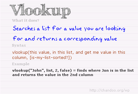
What is the syntax for Match, Vlookup and INDEX?
Here is the syntax for these three very powerful functions in plain English:

What are vlookup () and match () ?
VLOOKUP and MATCH are your way of asking excel to find a needle in haystack. Imagine you have all your customer contact information in one sheet in the range A1:D5000 in the format phone number, name, city and date of birth. Now you need to find out which customer has the phone number “936-174-5910”. How do you do it?
You guessed it right, you use VLOOKUP and summon excel to do the search and return with customer name.
While VLOOKUP is used to fetch value a based on what you are looking for, MATCH is used to fetch the position of the value you are looking for.
See this illustration to understand :

What does VLOOKUP really do?
Imagine you have a list of data like this:
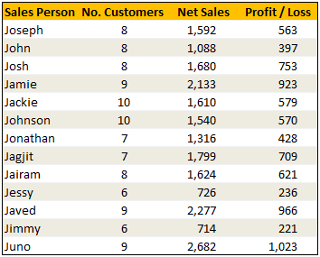
Now, how do you answer the question – “How many sales did Jimmy make?“
Yes, your guess is right. VLOOKUP is one of the formulas you can use to answer questions like this.
VLOOKUP searches a list for a value in left most column and returns corresponding value from adjacent columns.
So, in our case, we need VLOOKUP to search for Jimmy and return the amount of sales he made from column 3.
VLOOKUP Syntax & Examples:
The syntax of VLOOKUP is simple:
=VLOOKUP( this value, your data table, column number, optional is your table sorted?)
Here is an example to get you started:
Learn more about VLOOKUP Formula with examples
Please check out this page for 10+ examples of VLOOKUP and how to use it to solve real world problems.
VLOOKUP Examples & Homework
I have made a small excel file detailing 4 VLOOKUP formula examples. The file also contains some home work so that you can practice this formula.
Download VLOOKUP Example Workbook
[NEW] XLOOKUP replaces VLOOKUP in Excel 365
If you are using Excel 365, you can use the new & improved XLOOKUP function. It offers a shorter & more versatile syntax for performing lookups.
For ex: the same lookup as above will be done with XLOOKUP like below:
=XLOOKUP(“Jimmy”, A2:A14, C2:C14) will lookup “Jimmy” in column A and return sales amount from Column C.
Click here to learn more about XLOOKUP.
So what is INDEX() then?
INDEX function is your way of telling excel to fetch a value from large range of values. Since MATCH() function can tell us where the data is found, you can then use INDEX() function to extract corresponding data from another column. In this case, we can use MATCH() to find out which row has net sales 1,799 and INDEX() to return the name of the person. Like this:
Find the position of 1,799 in sales: =MATCH(1799, $C$2:$C$14, 0)
The answer will be 8.
To find the 8th person in names list, we can use INDEX() function like this:
=INDEX($A$2:$A$14, 8)
The answer will be Jagjit.
Related: Learn more about INDEX Formula.
So how are INDEX() and MATCH() linked to each other?
Since MATCH returns the position of the item you are looking for in a list, you can then use this position in INDEX to fetch values surrounding the searched value.
So, we can combine both functions like this:
=INDEX($A$2:$A$14, MATCH(1799, $C$2:$C$14, 0))
This combination is called as INDEX+MATCH formulas.
Related: Using INDEX + MATCH functions & INDEX+MATCH Video
Finally
Remember, both VLOOKUP and MATCH throw a fail error of #N/A if the value you are looking for is not there. If you want to stop seeing the error, use IFERROR function.
Just use them with some dummy data, play around with arguments and see how you can say “oh yeah, I can do that in few minutes” to your boss next time.
VLOOKUP tutorial – video
Please watch this quick video tutorial to understand all these concepts and how to write VLOOKUP formulas easily.
INDEX MATCH Tutorial – Video
Want to Learn More Formulas? Get my VLOOKUP book
If you want to learn VLOOKUP and other Excel lookup functions, then consider getting my VLOOKUP book.
 |
Comprehensive and easy to understand
This is a book for everyone who uses Vlookup. Most of us think… Oh.. I already know the function. But this book will open your eyes to some brilliant techniques. – By Dr. Nitin Paranjape Solid introduction to lookup functions
This books does a wonderful job of taking each of the lookup functions available in Excel, breaking them down to a simple, easy-to-understand level. – by Lucas Moraga |


31 Responses to “Beautiful Budget vs. Actual chart to make your boss love you”
Would be considerably easier just to have a table with the variance shown.
On Step 3, how do you "Add budget and actual values to the chart again"?
There are a few ways to do it.
Easy:
1) Copy just the numbers from both columns (Select, CTRL+C)
2) Select the chart and hit CTRL+V to paste. This adds them to chart.
Traditional:
1) Right click on chart and go to "select data..."
2) From the dialog, click on "Add" button and add one series at a time.
One more way to accomplish it is just select the columns into chart. Press Ctrl+C and then press Ctrl+V
Regards
Neeraj Kumar Agarwal
Unfortunately, this doesn't seem to work for me in Excel 2010. The "Var 1" and "Var 2" columns cannot combine two fonts to display the symbol and the figure side-by-side.
Secondly, there is no option to Click on “Value from cells” option when formatting the label options. The only options provided are Series Name, Category Name or Value.
@TheQ47... the emoji font also has normal English letters, so if you use that font, then you should be ok. I am assuming your computer doesn't have that font or hasn't been upgraded for emoji support.
Reg. Excel 2010, you can manually link each label to a cell value. Just select one label at a time (click on labels, wait a second, click on an individual label) and press = and link it to the label var 1 or var 2.
I am using excel 2010, please explain how to apply Step 12
Regards
Neeraj Kumar Agarwal
Hi Neeraj,
"Value from cells" option is only available in Excel 2013 or above. In older versions, you have to manually adjust the label value by linking each label seperately.
Read this please: https://chandoo.org/wp/change-data-labels-in-charts/
Sir, you are just awesome.
Your creativity has no limit.
Regards
Neeraj Kumar Agarwal
Hi Chandoo,
I just found your website, and really love it. It helps me a lot to be an Excel expert 😉
Currently I am facing with a problem at step 11:
Var1 Var2
D30%
A5%
B0%
B4%
B7%
C10%
C13%
D27%
I42%
Though at mapping table, I used windings, here formula uses calibra. How I can change it? I am able to change only the whole cell. In this case numbers will be Windings too.
Thanks for your help!
Hi Mariann... Welcome to Chandoo.org and thanks for your comment.
If you wanted to use symbols from wingdings and combine them with % numbers, then you need to setup two labels. One with symbol, in wingdings font and another with value in normal font. Just add the same series again to the chart, make it invisible, add labels. You may need to adjust the alignment / position of label so everything is visible.
[…] firs article explains how you can enhance your charts with symbols. You can simply insert any supported symbol into your data and charts. To some extend you can […]
You're a good person, thank you to share your knowledge with us, I will try to do in my work
Great visualization of variance. My question is that is this possible in powerbi?
How would you go about it?
HELLO, WHY CANT I FIND VALUES FOR LABELS IN EXCEL 2013
Dear chanddo sir,
What to do if we have dynamic range for Chart. How this will work. can you able to make the same thing works on dynamic range.
Sir Chandoo,
Good Day!
First, I'd like to say that I am very grateful for your work and for sharing all these things with us.
I tried to do this chart but it seems that the symbols don't work with text (abs(var%),"0%") unless we keep the Windings font style.
The problem is, it converts the text into symbol as well and you wont see the 0% anymore. I'm using Windows 7.
WOW - Segoe UI Emoji
This is the greatest discovery for me this month 🙂 Thanks for sharing.
Here's my two-cents:
https://wmfexcel.com/2019/02/17/a-compelling-chart-in-three-minutes/
Sir This is awesome chart, and very easy to made because of your way to explain is very simple , everyone can do. Thank you
one problem i am facing, I hv made this chart , but when i am inserting data table to chart it is showing two times , how can i resolve this
in this chart when i am adding new month data for example first i made this chart jan to mar but when i add data for the apr month graphs updated automatically but labels are missing for that new month
Hi Renuka,
Please make sure the formulas for labels are also calculated for extra months. Just drag down the series and set label range to appropriate address.
So I am playing with the Actual chart here - but amounts are bigger than your - you have 600 as Budget - my budget is 104,000 - is there a way to shorten that I am unaware of
thank you - I LOVE YOUR SITE
Thanks for the tips and tricks on Excel. In the Planned versus Actual chart examples, you use multiple values (ex. multiple Categories in above). How can this be done when we have only 1 set of values? For example if I have only this:
Planned Actual
SOW Budget 417480 367551
How can I create a single bar chart like the one above?
Thank you Chandoo.
This one is just perfect for my Quarterly Review presentation on Operational Budget against Actual Performance for the Hospital I'm currently working with.
Just Subscribed today (10 minutes ago)
Is there a way to make the table of data into a pivot table to be able to add a slicer for the graph due to many different categories and months?
Hi, I tried to modify you template with something appropriate for me, and I found a problem. this template was modified by me started with excel 2010, then 2016 and finally 2019. Same thing - somehow appear an error - or didn't show the emoticons for positive percentage or doubled the emoticons for some rows. I suspect to be from excel. if is need it I can sand you my xlsx for study. Please help if you can.
Hi Chandoo,
Could you please check the Var Formula in Step1. You have mentioned budget-actual and when i did this i got different values but when reversed like actual-budget i got the actual value what you have demonstrated in step1.
Please share your view.
This is a great chart (budget vs. actual). However, in trying recreate it, I cannot color in the UP Down bars individually, and they all become formatted with the same color. I'm using Office 365. Look forward to the feedback.
Thanks.
Dan
pls explain in detail step 7
While in the Excel sheet you have used following formula for Var
Var = Actual - Budget
But
in the note, you have written
Var = Budget - Actual
Good Presentation and Data information.thank you so much chandoo.