Analyzing half a million complaints – Customer Satisfaction Scorecard [Part 3 of 3]
This is the final part of our series on how to analyze half a million customer complaints. Click below links to read part 1 & 2.
- Complaint reason analysis – Part 1
- Regional trends & analysis – Part 2
Customer satisfaction scorecard
In the previous parts of this case study, we understood what kind of complaints were made and where they came from (states). For the customer satisfaction scorecard, let’s focus on individual companies.
Analyzing half a million customer complaints – Regional Trends [Part 2 of 3]
This is part two of our three part series on how to analyze half a million customer complaints. Read part 1 here.
Analyzing Regional Trends
As introduced in part 1, our complaints dataset has geographical information too. We know the state & zip code for each complaint. Please note that zip codes are partial or missing for a 10% of the data.
In this article, let’s explore three ways to analyze regional trends.
- Regional trends by state, product & issue
- Complaints per million by state
- Complaints by zip code
KPI performance charts & dashboards – 43 alternatives (contest entries)
Hello all, prepare to be amazed! Here are 43 creative, fun & informative ways to visualize KPI data.
About a month ago, I asked you to visualize KPI data. We received 65 entries for this contest. After carefully reviewing the entries, our panel of judges have discarded 22 of them due to poor charting choices, errors or just plain data dumps. We are left with 43 amazing entries, each creatively analyzed the data and presented results in a powerful way.
How to read this post?
This is a fairly large post. If you are reading this in email or news-reader, it may not look properly. Click here to read it on chandoo.org.
- Each entry is shown in a box with the contestant’s name on top. Entries are shown in alphabetical order of contestant’s name.
- You can see a snapshot of the entry and more thumbnails below.
- The thumb-nails are click-able, so that you can enlarge and see the details.
- You can download the contest entry workbook, see & play with the files.
- You can read my comments at the bottom.
- At the bottom of this post, you can find a list of key charting & dashboard design techniques. Go thru them to learn how to create similar reports at work.
Thank you
Thank you very much for all the participants in this contest. I have thoroughly enjoyed exploring your work & learned a lot from them. I am sure you had fun creating these too.
So go ahead and enjoy the entries.
A simple trick to make your dashboards user friendly [video]
Whenever you have a dashboard that is quite long or spans across multiple worksheet tabs, it can be hard to use. Here is a simple trick to make your dashboards user friendly. If your dashboard has form controls, create duplicate sets of them and place them in locations where users are looking. For example, If your […]
Narrating the story of change using Excel charts – case study

Here are three questions you often hear from your boss:
- What changes are happening in our business and how do they look?
- Do you know how to operate this new coffee machine?
- Why does every list has 3 items?
Jokes aside, our urge to find change in environment predates cave drawing, slice bread and Tommy Lee Jones. So, today let’s examine a very effective chart that tells the story of change and re-create it in Excel.
Download today – Introducing Excel Dashboard Templates from Chandoo.org
Friends and readers of Chandoo.org, my newest download, Excel Dashboard Templates are available for your consideration. Click here if you are ready to get them. Read on to know more.
What are Excel Dashboard Templates?
As the name suggests, these are ready to use Excel templates for creating awesome, informative, easy to understand & quick dashboards with your data. You just enter your data, set up few calculation options, decide how your dashboard should look & bingo, a beautiful & insightful dashboard will be created for you. These dashboards are optimized to look great, convey key information & prompt correct action.
Who should buy these templates?
Analysts, managers, reporting professionals, business owners & executives. These templates are designed to help anyone preparing Excel based dashboards, scorecards or KPI reports.
Benefits for you
- Design awesome dashboards in minutes, not months: Don’t waste hours trying to figure out formulas, chart settings and layouts. Instead focus on what your users want, how your business works and use those insights to tell the ‘Excel Dashboard Template’ what you want. Save time and look awesome.
- Accommodate change elegantly: People change. Businesses change. What your boss wanted last month is no longer what she wants today. So when someone asks you, “hmm, can you show me YTD data instead of last 13 months”, or “Can I see top 10 KPIs instead of all”, you just smile and tap a few clicks and bingo, the new dashboard will be ready. These templates are designed to handle change (data, requirements, design preferences and insights).
- Beautiful & Informative: These templates are designed with a delicate balance of beauty & insight. Everything is seamlessly designed, perfectly aligned and precisely calculated so that you & your boss can focus on the insights & decisions. Time tested and well honored visualization principles & guidelines are observed thru-out the reports.
- Built for starters, built for pros: Whether you are just starting with Excel or a seasoned pro, you can find the templates right up your alley. For advanced users, we have many customizations to whet your appetite. Want to build a custom calculation or include another type of sorting, you can do it by tinkering with ‘calculations’ sheet.
A better chart to visualize “Best places to live” – Top 100 cities comparison Excel chart
Recently, I saw this chart on Economist website.
It is trying to depict how various cities rank on livability index and how they compare to previous ranking (2014 vs 2009).
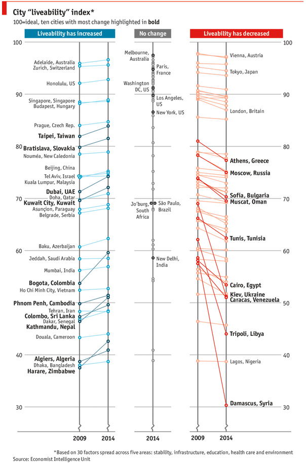
As you can see, this chart is not the best way to visualize “Best places to live”.
Few reasons why,
- The segregated views (blue, gray & red) make it hard to look for a specific city or region
- The zig-zag lines look good, but incredibly hard to understand % changes (or absolute changes)
- Labels are all over the place, thus making data interpretation hard.
- Some points have no labels (or ambiguous labels) leading to further confusion.
After examining the chart long & hard, I got thinking.
Its no fun criticizing someones work. Creating a better chart from this data, now thats awesome.