
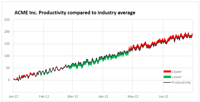
Let’s learn how to create a color changing line chart using Excel. This is what we will create.

Looks interesting? Read on.
Why color changing line charts?
I will be honest. These charts offer no new information. The height of line already encodes the information we need. Color is merely an eye candy. But sometimes you may want some eye candy. If so, you can use this tutorial.
Let’s look at the data:
Let’s say we have some data for 3 months starting 1-SEP-2015 in a table like below. We need to add 3 extra columns – Before, Line & After as shown in the below picture.

What are these 3 columns?
- Before: This is value – 1
- Line: this is simply 1
- After: We first calculate the maximum possible value (let’s say 160) and then subtract value from it. ie 160-value.
Create a stacked area chart from Before, Line & After data:
Select all three columns (before, line & after) and create a stacked area chart.
This is what we get:

Fill plot area with red yellow green gradient

- Select plot area of the chart and fill it with a Red-Yellow-Green gradient (see below)

Fill colors in before, line & after series
- Select before series and fill white color
- Select after series and fill white color
- Select line series and fill it with no color (ie make it transparent)
This is what we get:

Adjust vertical axis maximum
to 160 (or any other value as used in your calculations earlier)
At this stage, our chart looks like this:

Clean up and format the chart:
- Adjust horizontal axis labels
- Set up a chart title
- Remove legend
Now, our color changing line chart is ready:
Download color changing line chart workbook:
Click here to download the workbook. Play with the chart settings & data to understand this chart better.
Would you use such a chart?
I find very few uses for this chart. Also, when creating this chart using area chart technique, we loose the ability to add grid lines (as they are covered by the white color filled areas).
What about you? Would you use color changing line charts? Please share your thoughts and suggestions in the comments section.


14 Responses
Hi Chandoo,
You can make the line a coloured gradient directly, without the use of area charts.
See here: https://dl.dropboxusercontent.com/u/57487477/GradientChart.png
🙂
Interesting. I did not think about that option. Certainly lot better and simpler than my tutorial. Thanks for sharing it. 🙂
File not available now..
@Lex
It is still working for me ?
Are you on a network that bans downloads?
One option is to keep the before (or the actual values?) as area chart with the gradient colouring.
It helps when there are a few colors on the chart. For example green for profits and red for losses. Thanks for a tip!
Just make a line chart and then change the line color.
Would it be possible to change the color based on some other value? For example, if I wanted to chart a stock price and have the color change depending on the trading volume?
Hi
Is any one help me to insert values in ms access using vb macros since i’m able to insert values later i’m getting the error.
Below is the syntax
con.execute ” insert into copper(EIN,Team_Members_Name,OUC) values(‘” & Worksheets(“Copper”).Range(“L92”).Value & “‘,'” & Worksheets(“Copper”).Range(“m92”).Value & “‘,'” & Worksheets(“copper”).Range(“N92”) & “‘)”
@chandoo
I have done an Experiment the sensor give me a reading for every 1ms (temp value). I can not Change the sensor Settings. It means that i have rund exp for 16mints so 16*60*1000 = 960000 values so 960000 rows i get. I want to plot the graph for Temp vs Time.
1) I Need to reduce the no of data Point
2) how can i redice the no of rows
3) I want that graph will Show value for 1sec
I want to get the average value after 1sec. how can i do that I want to send you the file i am very new to excel
@Saleem
You have asked this question about 10 times now,
Every time I have asked you to:
“If you post the question at the Chandoo.org Forums
http://forum.chandoo.org/
Please attach a file and you will get a more targeted response”
Great post! I use Chart.js, which is JavaScript library for all my projects where charts are needed. It is very simple to use. I recently wrote a tutorial on how to create gradient line charts using Chart.js, you can read on my blog https://blog.vanila.io/chart-js-tutorial-how-to-make-gradient-line-chart-af145e5c92f9 . I hope someone will find it useful. 🙂
Is it possible to have a line chart when there is negative values the line that goes negative (below the X axes) turns for example, red? and if the numbers turn positve that line turns green?
Thanks,
Miguel
Hi, How do i achieve this in power bi desktop