
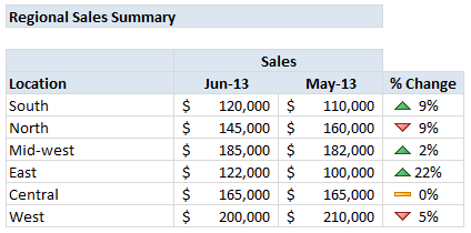
Pop quiz: What is wrong with below report?
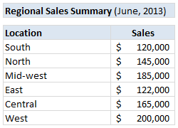
At first glance, it looks alright. But if you observe closely, you realize that it is not telling the entire story. Just looking at regional sales numbers, you have not much clue what is going on with them.
So how to improve it?
1. Add context
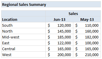
In order to know whether a number like $120,000 sales in South is good or bad, you need to provide some context. For example, if you include previous month sales figures, suddenly $120k is comparable to some other number. This tells a better story than a simple number alone.
You can also try these,
- Target values
- Same month last year values
- YTD, QTD values
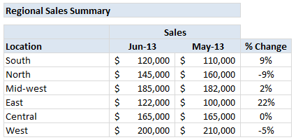
2. Add % Change
When you have 2 numbers like $120k and $110k in a report, anyone looking at them are going to mentally calculate the % change from last month to this month. This is easy for numbers like 120 and 110, but if your numbers are like 36,450 and 43,150 then calculating % change values will take time.
Why force your audience to do this mental math? Instead show these %s on the report.
3. Highlight bad numbers
Another way to enhance your report is to highlight poorly performing regions. Since each region is different, comparing sales of one with another is not good. But you can compare % change (from previous month / same month last year / targets etc.) and highlight poorly performing regions. This can be done with conditional formatting.
So lets go ahead and do it for our report above.
3.1 Add conditional formatting
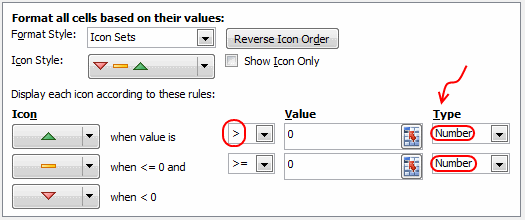
Just select the %change column, go to conditional formatting > icon sets > and choose an arrow icon set that you fancy.
![]()
3.2 The default formatting kinda sucks
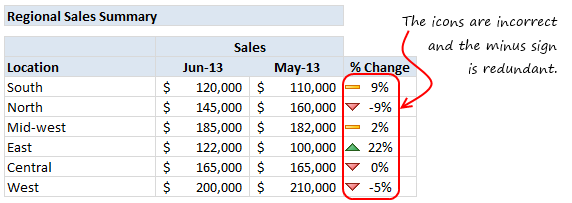
We are not done yet. If you look at the default icon formatting, it looks in-accurate. We are seeing red colored, down-ward arrows even when there is a positive change. And, when the % change is negative, we no longer need minus sign (-) because it will be indicated by down arrow.
3.3 Fix the conditional formatting icons
Select the cells again, go to home > conditional formatting > manage rules. Select the rule and edit it (you can double click on the rule to edit).
Change the rule type as shown below.
3.4 Remove the minus sign
Select the %change column once again, go to format cells (ctrl+1) and set the custom formatting code 0%;0%
This will make sure that even when the percentage is negative, Excel will not show the sign (minus symbol).
Related: More on custom cell formatting in Excel.
So there you go. A regional sales report that tells better story.
Key ideas to keep in mind
In your reports, try to provide as much context as possible. This can be done by
- providing comparisons
- including additional statistics (sum, count, median etc.)
- indicating the time frame of the report
- highlighting bad numbers or areas that require attention
- giving user a choice to change report criteria (interactive features).
Do you follow these principles when making reports or dashboards?
I try to observe these ideas in all my dashboards. What about you? Are you using simple numbers in your dashboards?
Go ahead and tell us how you are making your dashboards better, in comments.
Analyze data and make reports / dashboards often?
If your job involves data analysis, reporting & dashboards, then you will love our Excel School program. In this online course, you will learn how to use Excel to analyze data with formulas & pivot tables, highlight important stuff, create stunning charts & tables, make them interactive and put everything together to weave an informative dashboard & more.
Please click here to know more about Excel School program and join us.


20 Responses to “Untrimmable Spaces – Excel Formula”
Hi Chandoo,
First of all, HAPPY NEW YEAR!!! Wish you and your family another fruitful year ahead.
To answer your question: Power Query is the best way to trim. 🙂
Btw, if Power Query is not available, then formula would absolutely do... but did you forget to mention also Char 32?
One more question: Is the trailing minus meant to be a negative number? Maybe only the sender knows... 🙂
Cheers,
I just see your PQ way, it is amazing, I think it is the most simple way.
No idea how it did it?
I know these spaces can be a real pain but these days I advise Excel users to learn and use Flash Fill and that will learn what to do pretty quickly.
Highlight range to be cleaned. Then, in Replace, hold down the Alt key and type 0160. Replace with nothing.
I accomplished this by writing a macro to go through all the possible unprintable characters. Looped through the range.
@Steve
Brute force works just as well, its just slower
I use a different method here. First, I will copy the data from Excel and paste it in a notepad. In Notepad, I will do a Find Blanks (Space " ") and Replace (Empty) with nothing.
Then you can copy the data from Notepad and paste it back to Excel which will be a perfect number as you desire.
But Thanks for the formula. Its probably the 2nd out of 8 tricks as Chandoo mentioned. Waiting for the rest among 8 from other users 🙂
Hi....
You don't always need notepad for that. I use the Find/Replace is Excel works just fine.
I don't understand the x's. Why weren't they removed in the formula? Or are they part of some sort of numeric formatting that I'm not familiar with? I saw how you handled the non-breaking spaces and the dashes, but am confused about what role the x's played in all this.
Thanks!
Hi Andrew ,
The xs have been used solely to demarcate the actual data text ; thus , without the x in place at the end of text , as in :
x 4,124,500.00 x
it would be impossible to know that there are unwanted trailing characters , in this case , after the last 0.
These xs are not part of the original data text , nor are they used in the formulae ; they are put in only so that readers can visualize the individual items of data as they are in practice. Think of them as imaginary delimiters.
Oh, that makes sense! Thank you for the explanation. I had a feeling it was something along those lines.
You can type this character using the Keys Alt+0160.
Very useful to replace this Character using Find and Select resource.
For many years, my jobs have included ETL tasks and I built this macro to help long, long ago. I tweak it every now and again. Many co-workers, past and present, have it wired to a button on their toolbar.
Sub Clean_and_Trim()
'CAUTION: Strips leading zeroes -- do not use on zipcodes, etc.
If Application.Calculation = xlCalculationAutomatic Then
Application.Calculation = xlCalculationManual
Revert = 1
ElseIf Application.Calculation = xlCalculationManual Then
Revert = 0
End If
For Each Cell In Selection
For x = Len(Cell.Value) To 1 Step -1
If Asc(Mid(Cell.Value, x, 1)) = 160 Then
Cell.Replace What:=Chr(160), Replacement:=" ", LookAt:=xlPart, MatchCase:=True
End If
If Asc(Mid(Cell.Value, x, 1)) = 32 Then
Cell.Replace What:=Chr(32), Replacement:=" ", LookAt:=xlPart, MatchCase:=True
End If
Next x
If Cell.Value "" Then
Cell.Value = Application.Clean(Application.Trim(Cell.Value))
End If
Next
If Revert = 1 Then
Application.Calculation = xlCalculationAutomatic
ElseIf Revert = 0 Then
Application.Calculation = xlCalculationManual
End If
End Sub
This is awesome! What if you have several characters you need to have removed? What would be the easiest way as I can imagine there are several ways.?
# - 35
$ - 36
- 62
/ - 47
, - 44
. - 46
" - 34
: - 58
This is typical case of a Fitbit data export to Csv file. Each number has CHAR160 as thousand separator.. how smart Fitbit, thank you 😉
By the way, i prefer to copy the character, and use find and replace.
Sometimes it happens if you copy a table from outlook and paste it in excel. When you apply formula on those cells you will get error. What i use to do is
copy one character that looks like space,
select the entire range,
go to Find and replace,
Paste the copied character in Find option
Leave the replace option unfilled..
click on replace all..
All the errors shall be converted in to proper values..
Process looks lengthier.. but it is one of the simplest method
If Clean, Trim, and Substitute, or Find and Replace does not complete the job, I usually enter a value of 1 in an empty cell. Copy the Value of 1, Highlight the range of text numbers, and Paste Special, Values, Multiply. This site is great!
You can use Dose for Excel Add-In that can quickly clean huge data with one click besides more than +100 new functions and features to add to your Excel to save time and effort.
https://www.zbrainsoft.com
Hi,
I have a problem in excel. The sheet attached herewith.
TABLE CONFIG 2/6
A B C D E F G H
1 WEIGHT1 43,599 WEIGH2 62500 WEIGHT3 77000 WEIGHT4 66,500
2 DEDUCTION1 15,000 DEDUCTION1 15,000 TEMP 0 DEDUCTION2 11,005
3 RESULT 58,599 RESULT-1 77,500 RESULT-2 77,000 RESULT-3 77,505
4 RESULT SUBSTRACT 0 0 0
5 REQUIRED VALUE 77,500 77,000 77,505
Note: 1- RESULT (58599) IS TO BE DEDUCTION EITHER FROM D4 OR F4 OR H4 WHICHEVER IS MOST
LEAST CELL AMONG RESULT-1 OR RESULT-2 OR RESULT 3.
2-HENCE, RESULT VALUE $B$3 IS TO BE PRESENTED ON CELL EITHER D4 OR F4 OR H4 WHICHER IS
MOST LEAST VALUE
3-FORMULA =IF(E8<H8,$B$9,IF(E8<J8,$B$9,IF(H8<J8,$B$9,IF(H8<E8,$B$9,IF(J8<H8,$B$9))))))
CREATED ON CELL D4,F4 & H4 DID NOT WORK.
PLS FOR YOUR HELP.
THANK YOU
@R
Why not ask the question in the Chandoo.org Forums
https://chandoo.org/forum/
You can attach a file there