5 things you should know about VBA Classes + a Demo Lesson

Share

Facebook
Twitter
LinkedIn

I have been very busy with VBA Classes background work. Today, I want to quickly share a few things about the upcoming VBA Classes.

I have been running online training programs since Jan, 2010. I have trained more than 900 students till date. Still, whenever I am launching a new program, I could feel that familiar sense of eagerness, tension and tremendous enthusiasm building up. I feel eager because I want to meet you, teach you and learn from you. I feel tensed because I want to do it right. I feel enthusiastic because these training programs give me a lot of new ideas and open-up new possibilities.

1. Can we learn about Excel Dashboards too?

Of course yes. After receiving at least a dozen emails, I am now adding a 4th option to VBA Classes. You can get everything in Excel School + Dashboard Lessons apart from VBA Classes – all in one place. I think this is a great value for money as you will get 50 hours of lessons + at least 75 workbooks with lots of examples, tips & ideas.

Please look at the below table to understand various VBA School options:

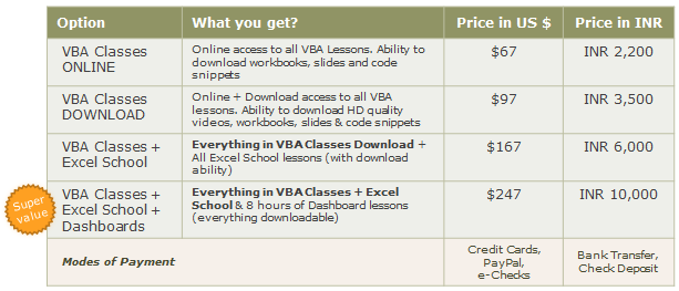
2. How much Excel (and VBA) should I know to join this course?

This program is not aimed at Excel Newbies. But if you know what a spreadsheet is, can create a simple formula and chart without choking yourself, then you are a good candidate for this course.

If you do not know much about Excel (ie not familiar with concepts like conditional formatting, pivot tables, charts, formulas beyond SUM & AVERAGE…) then you should consider joining VBA Classes along with Excel School. This way, you can learn various Excel Topics before plunging in to VBA.

3. What if I get busy after joining and could not attend a week or two?

No problemo!

Every week, we will be posting new lessons to the classroom area. You can visit the online classroom once a week (or two) and finish the lessons. If you are away for a few weeks, you can always catch-up. Moreover, you can also download the lesson videos and watch them at leisure.

4. Any Discounts for my team?

Yes, you can get 25% discount if you enroll 3 or more people in to the program. During checkout, enter the quantity to get the discount applied automatically.

5. Can I pay by Bank transfer or in Indian Rupee?

Yes. Send me an email at chandoo.d @ gmail.com and I will give you my bank account details.

Also, We have special pricing for you if you chose to pay in Indian Rupee (this is because, I get to save on Credit Card processing charges & other commissions). Refer to the table in (1) to know how much to pay.

Just visit http://chandoo.org/wp/vba-classes/inr-pricing/ (after 8th May) or drop me an email for details about my bank account details.

A Demo Lesson:

Well, this not entirely a demo lesson, more like a VBA Example that I created to answer a question one of the blog reader’s asked. In this 4 minute video, you can learn how to write a simple 1 line macro to change date format of selecte cell(s).

See it below (or here)

Doubts or Questions about VBA Classes?

Please send me an email at chandoo.d@gmail.com or call me at +1 206 792 9480 +91 814 262 1090. I will be glad to help you out.

Remember: Our VBA Class‘ first batch registrations open on Monday – 9th of May.

Facebook
Twitter
LinkedIn

Share this tip with your colleagues

Excel and Power BI tips - Chandoo.org Newsletter

Get FREE Excel + Power BI Tips

Simple, fun and useful emails, once per week.

Learn & be awesome.

Welcome to Chandoo.org

Thank you so much for visiting. My aim is to make you awesome in Excel & Power BI. I do this by sharing videos, tips, examples and downloads on this website. There are more than 1,000 pages with all things Excel, Power BI, Dashboards & VBA here. Go ahead and spend few minutes to be AWESOME.

Read my storyFREE Excel tips book

Overall I learned a lot and I thought you did a great job of explaining how to do things. This will definitely elevate my reporting in the future.
Rebekah S
Reporting Analyst
Excel formula list - 100+ examples and howto guide for you

From simple to complex, there is a formula for every occasion. Check out the list now.

Calendars, invoices, trackers and much more. All free, fun and fantastic.

Advanced Pivot Table tricks

Power Query, Data model, DAX, Filters, Slicers, Conditional formats and beautiful charts. It's all here.

Still on fence about Power BI? In this getting started guide, learn what is Power BI, how to get it and how to create your first report from scratch.

18 Responses to “Best Charts to Compare Actual Values with Targets – What is your take?”

  1. Andy Cotgreave says:

    Great post. I can't vote, though, because the answer I want to put down is "it depends". As with all visualisations, you've got to take into account your audience, your purpose, technical skills, where it will be viewed, etc.

  2. Jon Peltier says:

    I'm with Andy: It depends. Some I would use, some I might use, some I won't touch with a barge pole.
     
    Naturally I have comments 🙂
     
    The dial gauge, though familiar, is less easy to read than a linear type of chart (thermometer or bullet). It's really no better than the traffic lights, because all it can really tell you is which category the point falls in: red, yellow, or green.
     
    By the same token, pie charts are so familiar, people don't know they can't read them. Remember how long it takes kids to learn to read an analog clock?
     
    Bullet charts don't show trends.
     
    With any of the charts that have a filled component and a marker or ine component, it makes more sense to use the filled component (area/ column) for target, and the lines or markers for actual.

  3. [...] Best Charts to Compare Actual values with Targets (or Budgets … [...]

  4. Tony Rose says:

    I voted for #6 even though I agree with the other comments that it depends.

    The majority of the votes are for the #2, thermometer chart. I still have yet to understand what happens when you are above plan/goal, which was brought up in yesterday's post.

    Also, I agree with Jon in that it would be better to flip the series and make the filled part the target or goal and the line or marker the actual.

    I am also a fan of using text when appropriate if the data is among other metrics in a type of dashboard. Calling it out by saying actual and % achievement is a good option.

  5. Another "it depends" vote. Are you just looking at one or are you comparing a number of targets with actuals? You didn't include a text box. The problem with sentences is that they can get lost in a page of gray text. A text box can call attention to the numbers and line them up effectively.

    I'm with Jon: "Some I would use, some I might use, some I won’t touch with a barge pole" and I'm surprised that some of your readers voted for the last group.

  6. Bob Gannon says:

    Jon says:
    With any of the charts that have a filled component and a marker or line component, it makes more sense to use the filled component (area/ column) for target, and the lines or markers for actual.
    Why does this make more sense? I like 6 the way it is, although I would use a heavy dash for the plan/target marker.

  7. "It depends" is also my take. What I usually try to drill into my clients dashboard design is the fu ndamental difference between spot results (am I on target for this month) and long term trends.. I always try to create 3 different set of graphs to represent real perormance:
    - spot results vs objectives
    - cumulative results vs objectives
    - long-term trend (moving average) mostly) to see where we're going

  8. [...] Best Charts to Compare Actual Values with Targets – What is your take? (tags: excel charts) [...]

  9. Jamie Regan says:

    Jon says:
    With any of the charts that have a filled component and a marker or line component, it makes more sense to use the filled component (area/ column) for target, and the lines or markers for actual.
    Why does this make more sense? I like 6 the way it is, although I would use a heavy dash for the plan/target marker.

    I totally agree, Bob. I would normally favour a line for the target and a column for the actual, you can see quite easily then which columns break through the line, then.

  10. [...] best charts to compare actual values with targets — den Status mal anders zeigen, z. B. als Tacho [...]

  11. zzz says:

    Thermometer charts: "Not appropriate when actual values exceed targets" - this is easily solved by making the "mercury" portion a different color from the border, then you can clearly see where the expected range ends and the actual values keep going.

  12. Godsbod says:

    People seem to knock gauges quite a bit in dashboarding, but trying to show comparison of realtime data between operating sites and targets for each site can easily be done with a bank of gauges that have the optimal operating points at 12 o'clock.

    The human eye is great at pattern stripping, and any deviation of a gauge from the expected 12 position will quickly register with an operator and attract his attention. Using a colour background, or meter edge, will also indicate the sensitivity of a particular site.

  13. […] work laptop I have a favorites folder just dedicated to Excel charts.  Its got things like “Best Charts to Compare Actuals vs Targets” and “Best charts to show progress“. I love me some charts […]

  14. Albert says:

    I am wondering how will the plotting work, for some of the targets which may have been achieved before time. E.g. for the month of Jul the target was 226 and the actual was 219. So the chart will show a deficit in meeting the target by 7 points but what if this 7 may have been completed earlier in month of June. So ideally it not a deficit.

Leave a Reply