
Here is a quick macro tip that I stumbled on to while debugging some code yesterday (ya, ya, call me workaholic for coding on a weekend…)
You can select expressions in your code and place mouse pointer on that for a second to find what value it evaluates to (of course, this works only on break-point).
I think the above line has too much jargon, so watch this short animation to understand:

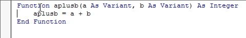
PS: You can add break points to your code by clicking on the left margin next to the line of code where you want a break point, like this:
When you add a break point to your code, excel will stop running the code at that point and brings you back to VB Editor so that you can find out if everything is going alright.
Share your favorite macro debugging techniques:
I use a variety of techniques when debugging macros. Most of the time I use break points, watches. Sometimes I use the msgbox to display the values I want to see while the code is running or print them to immediate window. What about you?
I am thinking of compiling all the debugging techniques people use in one post. So please share your tricks thru comments.


12 Responses to “Select Expressions to Find their Values [Macro Debugging Tip]”
Adding the Comment Block and Remove Comment Block to the toolbar in the VBA editor.
Chandoo
That will work on any variable not just on the breakpoint line
Once you have set a Breakpoint You can execute the code line by line by using F8
Note that a New variable isn't calculated until the line is moved past
ie: C = A + B
will not show the values for C until the execution is on the next line
so A + B will how there values and C will be 0 until it is executed
Whilst you have a breakpoint active and execution has stopped
you can do intermediate calculations in the Immediate Window (Ctrl G) if not visible
ie if you have A = 2 and B = 4
In the Immediate Window at the bottom you can do something like
? A
and it will show 2
or
? A+B
and it will show 6
Hui beat me to it!
I use F8 alot to check and debug code as once you have passed a line of code the values will show by hovering over them.
Until recently I used to use the watch window but now I favour the Locals window as it lists out everything in a module which I prefer. Try it...
Also the immediate window is very helpful.
Trial and error is my best tool 🙂
Most everything as per this Chip Pearson article http://www.cpearson.com/excel/Debug.htm plus one he missed; Ctrl+F9 (Set Next Statement).
The Set Next Statement allows you (within reason, usually within the same sub/function) to select any statement to resume on after a break-point. Combined with the Immediate Window it is, for example, possible to change the value of some variables then to re-try a block of code from a particular starting point.
Tom
This also works for expressions in parentheses, for example:
For i = LBound(myVar) To UBound(myVar)
' loop
Next i
If you hover over "LBound" and/or "UBound" (while in break mode) you can check the lower and upper bound values.
ps- you might consider a syntax highlighter for your blog to format code snippets.
pps- I code on the weekends too!
Set a watch on the variable(s) that you are interested in, and you can manually change their values in the watch window. I find this useful for if I get an unexpected result, as combined with using breakpoints I can then backtrack to see why I got the surprise outcome.
I tend to use the full set of debug tools:
Immediate window
Locals window
Watch variables, global as well as procedural
and the Call Stack to make sure I'm where I'm supposed to be dependent on a set path.
@Joe.. can you elaborate your comment. I didnot understand what you mean by comment block?
@Hui, Oli, Tom, JP, Andy and Nick: Excellent tips. thank you 🙂
@JP: Can you recommend a good non-CPU, non-DB hog code highlighter?
For variables that contain too much information to display in the hover tooltip you will see ... at the end. In order to see the end of the text hold the CTRL before hovering over a variable.
This time the ... will be at the front if the content is too long.
Of course if the content is too long when view form left and right you will need to use the immediate window.
i use SHIFT+F8 all the time!
it executes a function (or a sub) within a sub while skipping going into the algo for the function or the sub itself.
/i hope that make sense
[…] Hover mouse pointer on a variable in break-mode to see its value […]