
Ok, so you have written a shiny new macro to solve all the problems. The macro, solveWorldProblemsAndMakeSomeCoffee() sits nicely in your personalmacros.xlam file somewhere in C drive. You have also installed the macro as an add-in so that it is always available.
But wait!!!
How do you run your sWPAMSC everyday in the morning?
(ok, wake up now!!!, that is short for solveWorldProblemsAndMakeSomeCoffee())
One way is to,
- Right click on sheet name
- Select View Code
- Navigate to the VBA Project corresponding to your personalmacros.xlam file
- Yawn!
- Open the module with sWPAMSC
- Run the macro
 But, shouldn’t this be faster and smarter than that?
Well, it is. You can add your macro to Quick Access Toolbar so that you can run it with just a click (or by pressing a shortcut).
Here is how you can add macros to Quick Access Toolbar (Excel 2007 Version):
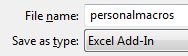
- First write your macro and save the workbook as an excel add-in.
- Now, install the add-in by going to Office Button > Excel Options > Add-ins
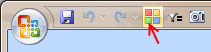
- Now, right click on QAT and select Customize

- Select Macros from “choose commands…” option.

- Now, select the macro you want to add to QAT and then press Add button

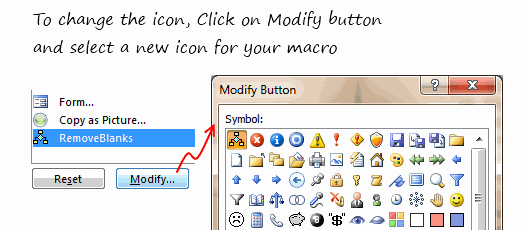
- This will add your macro to QAT with default icon. You can change the icon using Modify button.
- That is all.
Here is how you can add macros to toolbars in Excel 2003:
- First write your macro and save the workbook as an excel add-in.
- Go to Tools > Customize
- Now, click on New button to create a new toolbar.

- Give it a name. Now your new toolbar will show up in Excel 2003 UI.
- Go to Commands tab and select Macros from left. Now drag the smiley icon from right to your new empty toolbar.

- You have added a new button to your toolbar. Now click on it.
- Excel will prompt you to assign a macro to that button. Select the macro from the list shown (it includes the macros in your add-in file).
- That is all.
Now go solveWorldProblemsAndGetSomeCoffee()
How do you customize your QAT / Toolbars ?
Customizing quick access toolbar can be a very productive thing to do. I used to have a bunch of macros added to QAT for quickly accessing them when I was working.
What about you? How do you customize QAT or toolbars? Do you add macros? Share your experience using comments.


14 Responses
We have only just got excel 2007 so this is helping me navigate my way through the differences cheers.
For Macro’s i always add a Command Button, rename it something obvious, change the colour of it and finally add the following to its View Code section.
Application.Run “MAcro1”
This way anyone opening the file knows what to do if i ever win the lottery and dont make it in 🙂
Hi,
Good article. But I have this problem.
1) Customized QAT with a macro. Macro name = MacroX
2) Runs OK from original location (e.g. C:\TestLoaction1\TestFile.xls)
3) Copy past file to new location (e.g. C:\TestLoaction2\TestFile.xls)
Menu button now fails:
Cannot run the macro “C:\TestLoaction1\TestFile.xls’!MacroX’ The macro may not be available in this workbook…
Of course the code is there, and macros are enabled.
Could get it to work after deleting and recreating macro custom buttons. So have to re-assign macro to QAT button every time I move the file?
If I put a form button on he worksheet and assign the macro to that, it’s location independent.
Any ideas?
Thanks
@Ron
What you have said is correct
Macros within a worksheet are stored within the worksheet and hence follow it.
Macros referenced by a button in the QAT or elsewhere are locaed in a file and if that file is moved the linkages don’t follow.
The easiest way around this is to store all your macros in a location that doesn’t move and is in fact reloaded everytime that Excel starts and that is called the Personal.xlsx/b file.
These are refered to several time at Chandoo.org or have a read of
http://www.rondebruin.nl/personal.htm
or
http://office.microsoft.com/en-us/excel-help/deploy-your-excel-macros-from-a-central-file-HA001087296.aspx
In Excel 2003 and prior versions, a button added to the Toolbar maintained a DYNAMIC link to the file (e.g. Personal.xlsb) holding the assigned macro, such that if the file was relocated for any reason (by using Excel’s native Save As command rather than just moving it via Windows Explorer), the link between the button and the file was updated.
I expected the same to occur with Excel 2007+, but alas, Microsoft in their infinite wisdom have removed another feature useful to advanced users (just as they did by removing the ability to design your own buttons)!!
So having just done some reorganisation of my files, I now have to remove and recreate every friggin macro button on my QAT (I have lots) – what a pain in the proverbial!!
Hi Hui,
Thanks for the help, that’s really useful.
1) The macros I’m adding are for one specific Excel application, so I really wanted the macros to follow the file
2) I didn’t want to have to pass other files around too and have users installing those – either Personal.xlsx/b or as an Add-In.
3) I realise now that the QAT additions will appear for other Excel workbooks in which I don’t want the macros available.
So, it looks like I need to keep it local, by using a button on the worksheet. Unless you can suggest any way of adding to menus just for a specific workbook.
Thanks again for your help. Great site, so I’ll be signing up for the emails.
Ron
I know I’m a little late jumping on this post, but wondering if anyone knows how to add a UDF to the QAT? I’ve saved my UDF in my personal workbook, but it does not show up in my list when I choose Macros when customizing my QAT. Suggestions? Thanks!!
@Cheryl: UDFs cannot be accessed like Macros. You can use them from other macros or from worksheet cells as formulas…
@David: If you save your macros file and then install it as an add-in then it will be always available for you.
The instructions work great when you are creating a new file, and it is still open. I find that I can’t access macros after I’ve saved a file as an xlam and closed it. When I reopen the xlam, either by browsing to it, or by having it set to open as an addin using Excel Options, the macros are no longer available in the macros list when I go to edit the QAT. Any way around that?
I need to create a button that will run a macro. Once you click the button it needs to open up a browser asking you to select a report/file. Once you select the file, it will run the macro on the selected file and then save it as a new report with a name and the current date. I created the macro to sort/modify the report but I do not know how to do what I mentioned above. I hope this makes sense.
I’m having trouble adding a macro to the QAT. I’ve done everything up to step 5 but my macro isn’t showing up. What am I doing wrong?
Hi,
Thank you for the explanation. Very useful for a recent switcher from office 2003 to office 2010.
My follow-up question is: in Excel (or ppt) 2010, can you customize the macro button that you put in the QAT?
In office 2003, once you chose the custom button for your Macro, you could then edit pixel by pixel the said button.
For instance, I’ve created 2 Macros in PPT that are converting all my slides to either English or French language, so I’d like one button to show EN and the other FR… that would be more meaningful that any of the possible “custom” office 2010 buttons
I read all the post and one important aspect to the QAT was never mentioned. That is, you have a macro driven worksheet that you want to share with other. You have customized the QAT with two icons to run the macros (VBA programs in reality). However, when the others receive the workbook, the icons are no where to be found. It’s my understanding those “customized buttons” have been saved to an outside file, Excel.qat. QUESTION: Could one simply attach that file to your email, along with the worksheet, and tell the recipients to copy that file to correct location on their computer – C:\Users\\AppData\Local\Microsoft\Office|\
Would the customize macro buttons then appear in the worksheet and, more importantly, work? Thanks for your thoughtfulness and thanks for well written instructions Chandoo!
MortW