
 My Friend and long time Microsoft Excel MVP, Jon Peltier has released a wonderful little excel charting utility called Cluster Stack Chart Utility.
Although my work rarely involves constructing clustered stack charts, out of curiosity I have mailed Jon and asked him if he could send me a copy of it so that I can review the product and recommend it to PHD reader community. He is kind enough to mail the add-in to me and here goes my review of the tool.
First the Basics: What is a cluster stack chart?
A cluster stack chart is a stacked column chart that also has clusters. It is an ideal type of chart to show performance of multiple products over last few quarters (years) in several regions. A very common need if you are doing sales reporting. Here are few more situations where you would need cluster stack chart:
- Efforts across various activities in each of your projects for the last few years
- Department-wise employee count in each of the branches in the last few years
- Profits for each of the products in each of the regions in the last few years
Ok, how do you make cluster stack chart in Microsoft Excel?
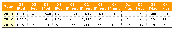
You can make a cluster stack chart in excel by massaging your data. Assuming you have fictitious data like this:
You can make a cluster stack chart by dividing the data in multiple series with few blank values and then plotting a regular stacked column chart. Check out the entire process on Jon’s site itself.
But, I can assure you that it is a very lengthy process and repeating it whenever you need a cluster stack chart is going to be painful. And that brings us to,
Why and what is PTS Cluster Stack Chart Utility?
It is an excel add-in that sits tight in your menu (and has its own toolbar too). To generate a cluster stack chart, all you need to do is, select your data and click on the “Clustered Stacked Chart” from either PTS Charts Menu or the PTS Charts Toolbar.
The data entry dialog looks something like this:

All you need to do is, select the data, specify how many stacks you want and tell it how many items are there in each of the stacks. When you are done, click “OK” and it creates a new sheet with your data neatly arranged in a table form (that is required for generating a clustered stacked chart) and creates a clustered stacked chart for you.
What are my impressions on this utility?
Clustered stacked charts are one of the popular charts used by lots of business users and it is strange that these are not included as part of default chart package in MS Excel (and other professional spreadsheet tools). Still, you can make them, thanks to techniques provided by Jon himself. But not without lot of manual steps. And that is where the clustered stacked chart utility can help you.
The tool comes with simple yet really useful help documentation. You can checkout the cluster stack chart documentation online if you are looking for a step by step tutorial on using the cluster stack utility.
The only gripe I have about the tool is that it uses default formatting. So if you have the excel 2003”s default color scheme, this is how your charts will look when you use the tool:

But as I pointed out, you can easily correct that using formatting of your choice without breaking the functionality and it just takes few clicks.
Should you buy the cluster stack chart utility ?
The utility is priced at $ 29 but you must buy before Feb 15, so click here (after Feb 15 the price becomes $ 39). Even if you make 2 cluster stack charts per year, you could easily save 1 hour using PTS utility and that means, you have easily extracted more than your money’s worth using this little tool.
This is a very good tool for people in finance, marketing or management positions who need to constantly make cluster stack charts using excel. Also, this tool can be a very effective way to make cluster stack charts if you ever need one for your website or project report.
So what are you waiting for? Just head over to PTS Chart utilities page and buy the cluster stack chart utility. While you are there check out the other charting utilities he has: waterfall chart and box & whisker plot utility.
PS: I have used my affiliate code to recommend this product because I think the cluster stack utility totally kicks ass. Even if I had no affiliate code, I would have recommended it, because this is a wonderful tool and Jon is an awesome person who likes to help others and I would like to help him in return by recommending his utility. So go ahead and buy it now, because the price goes up after Feb 15.


2 Responses
The cluster stack is one of a large class of graph types that Microsoft have, or would have, great difficulty in explaining the format for, in order for users to quickly and easily construct their graphs. The class in question is “graphs that have more than two dimensions”.
They handled the scatter graph problem the same way as Lotus did for 123 (defining the leftmost column as the common “X axis” and leaving the user to fix it so that the series each had their own X-range). But even that system broke when they introduced bubble charts, and there is really no elegant way to allow for multiple series of bubbles except pasting them separately into the graph. Attempts to line them neatly up in a block fail. I expect that any attempt they made to implement cluster stacks, panel charts, or other multidimensional types would fall down just as hard.
I haven’t checked out the cluster stack utility, but I get the impression Jon has thought hard about this issue, and I’m interested to see if he comes up, in any future utilities, with a unified methodology to handle several different types of multidimensional graph using the same “block wizard” method that you showcase here.
Jon stacked chart utility is like all his utilities, well thought out, very user friendly and really useful, even if you point out, you’ll only use once a year.
I cannot say I use Stacked bar charts often. I rarely do, but then they take hours as I use them more often than not in the “Stacked Charts With Vertical Separation” mode. The utility there has saved me hours of fiddling around, and even if I will not use for another few months, I cannot say how much the time saved has been pleasurably saved! I actually am now seeing other uses where I would not use them because of the simplicity of use of the utility.
The colour formatting can also be changed using Jon’s colour chooser add in, or if you have Bissantz microcharts, using the palette they offer. Any time saving utility becomes a well used utility, and the intuitive way it is set out makes it so user friendly, so like box plots this utility will be well used in the future.