
Stacked bar(column) charts are a popular way to depict 2 more series of related data, like sales of 2 products.
But there are several ways to stack the bars in a bar chart. Here is a list of 6 ways to stack them
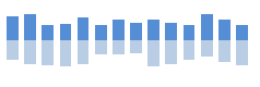
1. One on top of another

Advantages: Easy to create, takes less space
Drawbacks: Hard to compare, only first value starts at zero
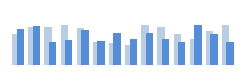
2. Separated

Advantages: Easy to read and compare
Drawbacks: takes more space, needs extra calculation for the gap series
3. Mirrored:
Advantages: looks fancy and takes less space, good for large data sets
Drawbacks: needs extra calculation
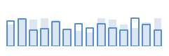
4. Partially Overlapped
Advantages: Easy to compare, Easy to make
Drawbacks: One series dominates another, good where domination is needed (like this vs. last year)
5. Completely Overlapped
Advantages: easy to compare
Drawbacks: Needs extra formatting, not always produces good results
6. Hanged from Top and Bottom

Advantages: none
Drawbacks: difficult to compare, needs extra formula to calculate gap series
I like 2 and 5 and use them whenever I can.
What about you? How do you like your bars?
PS: for the purpose of discussion neglect other important chart elemets like labels, colors etc.


