
Dashboards are very common business monitoring tools, but creating them in excel with all the bells and whistles is not so easy. So here is a quick 1-2-3 on how to do it.
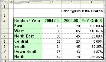
Lets take a sample of 2 consecutive year sales figures for 7 regions. The colums have Region name, 2004-05, 2005-06 figures and finally YoY Growth percentages. The lame dashboard should look something like this:
But may be we can make it little better. Ideally, a person looking at this would like (to know) the following things:
- What are the things that are going up / down / remaining constant
- The chart should look simple and not cluttered; meaning, there cant be multiple columns to present information. He/she should be able to look at one column and concluded something
- May be little graphics wont hurt the presentation while retaining the information.
So, a cool dashboard would look something like the below one:

Well, how to get it in 3 steps?
- Type the following formula in the cell F5 and drag it to apply to all the cells

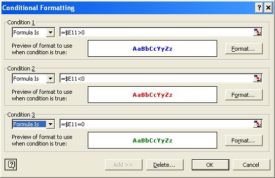
[Click on the image to see bigger version of the formula] - Select the range F5:F11, goto Format->Conditional Formatting and enter the following values there:

[Click on the image to see bigger version of the formula] - Finally, if its already not, change the font of the worksheet to Arial, (see those arrow marks, they are not available in all fonts. And btw, if you dont know how to insert them in the formula use Start->Programs->Accessories->System Tools->Character Map and then locate the symbols.)

So, go ahead and impress everyone with the cool dashboards.


17 Responses
This is great BUT I am attempting to modify and adapt for a dashboard at work…with regard to conditional formatting how can I show an insignificant change ie if the % change is >-1% and <1% then colour the cell contents yellow?
This way significant changes are coloured red (negative) or green (positive) with insignificant changes coloured yellow.
The collective intelligence in the office is stumped and would dearly love to come back with an answer!
Thanks in advance – Andrew
Hi Chandoo
I think there is some thing wrong in the formula that you have provided. If you notice the first sheet all your data is in the C and D columns whereas your formula is making comparisons with Column E. i.e. IF E11>0. To begin with there is no data in the cell E11. And, if I go by your 2nd excel screenshot all the up and down percentages should be in column E and I do not understand why you have asked to choose the range F5:F11 and under the conditional formatting you are putting it as $E11. How can this conditional formatting be done in Excel 2007?
Thank you,
Rajiv
Hello Chandoo,
First of all i would like to thank you for ur awesome work.
As Rajiv said this formula is not working i have tried it. Could you please hlep me out here.
I am working as in inside sales engineer and this tutorial was highly helpful for me to create a Excel dashboard and my mangers were pleased to see the report 😉
the formula works. He has hidden the % change in column E. This is why he is using cells E for comparison in the IF statement, and then concatenates the value from column E with the rest of the text you see in the result. Therefore the concatenation occurs in column F. He meant to say start in cell F11 and drag formula all the way up.
Sir i want to make a simple dashboard involving trends in excel 2007.
Can you give a more detailed and simplified information about hoe to make it?
Dear Mr. Chandoo,
Good Afternoon. please check your 3 steps Dashboard formula. I Think there is a simple mistake. Instead of E5 it mention here E11. So, please correct.
=IF(E5>0,CONCATENATE(FIXED(E5*100,2,TRUE),”%”,REPT(“”,10-LEN(FIXED(E5*100,2,TRUE))),”?”),IF(E5<0, CONCATENATE(FIXED(E5*100.2,TRUE),"%",REPT("",10-LEN(FIXED(E5*100,2,TRUE)))," ?"),CONCATENATE(FIXED(E5*100,2,TRUE),"%",REPT(" ",9-LEN(FIXED(E5*100,2, TRUE))),"??")))
Bonjour Chandoo
j’ai découvert ce site cette semaine et un grand merci pour le travail effectué et les tutoriels,je progresse à pas de géant.
étant français,je me debrouille pour “traduire les formules” et en general je m’en sors assez bien en prenant le temps.
Ceci-dit,je ne parviens pas à trouver la solution pour entrer les caractéres entre guillemets (triangle vers haut,le bas…) dans cette formule.
merci de m’aider et bonne continuation
hi Ahsan,got some query???
Hi Guys,
I thought i’d share this… it achieves the same but is more efficient. Ron Coderre suggested this method
=TEXT(K6,”#.00%”)&REPT(” “,10-LEN(TEXT(K6,”#.00%”)))&TEXT(K6,”?; ?;??”)
It is not working in excel, please help me..
=IF(E11>0,CONCATENATE(FIXED(E11*100,2,TRUE),”%”,REPT(“”,10-LEN(FIXED(E11*100,2,TRUE))),”?”), IF(E11<0, CONCATENATE(FIXED(E11*100,2,TRUE),"%"REPT("",10-LEN(FIXED(E11*100,2,TRUE))),"?"),CONCATENATE(FIXED(E11*100,2,TRUE),"%",REPT("",9-LEN(FIXED(E11*100,2,TRUE))),"??")))
dear sir every five thousands we increased 30 rs extra how implement in excel formal
@Murali
The number of 5,000’s is calculated by
=INT(A1/5000)
So if for every 5,000 you increase by 30
=INT(A1/5000)*30