
A bunch of us went to Ashtabula county and Put-in-bay island over the weekend; beautiful lake Erie beach locations on the northern side of Ohio.
We started off from Columbus on Saturday early morning, the weather wasn’t perfect as it started raining. After nearly slipping out of the ramp, I managed to get the car on to highway and we drove for nearly an hour before halting at Bellville for some breakfast. The weather got better by then, but there was some drizzle. The tulips near McDonald’s looked beautiful too.

We couldn’t help but notice that fuel prices have almost reached sky, well thankfully we weren’t stopping for a refill.
We reached Geneva on the lake by noon. A beach side village with population of 6500. Since we reached there 2-3 weeks earlier than the holiday season, the village looked even more empty with hardly anyone on the roads. We checked in to our cottage and quickly left to see the scenic Geneva state park on the lake Erie shore. The beach was bright and windy, and the waters were cold.
We left the state park after a couple of hours to eat something. We started off to visit one of the vineyards in Ashtabula county. We stopped at this beautiful looking wine tasting room and spent sometime enjoying the bright sun light and country side.
We set out to visit the famous covered bridges of Ashtabula county later. There are about 16 of these historical bridges. We could manage to see 3 of them as we kept loosing our way across the county constantly bumping into the same vineyard.
We took a pit stop near the Mechanicsville road bridge at Grand River Manor bar which apparently is famous for good food, cold beer and lousy service.
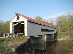

As we were leaving I captured these,

Later at night we played dumb-charades while gulping the wine we got from the winery. We crashed late into night and had a quick sleep before hitting the road next day, in search of something else to do.
After roaming to few places (mainly Cedar Point, which was closed for winter) we reached to Putin bay island. This is a 1-2 mile sized island on the lake Erie famous for its churches, laid back living style. We rented a golf cart there and roamed around the island. This gave the unique opportunity to experiment some of the finer aspects of my driving – namely accelerating while braking on turn and driving without seat belts.
We stopped at Perry peace memorial at 3 pm.

The island looked picturesque with everything looking green.

We left the island around 6 to catch the last ferry back to mainland,

Thanks to Google maps, on our way back we took a really scenic route for almost 40 miles on state roads[via OH13, CR77, OH 545, OH 603]. The road was really beautiful with bridges, tall trees and greenery on both sides. Before we could realize were back in Columbus and it was still raining when we returned home.


13 Responses to “Gantt Box Chart Tutorial & Template – Download and Try today”
Hi Chandoo
As one of your students I have followed your detailed example through with great success. However, Excel is acting in an unexpected way and I wonder if you could take a look?
http://cid-95d070c79aef808e.office.live.com/self.aspx/.Public/Gantt%20Box%20Chart.xlsm
On my version, I have to type 40239 (Which equates to 2 Mar 2010) to get the chart to display 31 May 2010 (which should be 40329)!!??
Have I done something wrong or is Excel acting up?
Thx
Oli
PS Your example file in 2007 displays correctly.
Hi,
I like this idea a lot, but I agree the name is a little drab.
As an American I may just be seeing things, but to me the combination of lines and bars on your chart looks like a bunch of cricket bats.
Maybe you could work that into a catchier name. 🙂
Cheers!
Here is some code I use to keep the axis synched.
It may be useful to some of your readers
It is based on a comment I saw on Daily Dose of Excel.
Function SynchGanttAxis(Cname, lower, upper)
'Sets the X min and X max for Category axis
Application.Volatile
On Error Resume Next
'
'Top Horizontal Axis
With ActiveSheet.Shapes(Cname).Chart.Axes(xlCategory, 1)
.MinimumScale = lower
.MaximumScale = upper
End With
'Bottom Horizontal Axis
With ActiveSheet.Shapes(Cname).Chart.Axes(xlValue, 2)
.MinimumScale = lower
.MaximumScale = upper
End With
End Function
Function SynchVerticalAxis(Cname, lower, upper)
Application.Volatile
On Error Resume Next
' Excel 2007 only
'Right hand vertical axis
With ActiveSheet.Shapes(Cname).Chart.Axes(xlValue, 1)
.MinimumScale = 0
.MaximumScale = upper
End With
End Function
@Oli.. Can you check your file again.. I see 40329...
@Dave: Even I saw things.. the bars actually looked like lollipops. How about calling this lollipop chart - now that would be yummy and goes along the tradition of naming charts after eatables (bar, pie, donut...)
@Bob: Superb stuff... thanks for sharing 🙂
Hi Chandoo
This looks really good and I think it can also be applied to show project phases / milestones.
Question: Thinking further could this be amended to display a project lifecycle (Idea through to Implementation say 7 phases) on one bar / row? Just imagine 20 projects within a programme all on one chart one bar each showing their respective lifecycle stages i.e. on one page.
Idea: As the Gantt Box Chart this is quite intensive to set up re formatting etc how about the added extra of once you have completed this to "Save as template" i.e. saves the formatting and layout of the chart as a template so you can apply to future charts. Simple to do and will save the time formatting etc again and again and again.
Therefore tip: Click on your chart demo and then click on Save As template icon (2007) - edit file name and click on save. Ready to use / apply via Templates in Change Chart Type window.
Thanks and be very interested if the lifecycle question can be resolved
Mike
How embarrassing.
I was obviously suffering from numerical dyslexia. I was one of those days.
@Mike H: You can easily make this chart to work like a generic project lifecycle plan chart. All you have to do is,
1. in a separate sheet define the steps of lifecycle and various dates in a table (with 5 columns for each of the projects you have).
2. now use a control cell to input the project name you want to show in the chart
3. based on the input, use OFFSET Formulas to get the correct data
4. Rest is same as the tutorial above
For more info on the dynamic charting visit http://chandoo.org/wp/tag/dynamic-charts/ and http://chandoo.org/wp?s=OFFSET
Your solution is really smart but in the en Excel isn't meant to do stuff like this. I, as a former PM, always thought is was frustrating that you had to do stuff like this for something simple like a Gantt chart. So I built Tom's Planner. And would like to plug it here. I think it really solves the problem you are trying to solve in the most efficient way. Check out http://www.tomsplanner.com for a free account or play around with the demo.
Hi there,
Chandoo - this is really a very nice and helpfull chart - I adopted it, so I can report a forecast or the delay of a certain task (coming from my role as an auditor for projects).
One topic I´m currently struggeling with: I do have a project lasting for lets say 12 month. For a management reporting, I want to have kind of snapshot, lets say one month back and 2 month in the future. I tried with the offset formula, but failed. Any idea?
Thx
Lopi
[...] Ein viel geliebter Klassiker ist die Erstellung von GANTT-Diagrammen mit Excel. Wir hatten das Thema wiederholt schon hier. Chandoo.org hat sich mal wieder mit einer neuen Variante hervorgetan: Das GANTT-Box-Chart. [...]
[...] [...]
Hi Chandoo - fantastic xls. One thing I can't figure out how to do is adjust the alignment of the vertical axis. I would like to left align so that I could indent to represent sub tasks. Can that be done? Or is there a better way?
I've been trying to work out if there's a way to show weekends on the graph. The closest thing I've got is to add them on a secondary axis, but then I haven't been able to keep both axis lined up together! Any ideas?
Following on from this - is it possible to show things like holidays?