
This article is written by Alex Kerin from Data Driven Consulting.
“When expensive dashboard software doesn’t work, do it with Excel” stated Stephen Few back in 2006. This was before the release of Tableau, and some of the other solutions now available for visualizing your data, but Excel remains a great choice for creating dashboards when you extend it with sparkline add-ins, clever chart hacks, and VBA or (relatively) simple formulas.
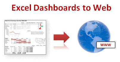
Excel however isn’t regarded as a “serious” business intelligence tool for delivery of your metrics and charts. Perhaps some of this is that users expect dashboards to be deployed on the web not on a locally installed application.
Today we will learn how to export excel dashboards to web pages.
Exporting Excel Dashboards to Web:
When it comes to exporting dashboards to web, 4 options come to my mind. I’ll quickly review these, culminating in a look at a new option – Excel 2010 and Microsoft’s online version of Office – Docs.com
- Save your workbook as a web page. Text in cells is converted to text in html tables, while charts and other shapes are converted to images. Excel offers two formats – mhtml and normal html. The mhtml version saves as a single file with the images encoded as text. Only IE can natively handle mhtml file while plug-ins exist for some of the other popular browsers. The normal html file option creates a folder full of images. By choosing this option you obviously lose any interactivity you had via drop down forms, pivot tables, or VBA. The conversion of charts/shapes to images is imperfect, leading to fuzzy edged images, and in my (beta) version of 2010 sometimes resulted in blank or missing images. You also lose font type information in 2007, so if you’re using any special fonts to create in-cell charts they will end up looking odd. Excel 2010 preserves font information (as long as the font is installed on the user’s machine). Personally, I don’t think it’s a great option – you may as well just:

[click here for a larger version] - Take a screenshot and post it to your website. You could use contol-printscreen to take a snapshot of your dashboard. As this just dumps the screen to the clipboard you may want to use a screen capture tool which can select a portion of the screen and save it to a file easily. You’ll want to make sure you crop appropriately, for looks, and so that your boss doesn’t see your taskbar with your browser on Facebook. Excel 2010 has a new screenshot option, but that’s for inserting screenshots, not saving them out. You can’t save a file as jpg/png like you can in Powerpoint, but you could save as a PDF and upload that. But what if you want more interactivity?
- Publish using Sharepoint. Sharepoint is an MS server platform that among (lots of) other things, allows publication of Excel workbooks to the web. While some interactivity is preserved (like pivot tables), many features are not (VBA, form dropdowns, images, and shapes). As some sparkline add-ins use VBA to generate a shape that depicts the data, even the static shape will not be shown as it will be stripped out. Other add-ins use VBA and a special font to depict the shape. As Excel 2010 preserves font information, these may show on a Sharepoint server, assuming the user has installed the font. Of course though, they will not update as VBA is not allowed. Linking to external data sources is allowed, so you can use your OLAP cubes or whatever else. Sharepoint is a viable option, but requires servers and licenses, neither of which come cheap. What other options are there then?
- Docs.com and Excel 2010. Docs.com is Microsoft’s online version of the Office applications. At the time of writing (July 2010), it was still in private beta. Oddly, MS has chosen to release it with deep ties to Facebook (login, posting to your wall, and sharing documents amongst friends). I honestly have never needed to share a document with a friend, and equally I’m not friends with the people that I do want to share documents with. Despite this (and I’m sure plenty will change as Docs evolves past beta), Docs.com offers some interesting opportunities for web deployment of dashboards. It still suffers from no VBA or ability to show shapes – I suspect that docs.com is running in a Sharepoint environment, BUT, and this is a big but, Docs.com was built with Office 2010 in mind. This means that the sparklines new to Excel 2010 show up, and update when values change. Take a tour of one of my workbooks on docs.com here.

Problems with Excel Dashboards uploaded to Docs.com
You’ll see on the example that there are several warnings thrown up – I left some shapes in the file before uploading just to show you what the warning message looked like. Linking to external data is not allowed (as you would expect, compared to Sharepoint where you control the servers), so you’ll have to be clever about how you update the dashboards. If your goal is to deploy using Docs.com, you’ll probably design your dashboard with this in mind, making good use of pivot tables for example.
I could envisage using Docs.com in the following manner:
- Develop a great dashboard in 2010 that instantly makes the user aware of any problems (but you’re doing that already aren’t you?) and upload it to Docs.com
- Share the document with your users, and upload a new file as data is added to the dashboard
- For any interactivity (e.g. simple data exploration to further investigate problems), the user can download the document – even though things like dropdown list boxes are not shown on docs.com, they are preserved and will show and work on the local version (VBA is still a no-no as you can’t upload a xlsm file)
I would like to see some changes with Docs.com – for example being able to hide the “Who you are sharing this with” column, allowing full-screen viewing of just the sheet, and sorting out the sharing outside of Facebook.
Now this method will not be suitable for sensitive information where deploying to the cloud (albeit with careful sharing of access) would not be appropriate, but the concept of using Excel 2010 and Docs.com offers some interesting opportunities for web-deployed Excel dashboards, and for using on websites that teach us to become awesome in Excel…
Added by Chandoo:
How do you Export Excel Dashboards to Your Audience?
Do you save the dashboards as PDFs or email the workbook or save as web page? What is your way of exposing the dashboard to the audience?
Please share using comments.
More Resources on Dashboards:
Checkout our dashboards page which has lots of links, templates, downloads and tutorials on creating excel dashboards.
Thank you Alex
I thank Alex for sharing these beautiful ideas with all of us. Exporting dashboards is a growing need and we all could use help like this to become better. Thank you Alex.
About Alex Kerin:
Alex runs a kickass consulting business at Data Driven Consulting. He shares a lot of innovative ideas and information on dashboards, visualization and Excel thru his blog regularly. And of course, he is awesome with excel.


13 Responses to “Gantt Box Chart Tutorial & Template – Download and Try today”
Hi Chandoo
As one of your students I have followed your detailed example through with great success. However, Excel is acting in an unexpected way and I wonder if you could take a look?
http://cid-95d070c79aef808e.office.live.com/self.aspx/.Public/Gantt%20Box%20Chart.xlsm
On my version, I have to type 40239 (Which equates to 2 Mar 2010) to get the chart to display 31 May 2010 (which should be 40329)!!??
Have I done something wrong or is Excel acting up?
Thx
Oli
PS Your example file in 2007 displays correctly.
Hi,
I like this idea a lot, but I agree the name is a little drab.
As an American I may just be seeing things, but to me the combination of lines and bars on your chart looks like a bunch of cricket bats.
Maybe you could work that into a catchier name. 🙂
Cheers!
Here is some code I use to keep the axis synched.
It may be useful to some of your readers
It is based on a comment I saw on Daily Dose of Excel.
Function SynchGanttAxis(Cname, lower, upper)
'Sets the X min and X max for Category axis
Application.Volatile
On Error Resume Next
'
'Top Horizontal Axis
With ActiveSheet.Shapes(Cname).Chart.Axes(xlCategory, 1)
.MinimumScale = lower
.MaximumScale = upper
End With
'Bottom Horizontal Axis
With ActiveSheet.Shapes(Cname).Chart.Axes(xlValue, 2)
.MinimumScale = lower
.MaximumScale = upper
End With
End Function
Function SynchVerticalAxis(Cname, lower, upper)
Application.Volatile
On Error Resume Next
' Excel 2007 only
'Right hand vertical axis
With ActiveSheet.Shapes(Cname).Chart.Axes(xlValue, 1)
.MinimumScale = 0
.MaximumScale = upper
End With
End Function
@Oli.. Can you check your file again.. I see 40329...
@Dave: Even I saw things.. the bars actually looked like lollipops. How about calling this lollipop chart - now that would be yummy and goes along the tradition of naming charts after eatables (bar, pie, donut...)
@Bob: Superb stuff... thanks for sharing 🙂
Hi Chandoo
This looks really good and I think it can also be applied to show project phases / milestones.
Question: Thinking further could this be amended to display a project lifecycle (Idea through to Implementation say 7 phases) on one bar / row? Just imagine 20 projects within a programme all on one chart one bar each showing their respective lifecycle stages i.e. on one page.
Idea: As the Gantt Box Chart this is quite intensive to set up re formatting etc how about the added extra of once you have completed this to "Save as template" i.e. saves the formatting and layout of the chart as a template so you can apply to future charts. Simple to do and will save the time formatting etc again and again and again.
Therefore tip: Click on your chart demo and then click on Save As template icon (2007) - edit file name and click on save. Ready to use / apply via Templates in Change Chart Type window.
Thanks and be very interested if the lifecycle question can be resolved
Mike
How embarrassing.
I was obviously suffering from numerical dyslexia. I was one of those days.
@Mike H: You can easily make this chart to work like a generic project lifecycle plan chart. All you have to do is,
1. in a separate sheet define the steps of lifecycle and various dates in a table (with 5 columns for each of the projects you have).
2. now use a control cell to input the project name you want to show in the chart
3. based on the input, use OFFSET Formulas to get the correct data
4. Rest is same as the tutorial above
For more info on the dynamic charting visit http://chandoo.org/wp/tag/dynamic-charts/ and http://chandoo.org/wp?s=OFFSET
Your solution is really smart but in the en Excel isn't meant to do stuff like this. I, as a former PM, always thought is was frustrating that you had to do stuff like this for something simple like a Gantt chart. So I built Tom's Planner. And would like to plug it here. I think it really solves the problem you are trying to solve in the most efficient way. Check out http://www.tomsplanner.com for a free account or play around with the demo.
Hi there,
Chandoo - this is really a very nice and helpfull chart - I adopted it, so I can report a forecast or the delay of a certain task (coming from my role as an auditor for projects).
One topic I´m currently struggeling with: I do have a project lasting for lets say 12 month. For a management reporting, I want to have kind of snapshot, lets say one month back and 2 month in the future. I tried with the offset formula, but failed. Any idea?
Thx
Lopi
[...] Ein viel geliebter Klassiker ist die Erstellung von GANTT-Diagrammen mit Excel. Wir hatten das Thema wiederholt schon hier. Chandoo.org hat sich mal wieder mit einer neuen Variante hervorgetan: Das GANTT-Box-Chart. [...]
[...] [...]
Hi Chandoo - fantastic xls. One thing I can't figure out how to do is adjust the alignment of the vertical axis. I would like to left align so that I could indent to represent sub tasks. Can that be done? Or is there a better way?
I've been trying to work out if there's a way to show weekends on the graph. The closest thing I've got is to add them on a secondary axis, but then I haven't been able to keep both axis lined up together! Any ideas?
Following on from this - is it possible to show things like holidays?