We have a macbook at home (we have a name for it too, we call it Shimla, the most romantic place for us). Like all latest macbooks, this one too came with a trail version of iWork. Even though I have used iWork before, this time I wanted to compare iWork numbers with Excel. In this post, I want to highlight 7 really cool features for iWork and how Microsoft excel can benefit from implementing the same.
1. iWork comes with sexy templates
When you try to make a new Numbers document, iWork asks you to select from some of the templates. The templates are really practical and very cool. For eg. they have a template for creating a check-list, product comparison worksheet, household budget. These are really easy to use and work to the point.

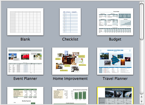
With excel 2007, MS introduced several new templates and gave us an option to import templates from web. But still, users resort to quite a few workarounds when it comes to building a neat looking worksheet. We all could benefit if something like this is available in Excel.
2. Simple but effective Paste Options

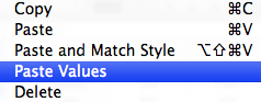
When you copy some values in to clipboard and try to paste them, iWork gives you an option to “paste values” and “paste and match styles”. 2 most commonly used paste options.
In excel, this is usually hidden in paste special menu (in 2007, paste values is available as a menu choice as well). Excel veterans know the ALT+ESV shortcut by heart. It would be cool to have these options highlighted in the menus and given easy to remember shortcuts.
3. Making Checkboxes, Sliders, Steppers ad List boxes is very easy

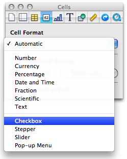
In iWork Numbers, to get a checkbox in a cell, all you need to do is format the cell as “checkbox”. You can also format a cell as slider, stepper or “pop-up menu” (usually known as combo box).
This is very easy compared to all the form control based stuff we are used to Excel. If MS implements this idea, we dont need to resort to sneaky tricks to get a bunch of checkboxes in excel or use wingdings font.
4. Quick summary of data

Whenever you select a bunch of numbers, iWork Numbers displays 5 quick statistics about the data, in the status area of the numbers application. (Unlike excel, iWork numbers has status bar in the left side).
Excel also shows the quick summary in the status bar, but usually the sum of values. (In excel 2007, you can configure the stats you want to see, thus mimicking this behavior. But it would surely help if these 5 stats are “always on” by default.
5. Cleaner Menu / toolbar area

While MS is going towards ribbon based interfaces for all their applications, iWork keeps the UI relatively simple and uncluttered. The toolbar area, shown below contains the vital buttons to make a filter, format a cell, create a chart, insert a function, table and change views. Everything else is buried one level deep.
This could be a more effective way to expose a complex application’s functionality. MS should consider these UI options as well.
6. Inspector Dialog for all the formatting options

Excel has a ton of dialogs to format cells, charts, drawings, printer settings, tables and more. In iWork, there is one dialog for all of these, called as inspector window. Using this you can setup printer options, page layout, table design, cell formatting, chart formatting, font, text, paragraph settings, drawing shape formats and other inserted object (such as movies) formats. Based on the selected item, the inspector window shows the corresponding tab where you can adjust the formatting.
This could be a great way to reduce the popup fatigue in Excel. In Excel 2007, MS introduced new popups that further complicated the way even a simple chart axis formatting. We all could benefit if MS implements simpler dialog boxes modeled after the inspector.
7. Switch rows and columns in charts intuitively
In iWork Numbers, to switch rows and columns in a chart, all you had to do is select the chart and then click on the little button that appears next to data range of the chart.


In excel you can do this using “select data” options of the chart. But doing this without leaving the worksheet is much more intuitive and cooler.
Have you tried iWork Numbers?
Apple is famous for its design sense and beautiful products. iWork is no exception. It is a visual treat to work with iWork.
What is your opinion about it?


37 Responses to “Pie of a Pie of a Pie chart [Good or Bad?]”
If I could have the same quality of graphics and illustration in Office Apps, I would certainly use it.
If I could have the same quality of graphics in Office Apps (Excel, PPT) I would certainly use it.
Chandoo,
First, let me say I love your blog. I like this post, and I think that technically (in terms of readability of data) your argument is correct. The bar of bars, and the table, are much better for readability and accuracy, and as you say would be much easier to produce.
But these points ignore the context of the chart. If the chart was part of a scientific paper, your solution would be a valid one. The context in this case is an illustrated atlas of wildlife. A companion graphic to go with written text. The importance of aesthetic goes up over readability and accuracy. Much of the data and points (I assume) will be covered in the text.
There's always a pure technical tufte-esque argument. But I sometimes think it ignores the value of aesthetics. (Which I admit are quite subjective)
Great post though. Thanks.
The Treemap makes the scope of the data much clearer! The 3D pie chart depiction is deceptive.
This reminds me of the videos ive seen on the internet where it compares the relative sizes of the earth with the larger planets, then the sun, then other stars in the galaxy. Eventually there is an image showing the largest star in the sky with a little pixel representing the sun.
My point is if you varied the size of the charts it would help convey the message. The first chart (salt vs fresh) would be the biggest and the rest would be arranged in descending order. I feel this would be more accurate.
It may be helpful to consider the advice of Steven Few and Edward Tufte regarding pie charts in general. To summarize, they are seldom the most useful way to present data. Here's Few's thoughtful piece on the subject.
http://www.perceptualedge.com/articles/08-21-07.pdf
Try putting the percentages on the bar charts instead of actual amounts. Lakewater would be .013 % instead of 52.
That is very good pie chart example.
Please send example file if it is possible.
It will work , even though colors may be confusing , it can be labeled well . Also it can be called as the drilled chart , as it drills in information further , like the first chart may show business in a region , second may drill into a particular region , thrid may further drill into wat products are there in that region . It works well for me , i would more vote for the 2 nd option .
Overall all this site is awesome ,
p.s : just like me
The risk with pie of a pie of a pie chart is that Jon may have a seizure by looking at it. Also, it isn't easy to read. 😉
I dunno. The only thing worse than a pie chart is a cascading series of pie charts. I don't even think they really lend themselves to this sort of thing. It just becomes a big hide-the-ball game with your viewer.
Those goofy connectors between the pies are pure chart junk. I can't really tell if the second chart has 2 series or 3 - because the connector is a different color than the 2 labeled slices. Despite that, even whereas the drill down kind of works, still the individual components suffer from the same old weaknesses that 3d pie charts have.
Use a large bar chart as your "cover story", and fill in the sub points with smaller bar charts - or even go grab the Fabrice SFE project for extra butter. Use page orientation, color, and some text styles to guide your audience through the drill downs.
FWIW, if you check out the guy's site, you can find several other truly mortifying charts:
http://www.andrewdavies.com.au/index.html
The methane emissions one is particularly heinous. Although, I'm kind of debating what I think about the 'Glacier Changes" chart. I'd kind of like to see the data on that to see how it would look in a more traditional horizon chart.
Thank you, that was scary. I don't understand the "Glacier changes" Chart at all...
Its a very nice way to represent the data, especially when we have sets and sub-sets within the data.
I like these!
Except for the fact that they aren't dynamic and hence must be setup manually each time
It would also be nice if they could be interrogated as in select a different segment and the new data falls out automagically, but then none of the standard Excel charts do that either.
I'd like it better if the bars were stacked. How about this idea (I hope I can convey it in words):
First bar is vertical and stacked.
Second bar is horizontal, stacked horizontally and the same proportion had it been on the first bar.
Third bar is vertical, stacked vertically and the same proportion had it been on the second bar.
Then it would really look like you are zooming on the chart, like the Powers of Ten video, or maybe like the golden ration spiral.
These looks shunting but setting up for each step makes kicks them out. However if these can be arranged automatically by native excel or by VBA, these will be the part of my "Archery"
I agree with Chandoo's Suggestion about the Bar Graph which represents data in a very appropriate manner. Even I prefer doing the same. I seldom use Pie Chart unless required.
That's a real nice example of a missleading infographic. But to be honest, I think chandoos suggestion is not much better!
Why are pie charts bad? I think because they don't show the real size-relations. The biggest pie in that example ist 300k big. The 2nd one has only the size of 10k, about 3% of the first one. Niether the pies nor the bars show the real sizes. I jnow, it's hard to show the sizes because the values of the second and the third pie are so small. But that's what visualization are about - showing relations to allow the reader to see the real sizes!
So how to show the real figures?
First possibility is o use a 1:1 scaling. Well then, you need a very big screen to show also after a 90° rotation, wihich I would prefer because it's a structural comparison and not a timeline. Maybe that solution is not the perfect way.
The other chance you have is to zoom in but to really show that you zoom in! http://www.pro-chart.de/images/Water_Fall.png maybe gives you a first impression what i mean. (i was a quick try, done in 10 minutes)
The next way is, maybe to fold the bars like in the financial report 2011 of the Post of Switzerland page 22. That chart is based on an excel chart. Maybe can explain you how to do it 😉
Financial Statement: http://www.post.ch/en/post-startseite/post-berichterstattung/post-berichterstattung-service/post-berichterstattung-downloads/post-gb-2011-finanzbericht.pdf
page 22: http://www.pro-chart.de/images/FS_Schweizer_Post.png
A way that is not so very common is to divide the bars in a lot of single datapoints. So maybe the 390k bar then consists of about 5,000 single datapoint. That's not possible - it is! Have a look:
http://www.pro-chart.de/images/Dotted_WF.png
It's pure excel!
Now one single point ist 0,2% of the whole (in the example above). Add more datapoints and you can visulize the very big and the very small numbers!
Wish you a lot of fun - visualizing with excel can be very powerful!
Joerg
...if you would like to know how these charts work, just send an email to J.Decker@pro-chart.de
Hey Joerg,
I don't dig so much the dotted waterfall thing. But this is kind of awesome:
http://www.pro-chart.de/images/FS_Schweizer_Post.png
Can you help me on the bar of bar graph? Would it be possible to create that from pivot table? Can you show me how to create the bar of bar graph?
do nothing but say "Awesome!"
You are a Rock star.....This seemed an answer as if someone was reading my mind and just had the solution to my questions on what I exactly was looking for .....What a Fab !!
can u explian me step by step
Can anyone please explain how to make this chart please.
Do you mean the pie of a pie chart or the folded bar chart?
Joery PIE OF PIE Chart please
Can someone please explain how to make PIE OF PIE Chart.
@Mandeep
The last line of the post is:
PS: If you want to know to create this pie of pie of pie chart in excel, see here.
Due to forum migration, link is now:
http://chandoo.org/forum/threads/multiple-pie-chart.7343/
Hi... i love these charts.... can any one show me how to draw these charts in excel 2010
@Vamshi
The very last line of the post refers you to:
PS: If you want to know to create this pie of pie of pie chart in excel, see here. http://chandoo.org/forums/topic/multiple-pie-cahrt
Where is the attachment....it used to be there...i have seen this before but now i am not able to find...
See this:
http://img.chandoo.org/playground/WaterDistribution-chandoo.xlsx
And this:
http://chandoo.org/forum/threads/how-do-you-create-this-chart.9743/
Normally I don't learn post on blogs, however I would like to
say that this write-up very compelled me to try and do so!
Your writing style has been amazed me. Thank you,
quite great article.
This is very impressive, I would like to learn how to build this for myself. I have tried for some time now, is there a step by step process on how to create these waterfall pie of pie charts?
I am novice to excel and use it very seldom. But your blog contains to the point information one needs to get going.
I was searching for a trick to do a Pie chart drill down - for example the first pie chart shows how the prices are distributed between perishable and non-perishable items.
Now if we want to know how the perishable items are distributed - one can click the segment and it will draw another pie chart with distribution of all different perishable items (milk,meat,fruit,veg etc)
So do you have any such trick?
Regards,
electrojit
I like the look of your pie of pie of pie chart, although I understand that the relative size of each pie does not represent the actual percentages.