CP048: How to create animated charts in Excel?

Podcast: Play in new window | Download
Subscribe: Apple Podcasts | Spotify | RSS
In the 48th session of Chandoo.org podcast, let’s make some animated charts!!!
What is in this session?
In this podcast,
- Announcements
- Why animate your charts?
- Non-VBA methods to animate charts
- Excel 2013’s built-in animation effects
- Iterative formula approach
- VBA based animation
- Cartoon film analogy
- Understanding the VBA part
- Example animated chart – Sales of a new product
- Resources and downloads for you
Shading above or below a line in Excel charts [tutorial]
When comparing 2 sets of data, one question we always ask is,
- How is first set of numbers different from second set?
A classic example of this is, lets say you are comparing productivity figures of your company with industry averages. Merely seeing both your series as lines (or columns etc.) is not going to tell you the full story. But if we can shade our productivity line in red or green when it is under or above industry average… now that would be awesome! Something like above.
Monitoring Monthly Service Levels using Excel Charts [Example]
Recently, I wrote a tutorial on tax burden in USA chart.
Jared, One of our readers liked this chart very much. Jared works as a workforce scheduler and has data similar to our chart. So he applied the same technique to analyze monthly service levels for last 7 years & sent me the file so that I can share it with all of you.
First take a look at the demo of Jared’s chart. And read on to know how this works.
How the tax burden has changed over the years – Excellent chart by NYTimes & Redoing it in Excel
If I need some charting inspiration, I always visit New York Times. Their interactive visualizations are some of the best you can find anywhere. Clear, beautifully crafted and powerful. Long time readers of Chandoo.org knew that I like to learn from visualizations in NY Times & redo them using Excel.
Today let me present you one such chart. This is based on an interactive visualization prepared by NY Times explaining how the tax burden has changed over years for various income groups.
Take a look at tax burden chart – Excel implementation
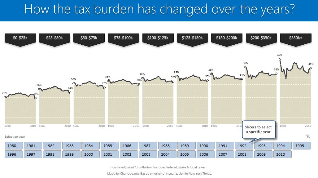
Read on to learn how to create this chart using Excel.
Comparing Sales of One Product with Another [Excel Techniques]
This is a guest article by Theodor on how to Compare Sales of One Product with Another
Ok, now here’s one for you.
Suppose you’d like to come up with a sales report on different products, comparing their evolution on the same period of different years (say Jan ’09 vs. Jan Jan ’10). At the same time, you’d like to keep an eye on their yearly trend (entire 2009 vs. entire 2010).
Read on to learn how you can use Excel Charts to do this very easily.
KPI Dashboard – Revisited
In 2008, I received an email from Robert Mundigl, which was the start of a life-long friendship. Robert asked me if he can teach us how to make KPI dashboards using Excel. I gladly said yes because I am always looking for new ways to use Excel.
The original KPI dashboards using Excel article was so popular. They still help around 12,000 people around the globe every month. Many of our regular readers and members have once started their journey on Chandoo.org from these articles.
In this article, we will revisit the dashboard and give it a fresh new spin using Excel 2007.
Highlighting Data Points in Scatter and Line Charts
Introducing a method of allowing data points to be interactively highlighted in Excel Scatter / X-Y Charts and Line Charts.
You will see a lot of these style charts in various places where you want to highlight various aspects of the chart to your audience. It is a great technique for complex scientific and engineering charts where you may have hundreds or thousands of points.