My Top 10 Tips for Mastering VBA & Excel Macros [Part 5 of 5 – VBA Crash Course]

Share

Facebook
Twitter
LinkedIn

This article is part of our VBA Crash Course. Please read the rest of the articles in this series by clicking below links.

Top 10 Tips for Mastering VBA, Excel Macros - from Chandoo.org

  1. What is VBA & Writing your First VBA Macro in Excel
  2. Understanding Variables, Conditions & Loops in VBA
  3. Using Cells, Ranges & Other Objects in your Macros
  4. Putting it all together – Your First VBA Application using Excel
  5. My Top 10 Tips for Mastering VBA & Excel Macros

In the part 5 of our VBA Crash Course, let me share you my tips for mastering Excel VBA.

A warning before jumping in to the tips: I am not a VBA expert. I am a learner, just like you. I find VBA quite interesting language to learn and explore. These tips are based on what I have learned writing VBA (and VB code) in the last 12 years.

Tips for using & mastering VBA in short term:

#1 Think Thru before Coding

The best way to solve even a very complex problem is to think thru. Next time, when you are about to automate that report or clean some imported data using VBA, just write the logic down on a paper. See and understand various aspects of the problem. The solution becomes clear to you. It has worked for me and it works for you too.

Related: Building your First VBA Application using Excel

#2 Use the Recorder

Excel’s built in Macro recorder is a great way to learn about new objects and ways to deal with them. I use it all the time to record parts of my code and then customize the output. Just keep in mind that macro recorder does not produce the best or complete code all the time. But it gives you a damn good idea about how to write code for a set of actions.

Related: Introduction to Excel VBA & Writing your First Macro

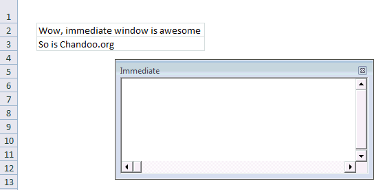
#3 Use Immediate Window

Excel VBE has a powerful feature called as Immediate window. Think of this like a sandbox. You can write almost any VBA statements here and get quick results. For example, Open VBE (ALT+F11 in Excel) and go to Immediate window.

  1. Type ?Activecell.Value
  2. Press Enter
  3. And you will see the current cell’s value printed in immediate window

Here is a quick demo of immediate window.

Demo of Immediate Window - Excel VBA Crash Course

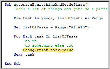
#4 Debug.Print is your Friend

There are 3 things you cannot avoid in life

  1. your 2 year old daughter thinking it would be fun to throw a stone on your car
  2. your baby boy running and sitting in your lap suddenly making the hot coffee spill on you
  3. and of course bugs in your code

Bug is a fancy name given to the situation when your code is not doing what it is supposed to do.

But why?!? Well, we don’t know why unless we examine. And this is where Debug.Print can come handy. In below example, you would see the values of all tasks in the immediate window as your program runs.

Example on Debug.Print in VBA

#5 There is a method for that!

Just like Apple says There is an App for that!, may be Microsoft should say There is a Method for that! about VBA. I say this because VBA comes with a lot of methods and functions to do lots of things. If you are thinking of writing your own code to reverse some text, split something based on a delimiter, find the intersection of 2 ranges or run something after 10 seconds, may be you should before writing your code. Because, my dear, there is a method for that.

Whenever you feel like you are writing code for a problem that is already solved several times, chances are there is some built-in method or object for that. So just search.

Tips for Using & Mastering VBA in Long-term

While the above tips are good for solving your immediate problems, we should always aim for continuous improvement. Here are my top tips for keeping your VBA in shape.

#6 Break Your Work in to Smaller Chunks

No matter how complex your work situation or problem might be, chances are, it is made up of several smaller problems. So break things in to smaller chunks. This coding technique is called as modularization. Modularization has several advantages:

  • Reuse: Once you break a big program to smaller parts, you can reuse a smaller part in several places or in other projects.
  • Testable: Smaller code fragments are easy to test and debug.
  • Maintainable: You can maintain smaller parts easily. You can upgrade them once you get a better version of Excel without breaking much.

#7 Build Iteratively

Rome is not built in one day, so is your buildRome() macro. Whenever you are attempting to automate a whole department’s work, take a step back and see what is the smallest (but most useful) feature you can have. Implement it and then add new features iteratively. That way, your turn-around time is improved, you look pretty in front of your boss and you feel in control of things.

Iterative development also lets you stop whenever you want and you would still have some working piece of code.

#8 Keep a Good Reference Handy

If you are going to use VBA quite often, then invest in a good reference. I suggest John Walkenbach’s Excel 2010 Power Programming if you are looking for one. Good reference books have lots of information and tips buried in them. For example, I keep Excel 2010 Power Programming book on my desk all the time and refer to it whenever I feel like not doing any work. I always learn something new.

#9 Take up Challenges

“Computers are like bicycles for our mind” said Steve Jobs. I am not sure if hours I put on facebook, twitter and gmail are keeping my mind fit. But any time I invest on programming is worth every second. I feel very sharp, excited and stoked when I solve a tricky problem using a computer program (be it VBA, an Excel Formula or php or anything else).

I think if you want to be good in VBA or Excel, then take up challenging work. Try to automate a report that you (or your team) produce using VBA, Try to simplify a formula or improve a chart.

If you are looking for fresh challenges, then look at our forums. We get dozens of interesting questions everyday.

#10 Use VBA only when you need it

Once you start learning VBA, it is natural to feel excited about the possibilities you have. But keep in mind that overusing it can complicate your work.

My suggestion: Use Excel’s native features as much as possible. Excel has several built in features to solve various day to day problems (conditional formatting, pivot tables, formulas, data validation, form controls to name a few). Only when you feel that there is no easy way to use Excel alone to solve a problem, go for VBA.

Example: Recently, I showed you all how to split text on new line using VBA. I did that because I thought there was no way to do it using Excel’s built in text-to-columns utility. Well, I was wrong. As Debra proved in the comments,

Chandoo, if you want to do this in the Text To Columns dialog box,

Select Delimited, then check “Other”
In the box beside Other, press the Alt key, and type (using the number keypad): 0010

That should separate the text on the line break character.

So if you feel like there is no way to do something in Excel without resorting to VBA, well, just keep looking, because there might be a way.

What are your Tips for Learning & Mastering VBA?

Its your turn now. What are your top tips for mastering VBA? Please share using comments because I and many of our readers want to learn. Go ahead and post.

Join Our VBA Classes

We run an online VBA (Macros) Class to make you awesome. This class offers 20+ hours of video content on all aspects of VBA – right from basics to advanced stuff. You can watch the lessons anytime and learn at your own pace. Each lesson offers a download workbook with sample code. If you are interested to learn VBA and become a master in it, please consider joining this course.

Click here to learn more and Join our VBA program.

Thanks

This post concludes our series on VBA Crash Course. I hope you enjoyed these 5 articles and learned something new. I really enjoyed writing this series. Thank you so much for your comments and support.

For more about VBA & Macros, consider enrolling in our online course.

Facebook
Twitter
LinkedIn

Share this tip with your colleagues

Excel and Power BI tips - Chandoo.org Newsletter

Get FREE Excel + Power BI Tips

Simple, fun and useful emails, once per week.

Learn & be awesome.

Welcome to Chandoo.org

Thank you so much for visiting. My aim is to make you awesome in Excel & Power BI. I do this by sharing videos, tips, examples and downloads on this website. There are more than 1,000 pages with all things Excel, Power BI, Dashboards & VBA here. Go ahead and spend few minutes to be AWESOME.

Read my storyFREE Excel tips book

Overall I learned a lot and I thought you did a great job of explaining how to do things. This will definitely elevate my reporting in the future.
Rebekah S
Reporting Analyst
Excel formula list - 100+ examples and howto guide for you

From simple to complex, there is a formula for every occasion. Check out the list now.

Calendars, invoices, trackers and much more. All free, fun and fantastic.

Advanced Pivot Table tricks

Power Query, Data model, DAX, Filters, Slicers, Conditional formats and beautiful charts. It's all here.

Still on fence about Power BI? In this getting started guide, learn what is Power BI, how to get it and how to create your first report from scratch.

55 Responses to “Did Jeff just chart?”

  1. Jon Peltier says:

    1. You screwed up the link to Mike's post. Try this:
    Highlighting Outliers in your Data with the Tukey Method

    2. Your initial line chart would be easier to read if you'd used markers. I use markers to indicate where the data actually IS, and help show that the line only ties the data together and doesn't indicate more data, until the points are nearly touching.

    3. Take the chart with lots of data (the one you delete the horizontal axis from), plot in descending order of value (revenue), and plot it on a log-log scale. Many phenomena, including the one you're describing, show a power-law type behavior, that is, a straight line on the log-log plot. This relationship is known as Zipf's Law. It basically means very few items have large values and very many items have small values. The decreasing returns for the many small values has become famous in Internet marketing as the "long tail".

    Your data doesn't show classic Zipf behavior, but in Looking Back at Peltier Tech in 2009 (wow, was that really four years ago?) I show how the distribution of traffic from individual web pages follows this law nicely.

    Like Benford's Law (look it up), Zipf's law could probably be used to audit financial data to make sure the stated distributions are realistic.

    • jason says:

      Holy great chart wizards beard!!!! its THE John Peltier!!!!

      ................My name .....is..........john, i mean Jason!.... I love you!!... i mean your site!!!

      ahaha

  2. Stiino0 says:

    OMG I'm cracking up on the pun in the title hahaha I totally misread that. Great work, learned alot. Chandoo 4 life!

    • jason says:

      i will admit, it took me a bit to 'get it'.... i kept reading the title and was just like....,"wut? .......that doesnt make sen....oooooooooohhh!!" hahahahhah

  3. David Onder says:

    You are right to have issues with Tukey's method with the data you are using. Tukey's method is best for fairly normal distributions. Your distribution is NOT normal but highly skewed. There are other methods that could be used to mathematically determine the outliers. But, as you observed, the mathematical identification is not always necessary. Sometimes, just looking at the graph is all we need to do.

  4. Doosha says:

    While I agree with your statement regarding the arbitrary nature of the parameter decision in Tukey's method, I disagree with saying the visual alternative is the best way to go. I'll leave the parametric vs non-parametric test discussion for true academics and say there are many reasons why having a analytical/programmatic approach is preferred despite subjectivity concerns. This can be processed quickly on many different features and draw many insights that require your method to be repeated. I find a lot of value in both approaches and suggest that a good data geek (like us here @ chandoo.org) knows how to do both.

    Great post mate! Thanks for sharing.

    • Jeff Weir says:

      I disagree with saying that the visual alternative is the best way to go, too. Which is why I didn't say it. Rather I said "My preference..."

      But great point, Doosha.

      • Jon Peltier says:

        My preference is the visual approach, and very often it is the best approach.
         
        Let's take Mike's list of numbers as an example. Plotted on Jeff's line chart, I've indicated with orange circles the points that a blind mathematical approach calls outliers.
        Jon Peltier_Visual Outliers

         
        Yet with our eyes, it's easy to see that if the first three points are outliers, there is no reason to consider the fourth not to be one. A similar if not so strong statement can be said about the last two vs last four points. I've outlined the outliers by this visual approach.
         
        In any case, it's easy to see the points which are closely related, which are the ones I did not outline. If we blindly apply a mathematical approach, despite its ease of application to lots of features, we can easily assign points to one group when they fit best in another.

  5. Jeff Weir says:

    Thanks Jon.
    1). Fixed
    2). Fixed
    3). Stop it, you're giving me gas. 😉

    Question: While this data may follow Zipf's law, do we gain anything by confirming whether or not it does?

    • Jon Peltier says:

      I'm not sure in this case whether we benefit from knowing our data follows Zipf's law. But I suspect in addition to verifying there is no fraud in the numbers, it may help to target where we might focus efforts to improve the bottom line. Maybe we're tapped out in the middle range, but at the top end we could add a deluxe new product that has more features and a higher price. Or we could offer a stripped down product at the low end to capture people who would make a smaller purchase.

      • Jeff Weir says:

        I have a colleague who did some fraud stuff with Zipf's law. Or rather, identified some fraud stuff. I'll have to pick his brains and write it up. Thanks for reminding me.

        By the way, added a new section in the original, and have just added something else again. So check it out and give me your feedback.

        Nothing like writing a blog post by committee...especially if you're the chair. 🙂

  6. Hui... says:

    Elimination of outliers should only be done once you understand the historical or cause of variability within the data / system producing the data.

    To manually remove data is akin to taking specimens not samples of the data.

    As we are told nothing about source of the data and the intrinsic variability in the data to randomly remove 5 of the 20 samples (25%of the samples) appears, at a glance, an overkill

    Examining the data and some basic stats
    Measure Mean SD
    All data 57.45 33.52
    Exclude highlighted outliers 59.67 20.02
    Exclude choosen outliers 57.67 8.72

    Typically and if the data is normally distributed we would expect that most of the data would fall with +/- 3SD of the mean (well 1 in 370 should fall outside of this)

    Which in all cases the data fits nicely within this criteria except the 132 data point which falls outside the Highlighted criteria
    Measure Mean SD -3SD +3SD
    All data 57.45 33.52 -43.1 158.0
    Exclude highlighted outliers 59.67 20.02 -0.4 119.7
    Exclude choosen outliers 57.67 8.72 31.5 83.8

    Be very careful removing data, much better to simply analyze your model with both sets of data and understand the risks of using one set of data vs the other

    • Jeff Weir says:

      What? No mention of my "About as welcome as a chart in an elevator" crack? I thought that was a classic Aussie saying that would put wind in your sail, Hui 🙂

      Note that this post wasn't about removing outliers...just about identifying them. In fact, the first part of the post was about identifying outliers via plotting ranked data, and then the post segued via a 'while we're here' aside into how using the ranked data graphical approach can be quite handy in visually segment data, without making clear that I'd moved from looking at ways to identify outliers. Sloppy writing on my part. It won't happen again. At least, not within this post, anyway!

      As David points out, the subscription dataset doesn't really lend itself to outliers identification via Tukey's method anyway, because of the type of data involved. And as Jon points out, this is classic 'Zipf's law' stuff, where very few items have large values and very many items have small values, and those increasingly large values at the far end are to be expected. They're still outliers, but in this case they're outliers that we want.

      Zipf's law, long tail, power law...why the hell do we need so many names to describe the same damn thing is beyond me.

  7. Ian says:

    Jeff

    Regarding your 2nd chart with markers - whether a marker looks as if it sits on the line or off it depends on the size of the marker.
    Size 4, 6 and 7 markers look as if they are off centre whereas size 3, 5 and 8 are centred in my re-creation of the chart.
    I have found that, generally, odd size markers tend to be centred on the line with even size markers off centre.
    This is just one of a number of reasons why you shouldn't go with the Excel defaults when charting, even with the better defaults in 2013 over 2003.

    Thanks for the blog post.

    Ian

  8. I think the good point is the grouping into categories ... But overal I do not like very much. In the labels is written a lot of information ... too much ink. I used a type of bar chart not an area chart (even with less data does its job well).

    This approach is a little different
    https://sites.google.com/site/e90e50/scambio-file/bar_123.pngRobert's approach

    which avoids using all that text ... the average of the values, the number of people ... are more explicit without being boring.

    Here the excel file i used:

    https://sites.google.com/site/e90e50/scambio-file/Segmenting-customers-by-revenue-contribution_V1_r.xlsx

    • Jeff Weir says:

      Roberto: Thanks for the insightful comment. There's some things about your redesign that I like, and some things I don't.
      On the like side:
      * I think it's a great idea to put the numbers of customers across the bottom. I never thought of that.
      * I think your approach of showing the average within each segment (i.e. putting in the boxes within each series) is clever. That said, ultimately I think it's more distracting than just putting the average in the data label. But I certainly appreciate the technique, as well as the thought that went into it.

      On the 'dislike' side (and these are personal preferences):
      * I don't like having to look up move my eyes from the chart to the legend to decipher it. I think labeling each point directly makes it much more easy for the reader, and I use Jon Peltier's Label Last Point routine whenever I can for this reason. I seem to recall something in a Tufte or Few book that suggests this approach, and I'll try to dig it up and post back here. Point taken though that maybe I've got too much information in those data labels for your liking, and as per the above, at least one of those lines of info can be moved to the Horizontal axis.

      * I'm not a fan of the black background. I find it oppressive, compared to white.

      Thanks again for your insights.

      • Jaff said:
        [...] That said, ultimately I think it’s more distracting than just putting the average in the data label [...]

        I would like to know how many visitors have read what you have written in the labels?
        I looked at your chart at least 20 times and I've never read ... too much effort. But I'm very lazy, i'm sorry 🙂

        if you want the legend can be removed, you have a lot of space and options for the labels and you can use a series xy as I have done below for average value

        I do not like the black too ... But I had those lines that I liked white

        I tried to make some changes, I think it is better to sort in descending order, I have added the labels with the average value, so the y-axis can now be removed. I used the legend to show the total values ??(areas) this is a matter that needs to be shown, and that causes me a bit 'embarrassed ... I keep thinking above.
        http://goo.gl/EnYuR9Roberto_2

        • Jeff Weir says:

          Roberto: The problem with your chart is that it's no longer self-sufficient. How is a reader meant to know what those white boxes denote, and what the various numbers mean? You would have to explain that somewhere off the chart. Why not just explain it directly on the chart?

          Regarding your point I looked at your chart at least 20 times and I’ve never read … too much effort....this approach is drawn from one chart of many in a report I did for a management team some time back, to show them just how different their customers are. Previous to my report, they had tended to treat their subscription customers as a homogenous group.

          So far from being too lazy to read the info they were highly incentivised to read it, and this information in the labels was valuable insight to them. They commissioned me to provide insight into their customer base to a busy management team, and charts like this passed on the kind of information they wanted to know in a very concise manner.

          I could have put that extra information in a table below the chart. But putting in on the chart - in my opinion - was a much better design choice: they don't have to move their eyes around, and this approach clearly illustrates some very important commercial aspects of their business. Putting less information on the chart would have required putting more information in the text. And that in my opinion would have slowed down the time it took to absorb this stuff.

        • Jon Peltier says:

          Roberto:
          I like to see the data in descending order.
          I'm not wild about the black background, but it works.
          The labeling is a bit too weak. I know what the data is, so I can presume that each white rectangle shows a subtotal near 20% of the total, made up of so many customers paying an average of some dollar figure. But I have to work for it.
          But as Roberto points out, one also has to work to get the information out of Jeff's labels. I didn't completely ignore them, but in my first reading I read one label on the two charts.

          • Jeff said:
            Roberto: The problem with your chart is that it’s no longer self-sufficient. How is a reader meant to know what those white boxes denote, and what the various numbers mean?

            Jon said:
            I know what the data is, so I can presume that each white rectangle shows a subtotal near 20% of the total, made up of so many customers paying an average of some dollar figure. But I have to work for it.

            I think is very clear what the white boxes denote and catch my attention. Those are the containers for those colorful piles. It's like taking a pile of earth and put it in a bucket ... first it was just a bunch but after is a measured quantity. Our attention goes there!

            One big problem is (as Jon pointed out and I'm agree) ... the comparison between the different buckets / boxes is difficult ... ummm rather it is impossible. How can we solve? I think in two ways:
            1) we know that the groups are homogeneous, so use buckets / boxes that have the same volume (20%) ... in this case the chart can not explain it, but we need to know in advance. Labels can not help, are read after looking at the chart ... and we tried to understand ... Frustration!
            2) use how support one more graph (bar or pie if the groups are just 2-3)

            something that I think might help?
            decrease the number of groups, 2 or at most 3

          • Jon Peltier says:

            Roberto -

            "I think is very clear what the white boxes denote and catch my attention."

            But remember, you envisioned and implemented these boxes. It is impossible for you to forget what they are intended to show, at least not until you've put this chart away for a few months.

            Not having had the same inspiration as you, I have to scratch my head and try to figure out what you were thinking. I know how creative you are, so I know it could be nearly anything.

            That said, I don't think it needs very much additional labeling to clarify your chart. Something like this:
            http://peltiertech.com/images/2014-01/RobertoRedux.pngJon Peltier_Roberto Redux

          • Jeff Weir says:

            @Jon Peltier: At first I really liked your redesign. The grey background is easier on my eye than the jet black in Roberto's original. But then, I see there's no y axis. y not? Isn't that kinda mandatory? We've got no idea how large that largest sub is without it.

            And I miss the gridlines too.

            And then I thought, instead of showing the white boxes - which while a good concept, add quite a bit of clutter, why not just show the position of the average using one point.

            Check out my update in the original post to see what I've come up with.

            While I like the grey, I do think it's harder on the eyes than black text on white background. And I don't think a grey chart would work well on say a dashboard. But that said, there's no doubt in my mind that this chart is sexier than my original. Might look nice in the Economist.

          • I can not stop thinking about ... and to try!
            Thanks Jeff, and thanks to Jon because I like all of this, and the discussion is a good source of inspiration (always!)

            Here my new version:
            http://goo.gl/539acQRoberto

          • Jon Peltier says:

            I actually like the gray better than the black. It's more comfortable, like using slightly muted fills on bar and area fills. But if we dispense with the boxes and use a single point (and I'd use a much smaller marker for it, 5 pts at most), we can go back to a white background, which is also my favorite.

          • Jon Peltier says:

            Jeff's markers and Roberto's latest with lighter fill replacing the white rectangles got me thinking. I came up with two new variations.
             
            Markers denoting averages of each quintile
            http://peltiertech.com/images/2014-01/DistribWithMarkers.pngGraph
             
            Horizontal lines denoting averages of each quintile
            http://peltiertech.com/images/2014-01/DistribWithLines.pngGraph
             
            Both need a label along the bottom, something like "Subscriptions ranked from highest to lowest" (Jeff, your latest says lowest to highest but it's ranked highest to lowest).

          • Jeff
            I like most about your latest version ... However, the position of the points that denote the average value is definitely wrong for the first 2 quartiles

          • Jeff Weir says:

            Yes, you're right Roberto. Partly this is due to an error, but partly due to the chart type as well... unless you're using an XY chart, you can't show the exact point on the edge of the existing graph series where the average occurs, because there is no discrete point (i.e. customer sub) associated with that value. Plotting a horizontal line gets by this, because you can visually see where the line and the original series intersect.

            Hard to explain. I'll fix my error and try this in a scatterplot. That said, I like Jon's line approach.

            I originally tried something similar, using a white line to break each series in half (albeit with the wrong value plotted). Redux_White Line
            But found it visually distracting so went with the point approach instead. But how Jon did it works better.

            God I love the hive mind.

  9. PeterB says:

    Hi Jeff,

    As a data analyst (not a chart guru), I think this post is brilliant. Your chart shows me (and my client) exactly the information I need to provide an overview of customer activity. It is also sufficiently flexible to allow me to adjust as required for various client projects.

    Thank you wholeheartedly,

    Peter

  10. Jon Acampora says:

    Hi Jeff,

    I like your customer segment chart. This is a great way to show a distribution while not summarizing any of the detail. I recently did a similar project where I used quartile plots and histograms. These both do a great job of summarizing a large amount of data, but they are also difficult for the reader to comprehend quickly. Especially the quartile plot. It takes time to explain if the reader is not familiar with quartiles and usually just confuses them.

    I think your segmentation chart is simple and easy to comprehend, and that is very important when it comes to visualization.

    Thanks for sharing!

  11. Suril says:

    awesome post jeff!

  12. Johnny says:

    hi Chandoo, great Chart,

    as you have done it, that the area so just going down?

  13. Johnny says:

    I've seen the chart at the top, have downloaded it and wanted to play.
    As I have seen it is a AreaChart and I do not quite like the area so just goes down as if it is cut off, I get it simply go not, can someone help me?

    Johnny

    • Jeff Weir says:

      What version of Excel do you have?
      What kind of chart type are you trying to change it to?
      Can you take a screenshot, and post it somewhere then put the link here, so we can see what result you are getting?

  14. Johnny says:

    Excel 2010

    I can make the screenshot and send this via mail

    Johnny

  15. Johnny says:

    send out!

    Johnny

  16. […] Did Jeff just chart? | Chandoo […]

  17. Johnny says:

    no, sorry

    Johnny

  18. […] here. You might remember me from shows such as Handle volatile functions like they are dynamite, Did Jeff just Chart, and Robust Dynamic (Cascading) Dropdowns Without […]

  19. Fredrik says:

    Hi - great way of presenting customer data! Is itt possible to download the template for "Update 1". Can't find a link...
    /fredrik

  20. Anthony Smith says:

    Hello,

    I really like the chart I have added some data into the table roughly 2,883 records of which 2,167 fall into the microscopic amount but its forcing the right hand side of the graph to have less pop.

    How did you flip the area for the larger customers to be on the left side?

    Any suggestion on how to make the larger segments more visiable and keeping the smaller guys in as well?

    Thanks,
    Tony

    • Jeff Weir says:

      Hi Anthony. Glad you like it. From memory I went Format Axis>Categories In Reverse Order. Did this a while ago and have forgotten the specifics.

      I'll upload a sample file with the right-to-left ordering shortly, so you can have a poke around.

      If you can't fit all the data on one chart and get the message across, then try two charts - one above the other, with big and medium customers in one and small in the other.

      • Anthony Smith says:

        Thanks Jeff, I did the Format Axis>Categories In Reverse Order; and it goes into the upper right hand corner.

        Thanks for you reply great tool....

        • Hui... says:

          @Anthony
          It sounds as if you have Reversed the Vertical Axis
          Try Reversing the Horizontal Axis or the one you didn't change last time

          • Jeff Weir says:

            Thanks Hui. @Anthony...it's actually quite tricky to reverse the axis in my example, because that axis is hidden. Or rather, effectively there IS no Axis, meaning you can't get to the 'Categories in Reverse Order' option. What you have to do is actually add an axis, then select it and right click on it, then choose the Format Axis option. Then check/uncheck the 'Categories in Reverse Order' option as appropriate, and then delete the axis. Then go have a lie down. 🙂

  21. Jessica C says:

    What would be the proper method for reducing the number of segments, I'd like to look at only 3 or 4. Thanks!

    • Jeff Weir says:

      Jessica: Just resize the table to exclude the rows at the bottom that you want to ignore, and then change the figures in the 'Break point' column into whatever groups you desire. e.g. if you wanted three even groups, you'd resize the table so that it cut off the last two rows, and you'd change the 20%, 40% and 60% figures to 33%, 66%, and 100%

  22. sasha says:

    I'm confused on how you got $34,239 from the 5% breakpoint (time wasters). What formula was used to calculate this?

Leave a Reply