
This article is written by Alex Kerin from Data Driven Consulting.
“When expensive dashboard software doesn’t work, do it with Excel” stated Stephen Few back in 2006. This was before the release of Tableau, and some of the other solutions now available for visualizing your data, but Excel remains a great choice for creating dashboards when you extend it with sparkline add-ins, clever chart hacks, and VBA or (relatively) simple formulas.
Excel however isn’t regarded as a “serious” business intelligence tool for delivery of your metrics and charts. Perhaps some of this is that users expect dashboards to be deployed on the web not on a locally installed application.
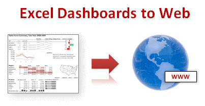
Today we will learn how to export excel dashboards to web pages.
Exporting Excel Dashboards to Web:
When it comes to exporting dashboards to web, 4 options come to my mind. I’ll quickly review these, culminating in a look at a new option – Excel 2010 and Microsoft’s online version of Office – Docs.com
- Save your workbook as a web page. Text in cells is converted to text in html tables, while charts and other shapes are converted to images. Excel offers two formats – mhtml and normal html. The mhtml version saves as a single file with the images encoded as text. Only IE can natively handle mhtml file while plug-ins exist for some of the other popular browsers. The normal html file option creates a folder full of images. By choosing this option you obviously lose any interactivity you had via drop down forms, pivot tables, or VBA. The conversion of charts/shapes to images is imperfect, leading to fuzzy edged images, and in my (beta) version of 2010 sometimes resulted in blank or missing images. You also lose font type information in 2007, so if you’re using any special fonts to create in-cell charts they will end up looking odd. Excel 2010 preserves font information (as long as the font is installed on the user’s machine). Personally, I don’t think it’s a great option – you may as well just:

[click here for a larger version] - Take a screenshot and post it to your website. You could use contol-printscreen to take a snapshot of your dashboard. As this just dumps the screen to the clipboard you may want to use a screen capture tool which can select a portion of the screen and save it to a file easily. You’ll want to make sure you crop appropriately, for looks, and so that your boss doesn’t see your taskbar with your browser on Facebook. Excel 2010 has a new screenshot option, but that’s for inserting screenshots, not saving them out. You can’t save a file as jpg/png like you can in Powerpoint, but you could save as a PDF and upload that. But what if you want more interactivity?
- Publish using Sharepoint. Sharepoint is an MS server platform that among (lots of) other things, allows publication of Excel workbooks to the web. While some interactivity is preserved (like pivot tables), many features are not (VBA, form dropdowns, images, and shapes). As some sparkline add-ins use VBA to generate a shape that depicts the data, even the static shape will not be shown as it will be stripped out. Other add-ins use VBA and a special font to depict the shape. As Excel 2010 preserves font information, these may show on a Sharepoint server, assuming the user has installed the font. Of course though, they will not update as VBA is not allowed. Linking to external data sources is allowed, so you can use your OLAP cubes or whatever else. Sharepoint is a viable option, but requires servers and licenses, neither of which come cheap. What other options are there then?
- Docs.com and Excel 2010. Docs.com is Microsoft’s online version of the Office applications. At the time of writing (July 2010), it was still in private beta. Oddly, MS has chosen to release it with deep ties to Facebook (login, posting to your wall, and sharing documents amongst friends). I honestly have never needed to share a document with a friend, and equally I’m not friends with the people that I do want to share documents with. Despite this (and I’m sure plenty will change as Docs evolves past beta), Docs.com offers some interesting opportunities for web deployment of dashboards. It still suffers from no VBA or ability to show shapes – I suspect that docs.com is running in a Sharepoint environment, BUT, and this is a big but, Docs.com was built with Office 2010 in mind. This means that the sparklines new to Excel 2010 show up, and update when values change. Take a tour of one of my workbooks on docs.com here.

Problems with Excel Dashboards uploaded to Docs.com
You’ll see on the example that there are several warnings thrown up – I left some shapes in the file before uploading just to show you what the warning message looked like. Linking to external data is not allowed (as you would expect, compared to Sharepoint where you control the servers), so you’ll have to be clever about how you update the dashboards. If your goal is to deploy using Docs.com, you’ll probably design your dashboard with this in mind, making good use of pivot tables for example.
I could envisage using Docs.com in the following manner:
- Develop a great dashboard in 2010 that instantly makes the user aware of any problems (but you’re doing that already aren’t you?) and upload it to Docs.com
- Share the document with your users, and upload a new file as data is added to the dashboard
- For any interactivity (e.g. simple data exploration to further investigate problems), the user can download the document – even though things like dropdown list boxes are not shown on docs.com, they are preserved and will show and work on the local version (VBA is still a no-no as you can’t upload a xlsm file)
I would like to see some changes with Docs.com – for example being able to hide the “Who you are sharing this with” column, allowing full-screen viewing of just the sheet, and sorting out the sharing outside of Facebook.
Now this method will not be suitable for sensitive information where deploying to the cloud (albeit with careful sharing of access) would not be appropriate, but the concept of using Excel 2010 and Docs.com offers some interesting opportunities for web-deployed Excel dashboards, and for using on websites that teach us to become awesome in Excel…
Added by Chandoo:
How do you Export Excel Dashboards to Your Audience?
Do you save the dashboards as PDFs or email the workbook or save as web page? What is your way of exposing the dashboard to the audience?
Please share using comments.
More Resources on Dashboards:
Checkout our dashboards page which has lots of links, templates, downloads and tutorials on creating excel dashboards.
Thank you Alex
I thank Alex for sharing these beautiful ideas with all of us. Exporting dashboards is a growing need and we all could use help like this to become better. Thank you Alex.
About Alex Kerin:
Alex runs a kickass consulting business at Data Driven Consulting. He shares a lot of innovative ideas and information on dashboards, visualization and Excel thru his blog regularly. And of course, he is awesome with excel.


23 Responses to “4 Alternatives to Export Excel Dashboards as Web Pages”
I use PDF as well as mhtml format to publish the Dashboards..But yes with mhtml format the end product looks very ugly..
how did you do the map?
Thanks for the tips Alex!
For the print screen, you can capture just the active window with Ctrl+Alt+PrintScreen
I usually save as PDF, for files with interactivity I try to save them on a server so people can access them from there. Unfortunately e-mailing workbooks around is still pretty common.
As for Excel not being regarded as a “serious” BI tool; I think that perception might change when PowerPivot catches on. To me it also looks like Microsoft is promoting Excel as an important part in their BI product line which is an important change as well.
Chandoo, thanks for the opportunity to post this, and for the bio...
Dan, that map is just an image that in the original file had four bar charts laid over it to show regional differences. If you want to display a real choropleth map in Excel that updates with new data, I would go here: http://www.clearlyandsimply.com/clearly_and_simply/ Robert has a number of posts on this topic, including great VBA and shape files to create the maps.
Alex Kerin (owner of the apparently kickass consulting company)
If you ever call me a choropleth again, we're going to have words.
I'm kidding.
Thanks.
The term Dashboard indicates interaction - they are to my mind never static as such so PDF isn't part of my plans...however....
a) I save the dahsboard on a shared area, with as much protection of the dahsboard worksheet(s) - all data/ driver worksheets are hidden, so it is a very nice and clean file with only the focus point visible, that is the dashboard itself.
b) my exception is that I always have a "Print version" worksheet too as my second w/sheet.
So the user of the dashboard makes their choices etc and if they want a print out the print ready page will be a perfect duplicate of the info. I find sometimes what looks good on screen as a dashboard can need changing to make it as visually appealing on paper - so they are duplicate info - sometimes different format.
For some executives I simply make a PDF with the range of page options applicable to them - and send via PDF, that way they can easily read while in transit etc.
--------
The term Dashboard indicates interaction – they are to my mind never static as such so PDF isn’t part of my plans
--------
Why?
I'm not arguing. I'm just curious as to how you use interactivity? My only real 'dashboard' thing that I made so far has one 2 set dynamic chart, the rest is pretty static.
@Christian & Dan l: Just to add to the discussion, Stephen Few does not fully recommend interactivity in his book Information Dashboard Design. His view is that a dashboard should be as good when printed and we all know print provides zero interactivity.
That said, he also points that analytical dashboards are better off with ability to dig deep, add detail on demand.
While I do not completely agree with him, I think interactivity beyond a point is not advisable in dashboards. It beats the purpose of "all the information required at a single glance".
Alex, Chandoo - thanks for the post. Perfect timing for me as I'm working on a dashboard for my local government. Currently, it's an Excel based, fully interactive dashboard that is distributed by e-mail every month. It is a bit problematic as I constructed it with Excel 2007 and not everyone has that - so there are some errors in translation. I have recently began constructing a dashboard in Xcelsius which will allow me to put the data online and preserve the interactive capabilities. While I've noticed some challenges associated with this approach, it seems to be quite promising! By the way, Xcelsius Present is now offered for FREE by SAP!
I'll respond to Dan L. in regards to his question for Christian. Obviously, not every dashboard requires interaction. However, for my needs, it's pretty much essential. I have constructed a dashboard for each of our approx 15 depts. Currently, my "dashboard" workbook has a different sheet with each dashboard (I've crafted some buttons which link to other sheets to make it appear to be one "tabbed" page). Within each dashboard, I have dynamic charts and drop down menus that allow the user to view a large chart with the results of any given performance measure or financial metric (account balance). Also, the interactivity can change the time frame. There is no way that I can fit all of this information on one page, so I like to let the user define what they see.
Tom, is this the product offer you're talking about? http://events.businessobjects.com/forms/Q210/present/sap/?source=bansap
I'm downloading now - will review it on my blog if it's interesting.
RE: dashboard interactivity, I am having a similar discussion in the comments section of a recent post on my site: http://www.datadrivenconsulting.com/2010/07/if-your-sales-dashboard-tells-you-that-sales-are-down-but-not-why-you-dont-have-a-dashboard/
I also think that outside of analytical dashboards, the interactivity should be limited - any time you make your users search for the answer, chances are they won't. Better to understand what they may need to solve their business problem and provide it right there on the screen.
Alex,
Yes - you found it. Apparently they've changed the name very recently to Crystal Presentation Design (when I downloaded it, it was Xcelsius).
You make a good point about too much data being confusing. I'm working on multiple versions of the dashboard - one for an "analyst" and one for the basic information consumer. I try to keep this in mind, but I've got a lot to learn. Thanks for your feedback - I'll be sure to drop by your blog soon.
Tom
I'm using Zoho Reports to embed Excel dashboards to my blogs and web sites.
http://blogs.zoho.com/general/embed-zoho-db-reports-interactive-charts-in-your-blogwebsite
http://reports.zoho.com allows to upload from xls files, synchronize data, queries with SQL, share reports and dashboards with collaborative analysis.
Has anyone used this?: http://www.exceleverywhere.com/
any good?
Here's your answer Andrew:
http://quickshare.spreadsheet-converter.com/l/p/77jt7b4mh19e/
I really like what they offer, but it's not for dashboards.
Here's a new alternative to posting an excel web based dashboard
http://blogs.msdn.com/b/excel/archive/2010/09/23/embedding-excel-web-app-in-your-own-web-page-or-blog.aspx
I just used Microsoft ExcelWebApp to embed my workbook about how to make the Easter dates in my blog:
http://pedrowave.blogspot.com/2010/09/how-to-make-easter-dates.html
I’ve enabled interactivity and typing to allow people to change the year in A1 cell.
Now I can share my workbooks with people without MS Excel.
Here's an example I put together to show how to get MapPoint maps dynamically into an Excel Dashboard --
http://www.mapforums.com/sample-excel-application-automating-mappoint-pasting-map-images-into-excel-part-1-2-a-20990.html
I will be posting a follow up article in the next couple weeks, let me know if you have any suggestions.
Thanks,
Eric
Hi!
You can also use directly an online app like Jolicharts to embed your excel sheets and draw visualization with quick drag and drops...
https://jolicharts.com/
Then, it's really easy to publish, share your dashboard with a lot more of interactivity than Excel itself.
Interesting feature for you is that you can also control the access of any data that you share. Like making on dashboard, and then sharing every part or chart to people with different authorization or filters. 🙂
I've embedded a dashboard that includes slicers for interactivity:
http://datascopic.net/embedded-excel-dashboard/
Am I missing something? If I save my dashboard to a folder that the "users" have read-only access to, it would appear that multiple users can access it, and the interactive features work. This sounds too simple - what's the snag?
The snag is does not support VBA
Thanks for sharing your thoughts on charts and graphs.
Regards