Shading above or below a line in Excel charts [tutorial]
When comparing 2 sets of data, one question we always ask is,
- How is first set of numbers different from second set?
A classic example of this is, lets say you are comparing productivity figures of your company with industry averages. Merely seeing both your series as lines (or columns etc.) is not going to tell you the full story. But if we can shade our productivity line in red or green when it is under or above industry average… now that would be awesome! Something like above.
How the tax burden has changed over the years – Excellent chart by NYTimes & Redoing it in Excel
If I need some charting inspiration, I always visit New York Times. Their interactive visualizations are some of the best you can find anywhere. Clear, beautifully crafted and powerful. Long time readers of Chandoo.org knew that I like to learn from visualizations in NY Times & redo them using Excel.
Today let me present you one such chart. This is based on an interactive visualization prepared by NY Times explaining how the tax burden has changed over years for various income groups.
Take a look at tax burden chart – Excel implementation
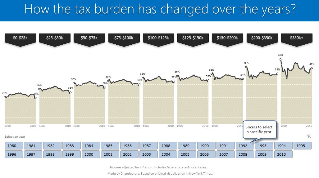
Read on to learn how to create this chart using Excel.
Making Small Multiples in Excel [Charting Technique]
Today, lets learn how to create small-multiples (or panel charts) to visualize trend of 2 product lines over years in various regions. The inspiration for this chart and article came from my friend, Paresh‘s recent article on his blog.
See how you can create a combination of area & line chart to create the small-multiple chart and clone it. You can also download the workbook and play with it to understand this technique better.
KPI Dashboard – Revisited
In 2008, I received an email from Robert Mundigl, which was the start of a life-long friendship. Robert asked me if he can teach us how to make KPI dashboards using Excel. I gladly said yes because I am always looking for new ways to use Excel.
The original KPI dashboards using Excel article was so popular. They still help around 12,000 people around the globe every month. Many of our regular readers and members have once started their journey on Chandoo.org from these articles.
In this article, we will revisit the dashboard and give it a fresh new spin using Excel 2007.
Evolution of Privacy Policies on Facebook – a Panel Chart in Excel
Out of curiosity I took the data from Matt McKeon’s Privacy on Facebook chart and try to re-do the chart in Excel. I made a panel chart depicting how Facebook’s privacy policies have changed since 2005. You can see a bigger version of chart as well as get the download excel from the post. Read on…
Excel Links of the Week – now even more downloads edition
Welcome to another edition of excel links. During the last week, I have revised excel downloads page on PHD and now it contains over 75 excel templates, tutorial downloads. I am not sure if you dig the new format of the page though. So go take a look at it and let me know what […]
Best Charts to Compare Actual Values with Targets – What is your take?
Comparing values is one of the main reasons we make charts. Yesterday we have a post on using thermometer charts to quickly compare actual values with targets. Today we follow up the post with 10 charting ideas you can use to compare actual values with targets. Check out how bullet charts, thermometer charts, traffic lights, gauges, column charts, area charts can help you compare targets with actual performances. A review of best charting options when you need to compare.
Read the rest of the post to see the options and participate in poll.