These Pivot Table tricks massively save your time

Share

Facebook
Twitter
LinkedIn

Pivot tables are powerful. Use these 6 tricks to save time when working with them.

Excel Pivot Table Tricks to save your time and make you awesome

1 - Double click to see details

Ever wondered what numbers add up to the total in a pivot table value area? Simply double click to investigate. Excel will show all underlying values. 

Extra tip: Don’t forget to delete such detail worksheets as they can create duplicate data.

pivot tricks - 1 - drill to details

2 - Format value fields quickly

The default value field formatting is useless. Often, we need to change the values to currency or accounting formats. You can do this quickly by right clicking on the values instead of going to Value Field Settings > Number Formats route.

See this image to understand the process.

pivot trick 2 - format quickly

🙏 Thanks to Srinivas who taught me this trick on my YouTube channel (link)

3 - Include filtered items in subtotals

Let’s say you have a pivot table with Sales by product & region. You filter out some products. The grand totals change. This can be inaccurate.

If you want to to include filtered items in the totals you can use the option in “Subtotals” menu in ribbon. Oh wait a sec, that is grayed out 🤔🤔🤔

pivot tricks 3 - include filtered values in totals - disabled

Turns out you can ungray it. All you need is to use data model. Click on “Add to data model” in the insert pivot screen you are able to use this feature. 

🙏 Thanks to Ryan who taught me this tip on my YouTube channel (link)

4 - Consistent pivot charts with a simple trick

Let’s say you have a pivot chart linked to a slicer showing sales by product in selected region. As you don’t sell all products in all regions, the chart looks jumpy with inconsistent axis.

Something like this:

pivot tricks 4 - inconsistent axis

You can make the axis consistent by formatting the row label to show “items with no data”. To do this, select the row labels area of the pivot, right click and go to “Field settings”. Now from display area, enable “Items with no data” option.

pivot tricks 4 - items with no data option

Your chart looks much better.

pivot tricks 4 - consistent axis

5 - Repeat row labels

Tabular form is my favorite layout for pivot. It looks clear and easy on eyes. 

Do you know that you can enable “Repeat item labels” option to make the tabular layout even better.

pivot tricks 5 - repeat item labels

Bonus tip: When you repeat item labels, you can use Pivot Tables in other formulas (like SUMIFS) easily. 

6 - Multiple pages with Report Filters

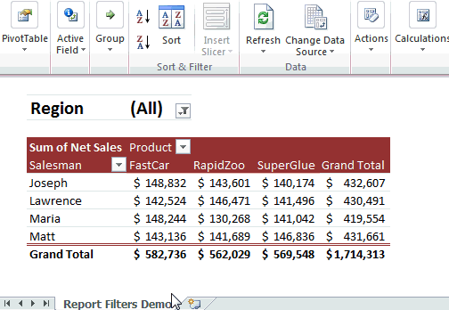
You got a handy little pivot report that details the performance of a region. Now you want to make similar reports for rest of the 16 regions too.

You can use Report Filters to quickly create all versions of this report in one click. Here is a demo of how report filters work.


Report Fitters in Excel - used to create multiple versions of a report - Demo


Click here for more tips & info on Report Filters.

Pivot Table Tricks - Video

If you want to view all these tricks + my new haircut, check out below video. You can also watch this on my YouTube channel here.

More Pivot Table goodness

Work with data often? Then learn Pivot tables you must.

Check out below pages to pick up valuable pivoting skills.

Got some tricks? Teach me...

You can teach an old dog new tricks. If you know a cool & useful Pivot Table trick, post it in comments. I am eager to learn from you.

Facebook
Twitter
LinkedIn

Share this tip with your colleagues

Excel and Power BI tips - Chandoo.org Newsletter

Get FREE Excel + Power BI Tips

Simple, fun and useful emails, once per week.

Learn & be awesome.

Welcome to Chandoo.org

Thank you so much for visiting. My aim is to make you awesome in Excel & Power BI. I do this by sharing videos, tips, examples and downloads on this website. There are more than 1,000 pages with all things Excel, Power BI, Dashboards & VBA here. Go ahead and spend few minutes to be AWESOME.

Read my storyFREE Excel tips book

Overall I learned a lot and I thought you did a great job of explaining how to do things. This will definitely elevate my reporting in the future.
Rebekah S
Reporting Analyst
Excel formula list - 100+ examples and howto guide for you

From simple to complex, there is a formula for every occasion. Check out the list now.

Calendars, invoices, trackers and much more. All free, fun and fantastic.

Advanced Pivot Table tricks

Power Query, Data model, DAX, Filters, Slicers, Conditional formats and beautiful charts. It's all here.

Still on fence about Power BI? In this getting started guide, learn what is Power BI, how to get it and how to create your first report from scratch.

21 Responses to “Distinct count in Excel pivot tables”

  1. Al says:

    The distinct count option works well but I have found that if I have a date field and want to group by year, month, etc. that option seems to be disabled. I need to do both, distinct count and group by year/month.
    Example data; sales orders with item quantities with dates.
    Challenge; sum the item quantities, count the distinct orders and group by month. How do I do this?
    Perhaps that's not possible due to the grouping?

    • Chandoo says:

      @Al... When you use data model based pivots, you cannot group values manually anymore. Why not use Excel 2016's default date grouping option? In this case we have just a few dates, so Excel is not grouping them, but if you have an year's worth of data, when you make the pivot with date in the row label area, Excel automatically groups them. If you have fewer dates or want to use your own grouping, just create a table with all dates, add columns with month, week, year etc. Then connect this table (these types of tables are usually called as calendar tables) to your data on date field as a relationship. Now you can create reports by month, quarter etc easily.

      • Dan says:

        Is this the only way to do it in 2013? I find it rather cumbersome to have to create another data table listing dates with the another column for MONTH() and YEAR() to be able to summarise data for senior level...

        • Chandoo says:

          I know people find adding calendar tables cumbersome, but it is a best practice and let's you add more layers of analysis quite easily. For example, adding analysis by weekday vs. weekend or by financial quarter or YTD calculations (you would need either Power Pivot DAX or some very carefully setup pivot table value field settings)

  2. NC says:

    I had absolutely no idea this was possible. Very useful, nice work!

  3. Pete says:

    Doesn't work for 2010 version though (or at least not my works version)

    • NARAYAN says:

      Hi ,

      The post has the following in it :

      These instructions work only in Excel 2016, Office 365 and Excel 2013.

  4. Sarah says:

    when i have 2 different Pivot tables, one without the enabled “Add this data to data model” option, and the other one with it enabled.. is there anyway i can link slicers between them?
    if the answer is NO,, what to do ?

  5. Edgar says:

    Quick note, the “Add this data to data model” option is not available for the Mac version.

  6. Steve Curtis says:

    perhaps outside scope of this article but I have found when I attempt to create a pivot table from an external data source (connection to a sql view) the "Add this data to data model" becomes greyed out. Anybody experienced and found a solution so I can start getting distinct count in my pivot tables?

  7. Kelly Nanfito says:

    Is there a way to still add a calculated field when using distinct count?

  8. Luna says:

    I found I can't change the date source after tick the " add this data to the data model", can you help to adv how to change the date source in such case?

  9. Chris says:

    Is there a way to update the source once you have added to the data model? I receive a new spreadsheet weekly and would like to update the connection so my tables pull from the new source.

  10. Ankit Moral says:

    A big Thank you. It worked.

  11. Mohapi says:

    Hi, have survey data that I need to analyze but the challenge is that my key fields are showing horizontally. I tried to transpose the fields using Power Query, but unfortunately the new fields are returning same values on a pivot table despite using distinct values

  12. sorina says:

    How I can a do a pivot table with discount conts in some columns and then generate shor report filter pages. pls it drives crazy

  13. ira says:

    Hi. Why grand total pivot of distinct count is 13? shouldn't it be 67?

  14. Asia says:

    Great Answer! Saved me lots of time!
    Thank you!!!

  15. Suresh says:

    Worked awesome! Thanks!!

  16. Mayank says:

    Hi Chandoo,
    I am using pivot tables for distinct count and now I need to update them with new set of data. But when I update the source data, all the columns and formatting of Pivot table disappears and I need to build it from Scratch.

    Is there a possibility that I can update the source data with new rows added and also retain my pivot tables?

Leave a Reply