fbpx
Search
Close this search box.

All articles with 'heatmaps' Tag

6 Best charts to show % progress against goal

Published on May 8, 2020 in Charts and Graphs, Learn Excel
6 Best charts to show % progress against goal

Back when I was working as a project lead, everyday my project manager would ask me the same question.

“Chandoo, whats the progress?”

He was so punctual about it, even on days when our coffee machine wasn’t working.

As you can see, tracking progress is an obsession we all have. At this very moment, if you pay close attention, you can hear mouse clicks of thousands of analysts and managers all over the world making project progress charts.

So today, lets talk about best charts to show % progress against a goal.

Continue »

Using IRR with Data Tables – Modeling Cash-flow Scenarios in Excel

Published on Oct 16, 2019 in Analytics, Financial Modeling, Learn Excel
Using IRR with Data Tables – Modeling Cash-flow Scenarios in Excel

Do you want to simulate multiple cash-flow scenarios and calculate the rate of return? Then this article is for you. In this page, learn how to,

  • Introduction to IRR & XIRR functions
  • Calculate rate of return from a set of cash-flows with XIRR
  • Simulating purchase or terminal value changes with data tables
  • Apply conditional formatting to visualize the outputs
  • Common issues and challenges faced when using XIRR
Continue »

Joyplot in Excel

Joyplot in Excel

Over on Twitter, I came across this beautiful chart, aptly titled – Joyplot. It is the kind of chart that makes you all curious and awed. So I did what any Excel nerd would do. Recreated it in Excel of course. This post takes you thru the process.

Take a look at final outcome above. Read on to learn more.

Continue »

Analyzing half a million complaints – Customer Satisfaction Scorecard [Part 3 of 3]

Analyzing half a million complaints – Customer Satisfaction Scorecard [Part 3 of 3]

This is the final part of our series on how to analyze half a million customer complaints. Click below links to read part 1 & 2.

  1. Complaint reason analysis – Part 1
  2. Regional trends & analysis – Part 2

Customer satisfaction scorecard

In the previous parts of this case study, we understood what kind of complaints were made and where they came from (states). For the customer satisfaction scorecard, let’s focus on individual companies.

Continue »

Analyzing half a million consumer complaints [Part 1 of 3]

Published on Feb 16, 2016 in Analytics, Charts and Graphs
Analyzing half a million consumer complaints [Part 1 of 3]

How would you analyze data when you have lots of it? That is the inspiration for this series.

Let’s meet our data – Finance Industry Consumer Complaints

As part of open data initiatives, US government & Consumer Financial Protection Bureau maintain a list of all consumer complaints made against financial institutions (banks, credit unions etc.) You can download this data from the catalog page here. I have obtained the data on 1st of February, 2016. The download has 513,824 records. Each row contains one complaint.

In this and next two parts of the series, we are going to analyze these half a million complaints to find insights.

Continue »

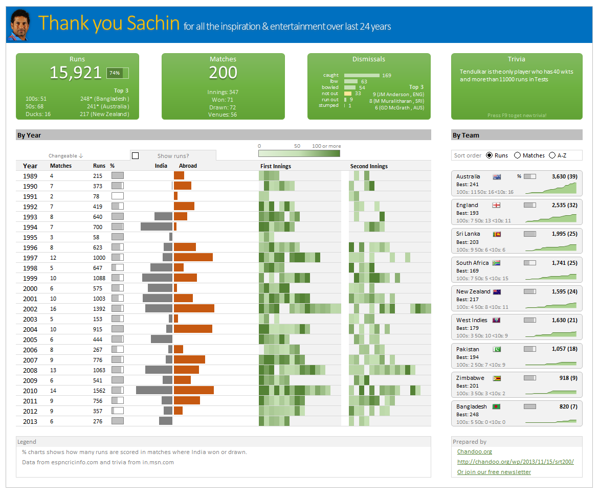
Thank you Sachin [a small tribute]

Lets talk about people who inspire us. People who show us that anything is possible. People who prove that commitment, hard work and perseverance are true ingredients of a genius.

I am talking about Sachin Tendulkar. Those of you who never heard his name, he is the most prolific cricketer in the world. He is the leading scorer in both tests (15,921 runs) and one day matches (18,426 runs). Read more about him here.

Tendulkar has been an inspiration for me (and millions of others around the world) since I was a kid. The amount of dedication & excellence he has shown constantly motivates me. It is a pity that the great man is retiring from test cricket. He is playing his last test match (200th, most by any person) as I am writing this.

So as a small tribute, I have decided do something for him. Of course, I have never been a cricketer in my life. Once in college I was reluctantly asked to be a stand-by player in a game with seniors. I did not get a chance to pad up though. That is the closest I have been to a cricketer. So I did what I do best. Create an Excel workbook celebrating Sachin’s test career.

Thank you Sachin – his test career in a dashboard

Here is a dashboard I made visualizing his test cricket statistics. It is dynamic, fun & awesome (just like Sachin).

(click on the image to enlarge)

Sachin Tendular 200 Tests - Visualized in an Excel Dashboard

Continue »

Designing a dashboard to track Employee vacations [case study]

Published on Jan 24, 2013 in Charts and Graphs, Learn Excel
Designing a dashboard to track Employee vacations [case study]

Employee Vacation Dashboard & Tracker using Excel

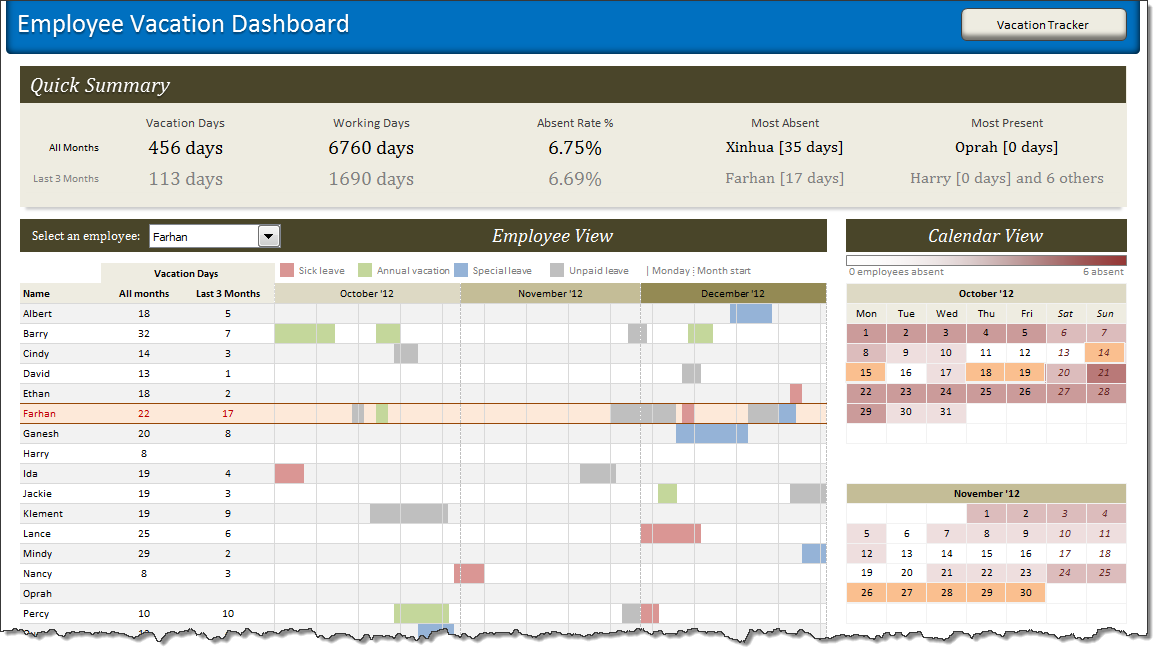
HR managers & department heads always ask, “So what is the vacation pattern of our employees? What is our average absent rate?”

Today lets tackle that question and learn how to create a dashboard to monitor employee vacations.

What do HR Managers need? (end user needs)

There are 2 aspects tracking vacations.

1. Data entry for vacations taken by employees
2. Status dashboard to summarize vacation data

Continue »

90% of you can see up to cell M26 & other findings [visualization]

Published on Nov 12, 2010 in Charts and Graphs, Learn Excel
90% of you can see up to cell M26 & other findings [visualization]

Two weeks back I ran a poll asking you to tell me what is the last visible cell in your excel window. It was a casual poll. So I didn’t expect a lot of responses. But, boy I was wrong! 295 of you have responded at last count. This is so much more than what I expected.

As I said, the purpose of this poll is to make a visualization out of the poll responses. In this post you can see the chart(s) I made from this data & learn more.

Continue »

Flu Trends Chart in Excel [Yes, we can edition]

Published on Jan 22, 2010 in Charts and Graphs, Featured
Flu Trends Chart in Excel [Yes, we can edition]

Last week I have reviewed Google’s flu trends chart and told you that is it is very well made. Out of curiosity I made a similar chart in Excel. In this post, I am going to share the experience and results with you. Interested? Read on…

Continue »

Flu Trends in a City chart from Google is Awesome!

Published on Jan 15, 2010 in Cool Infographics & Data Visualizations
Flu Trends in a City chart from Google is Awesome!

There is nothing awesome about flu. In fact, it is anti-awesome if you have flu. I have been fortunate enough not to get it ever (it is another story that I have cold almost 364 days of an year).

Don’t worry if you are afraid of it, Folks at Google are not letting you down. They are using google search terms to predict flu trends and present the information in a beautiful chart.

Today I want to tell you why this particular chart on flu trends made by Google is awesome…

Continue »

Baby Feeding Chart using Excel

Published on Oct 12, 2009 in Charts and Graphs, Learn Excel
Baby Feeding Chart using Excel

While feeding the babies last night, I had this idea. Why not make an excel sheet where you can keep track of the baby’s feeding and sleeping activities on day to day basis. It would probably help you understand your baby’s needs better and may be give you some insights.

Continue »

Excel Time Sheets and Resource Management [Project Management using Excel – Part 4 of 6]

Published on Aug 5, 2009 in Charts and Graphs, Featured, Learn Excel
Excel Time Sheets and Resource Management [Project Management using Excel – Part 4 of 6]

Timesheets are like TPS reports of any project. Team members think of them as an annoying activity. For managers, timesheets are a vital component to understand how team is working and where the effort is going. By using Microsoft Excel capabilities you can create a truly remarkable timesheet tracking tool.

In this installment of project management using excel series, we will learn 3 things about timesheets and resource management using Excel
1. How to setup a simple timesheet template in excel?
2. How to make a more robust timesheet tracker tool in Excel?
3. How to use the timesheet data to make a resource loading chart?

Continue »

We cant Cure Cancer, But we can Cure this Medicare Chart [Chart Busters]

Published on Jul 24, 2009 in Charts and Graphs, Posts by Jeff
We cant Cure Cancer, But we can Cure this Medicare Chart [Chart Busters]

In this installment of Chartbusters, we take a look at a poorly constructed choropleth of medicare reimbursements in US and suggest cure for it. The post is from our Guest Buster – Jeff.

Continue »

Hot or Not – McKinsey’s Innovation Heatmap

Hot or Not – McKinsey’s Innovation Heatmap

Take a look at the innovation heat map published by McKinsey and tell us what you think – Hot or Not?

Continue »

Featured Visualizations – Jan 02

Published on Jan 2, 2009 in Cool Infographics & Data Visualizations
Featured Visualizations – Jan 02

Every week Pointy Haired Dilbert celebrates visualization and info-graphics by showcasing some of the creative and fun charting work from around the web. Have inspiration and fun. Browse hundreds of fun visualization and graphics projects in archives.

Newsmap is a creative and fun way to look at news. They organize news items on a tree map based on recency and relevancy of the news items (that are probably pulled from Google news). The background color indicates the news topic (red for world, purple for business, green for tech etc.)

Continue »