• Hi All

    Please note that at the Chandoo.org Forums there is Zero Tolerance to Spam

    Post Spam and you Will Be Deleted as a User

    Hui...

  • When starting a new post, to receive a quicker and more targeted answer, Please include a sample file in the initial post.

How to draw an approximation graph in excel

Dil09

New Member
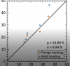
Hi everyone, I have two sets of data in excel. I want to plot them over X and Y axis with different color and draw a linear center line to check how different they are. But I could not make this. I added a picture how exactly I want them to draw. Please help.
 

Attachments

  • imgpsh_fullsize_anim.png
    imgpsh_fullsize_anim.png
    32.4 KB · Views: 7
Dil09
You should able to send an Excel-file with a sample data.
or
#1 Select Your data
#2 Insert XY-chart
#3 Modify series colors
... and so on.
 
Hi, I added an excel file. With the two sets data A and B I want to plot a graph like the added picture. Is it possible that the data in column A shows red and B blue? Also the straight line starting from the origin (showed in the picture) how to create this? Thanks
 

Attachments

  • example.xlsx
    8.8 KB · Views: 4
Dil09
For two xy-chart-series (A & B) You needs four columns data.
Your given data could show like below.
Screenshot 2021-09-10 at 18.40.09.png
Something is still missing.
 
I assume that A & B are 2 sets of Y values
What is the X Axis values for the data?
 
Back
Top