You are using an out of date browser. It may not display this or other websites correctly.
You should upgrade or use an alternative browser.
You should upgrade or use an alternative browser.
DASHBOARD HELP
- Thread starter Cash Khan
- Start date
Khalid NGO
Excel Ninja
Hi,
Dear I said you earlier to describe your question in detail and include the expected result.
I am not sure. Can you check this:
=SUMIFS($F$2:$F$41,$B$2:$B$41,$B$47,$D$2:$D$41,B$48,$A$2:$A$41,$A49)
Enter in B49 and copy across & down.
The red highlighted $F$2:$F$41 is sum range, I am not sure which column you want to sum. Change the range accordingly.
Regards,
Khalid NGO
Excel Ninja
thank you so much khalid..... you are a life saver ..... yes it works perfectly
You're welcome dear
") Glad it solved.
Glad it solved.Thanks for the feedback.
Keep visiting
Khalid NGO
Excel Ninja
Need more reviews please as this is my first dashboard
Hi,
A comprehensive guide to dashboard.
http://chandoo.org/wp/excel-dashboards/
Regards,
Khalid NGO
Excel Ninja
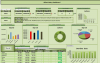
On the scale of 1-10 (10 being highest) where do you rank my dashboard... presentation wise, look wise
Hi,
Since it is your 1st Dashboard, I would say it is Good.
Colour scheme is good (l like limited colours)
But Sorry I can't rank as I am not a dashboard expert.
Wait someone to respond for rank.
Regards,
Riyaz Ali
New Member
Good attempt for a first timer... couple of observations (my personal view and may differ from person to person)
I would use a drop-down for Vessel and Designation selection... this way i can directly select the desired option as opposed to scrolling through all of them till i reach the one i am looking for.
Remove the effects from the headers and it is getting difficult to read them.
Normal 2D charts will look as well as deliver the message much better than 3D charts
Try to have all the squares of same sizes and aligned correctly... will give a professional touch
Usage of contrast colors on the donut chart will help differentiate the values and will be easier to read....
Again as i mentioned earlier... these are my personal views and may differ from person to person. Hope i have helped.
Khalid NGO
Excel Ninja
- I would use a drop-down.
- Normal 2D charts much better than 3D charts
- have all the squares of same sizes and aligned correctly
- contrast colors on the chart
Seems we have almost similar thought.
Here is a link to one of mine:
http://chandoo.org/forum/threads/wh...-have-performed-with-excel.24861/#post-149714
Regards,
") that is awesome...
that is awesome...