• Hi All

    Please note that at the Chandoo.org Forums there is Zero Tolerance to Spam

    Post Spam and you Will Be Deleted as a User

    Hui...

  • When starting a new post, to receive a quicker and more targeted answer, Please include a sample file in the initial post.

9 box grid - talent chart

Status
Not open for further replies.

Joe Pineapples

New Member
Hi - I have been an avid follower for a while and am always impressed by the simplicity and elegance of the solutions here.

I am currently struggling with an HR challenge - how to present the findings of a talent bench review for up to 150 people.

Employees are rated on Performance, Potential and Readiness, each with three criteria. I have included the criteria below.

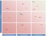
Currently the team have a 9-box grid in PowerPoint (am I allowed to say that here ?) that is updated manually by placing a small circle (a blob) and the name of the individuals in each of the nine quadrants. The grid axes are Performance and Potential. Readiness is represented by colour coding the blob Red/Amber/Green. Example attached

I have searched and whilst I can find excel templates that help with a two dimensional 9-box grid in excel to show Performance/Potential, many require manual intervention to shift people up/down/left/right within each of the nine boxes, or are fixed based on the number of people that can be shown, or are generally clunky. Unfortunately I wasn't able to come across any that show the third dimension (Readiness).

Q: Is there a way to do this in a scatter chart (or other option) that would dynamically adjust the positioning depending on the number of individuals included in the review and also apply a colour code to represent Readiness. The colour coding is a nice to have - I could live without it.

Many thanks in advance

Joe.


Ratings / Criteria:

Performance
  1. Weak performer
  2. Solid performer
  3. Strong performer
Potential
  1. Current role only or possible bad fit
  2. Good fit at current level, lateral move, or upward 1 level
  3. Upward mobility more than 1 level
Readiness
  1. Needs greater than 12 months to develop to next move
  2. Should develop in current role for more than 12 months before next move
  3. Can take next development step within next 12 months
 

Attachments

  • 9box.jpg
    9box.jpg
    54.4 KB · Views: 140
Hi Joe, and welcome to the forum! :awesome:

Here's an idea to get you started. Basic idea is to create a XY chart, one series for each color of dots that you want. To get the spacing, I have it add a small decimal to initial value, to "offset" from true 1, 2, or 3 value.
upload_2016-6-2_16-36-47.png

Still rough, but hopefully you can see the basic idea.
 

Attachments

  • 9 box chart.xlsx
    12.6 KB · Views: 562
Thank you so much for the fast response. My apologies for not getting back sooner - unfortunately the day after I posted I came down with a nasty bug and have been off work ever since. First day back today.

Allow me to catch up on a mountain of work and I will take a good long look at the sheet in particular how you have calculated the offsets.

Thanks again
 
Hi Joe, and welcome to the forum! :awesome:

Here's an idea to get you started. Basic idea is to create a XY chart, one series for each color of dots that you want. To get the spacing, I have it add a small decimal to initial value, to "offset" from true 1, 2, or 3 value.
View attachment 31506

Still rough, but hopefully you can see the basic idea.
Hi Luke,
Greetings Of the day!
I am new to the forum and just saw this post under 9 Box model. I am also creating a similar grid for the company where I am working. kindly explain this part of your set formula:B5-1+ROW()*1/15,NA()

Reagrds,
Rachna
 
Hi Luke,
Greetings Of the day!
I am new to the forum and just saw this post under 9 Box model. I am also creating a similar grid for the company where I am working. kindly explain this part of your set formula:B5-1+ROW()*1/15,NA()

Reagrds,
Rachna
I believe Luke explained it in his first response:
"To get the spacing, I have it add a small decimal to initial value, to "offset" from true 1, 2, or 3 value."
So the names do not overlap on the chart.
 
Hi Joe, and welcome to the forum! :awesome:

Here's an idea to get you started. Basic idea is to create a XY chart, one series for each color of dots that you want. To get the spacing, I have it add a small decimal to initial value, to "offset" from true 1, 2, or 3 value.
View attachment 31506

Still rough, but hopefully you can see the basic idea.
Chart seems very useful for many. And elegant offset tip. I could have used it a couple of years ago where I had a similar problem. Thx, Luke.
 
I believe Luke explained it in his first response:
"To get the spacing, I have it add a small decimal to initial value, to "offset" from true 1, 2, or 3 value."
So the names do not overlap on the chart.

Right on! :cool:

Glad you liked the post. :)
 
Can you help explain how to make the graph? I tried to duplicate the table and graph that you make with more data but I cant make the graph. How to display each name in graph?
 
Can you help explain how to make the graph? I tried to duplicate the table and graph that you make with more data but I cant make the graph. How to display each name in graph?
Glad you liked it. The names are shown using custom data labels.
https://chandoo.org/wp/2010/05/05/change-data-labels-in-charts/

So, once you've calculated the position using XY coordinates, I have the chart show data labels. There's add-ins to do this, or you can do it manually by single-clicking twice on a data label, then going to formula bar and putting in the correct cell reference.
 
Hi All.

Thanks for sending this through. I am getting into trouble with the grid for any information below 10 records. On the chart it just shows the result i.e. 2.9333 for row 11.

Is there an inbuilt restriction on the number of records?
Angus
 
Hi All

I am struggling to adapt this to what I need as my excel skills aren't great.

What I need is a 16 box version with 'Potential' on the horizontal axis labelled P1 to P4 and 'Performance' on the vertical access labelled A to D. I would then like the employees names to appear in the relevant box on the grid.

I also need to go one step further and be able to filter by job title.

Please help!

Kind Regards
Amanda
 
dear forum, what about if the performance scale is 1-4 and potential 1-3? How do I plot them in the 9-box? Many thanks
 
hi all, I managed to design the table but now only a few of the employees appear in the chart ... I am unable to add all employees. Is there a limit maybe to the number of items with data labels that can be plotted in the 9 box? also if I look at the calculation it seems that the employees that do not show in the chart are those for which the values are over 3.0 so maybe I am making an error in calculation?
Adam​
3​
2​
B​
#N/A​
#N/A​
#N/A​
#N/A​
4.93333​
4.21905​
Bob​
3​
2​
B​
#N/A​
#N/A​
#N/A​
#N/A​
5​
4​
Charlie​
3​
2​
B​
#N/A​
#N/A​
#N/A​
#N/A​
5.06667​
3.78095​
Dan​
3​
2​
B​
#N/A​
#N/A​
#N/A​
#N/A​
5.13333​
3.84762​
Evan​
3​
2​
B​
#N/A​
#N/A​
#N/A​
#N/A​
5.2​
3.91429​
Frank​
3​
2​
B​
#N/A​
#N/A​
#N/A​
#N/A​
5.26667​
4.12381​
Jim​
3​
2​
B​
#N/A​
#N/A​
#N/A​
#N/A​
5.33333​
4.19048​
Jose​
3​
2​
B​
#N/A​
#N/A​
#N/A​
#N/A​
5.4​
4.54286​
Tim​
3​
2​
B​
#N/A​
#N/A​
#N/A​
#N/A​
5.46667​
4.75238​
Zack​
3​
2​
G​
#N/A​
#N/A​
5.53333​
4.9619​
#N/A​
#N/A​
 
Status
Not open for further replies.
Back
Top