• Hi All

    Please note that at the Chandoo.org Forums there is Zero Tolerance to Spam

    Post Spam and you Will Be Deleted as a User

    Hui...

  • When starting a new post, to receive a quicker and more targeted answer, Please include a sample file in the initial post.

Sunburst alternative

Starkus

New Member
Hi everyone,

I am trying to visualize our production routing date in Excel. I have data that tells every unique routing for a production order (over 70,000 P.O.'s, over the last 2 years), and my goal is to find out what the most common routes are in our production.

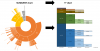
I have spent a lot of time arranging the data to show it in a sunburst chart. The sunburst shows what I want to see, but because sunbursts are circled, fields appear bigger than they really are. This is confusing.

Therefore, I am looking for a chart that does the same as a sunburst, only then not circled. I did a lot of researching, but I cannot find a chart type that can do that. In the picture attached you can visually see what I mean.

Can somebody please help me or give me tips on how to visualize the data otherwise?

Take care,

Julian
2018-06-28-2-png.53127
 
So, upload sample workbook and also draw free hand, how you want the chart to look like. We are not mind reader after all ;)
 
O I see the link broke... Excuse me for that. Attached you can find the data, and a picture of what I think it should look like.
 

Attachments

  • 2018-06-28 (2).png
    2018-06-28 (2).png
    226.5 KB · Views: 21
  • AUTO SUNBURST TOOL.xlsx
    703.6 KB · Views: 12
Hmm, I don't think that visual/chart is all that useful in telling a story.

I'd go with linked charts personally. First showing breakdown at highest level.

Then by either clicking category, shows break down of that category etc.

What's the purpose of the chart?
 
Hmm, I don't think that visual/chart is all that useful in telling a story.

I'd go with linked charts personally. First showing breakdown at highest level.

Then by either clicking category, shows break down of that category etc.

What's the purpose of the chart?
It would be very useful if we can show it that way. The purpose of the chart is to show what our main production routes were over the last 2 years.

So for example, we can see that 70% of the total production started in LSRFL. Of the jobs that started in LSRFL, 40% then went to BENDFL, 20% to Machining, and so forth. The white space after a certain operation means that it went to shipping after that (so, no following operation).

By visualizing our production data this way, we can see what combination of operations are common in our production.
 
Ah, ok. So it's like flow chart with volume associated with it. But with multiple starting point and end point for one, can be start point of another...

Let me think on that one, nothing immediately comes to mind.
 
Ah, ok. So it's like flow chart with volume associated with it. But with multiple starting point and end point for one, can be start point of another...

Let me think on that one, nothing immediately comes to mind.
Exactly. And by doing that, it is important that the routes stay connected. Any other type of diagram in Excel disconnects the routes, which makes it not usable. Thanks so much!
 
Ah, ok. So it's like flow chart with volume associated with it. But with multiple starting point and end point for one, can be start point of another...

Let me think on that one, nothing immediately comes to mind.
@Chihiro, were you able to come up with anything? I am very curious if there is a solution out there somewhere! :)
 
Not really via Excel. May be using R script, something like Sankey diagram...

https://www.r-bloggers.com/creating-custom-sankey-diagrams-using-r/
https://www.r-graph-gallery.com/sankey-diagram/

Using PowerBI custom visual.
https://powerbi.microsoft.com/en-us/blog/visual-awesomeness-unlocked-sankey-diagram/

I haven't tested it myself, but you may find below helpful in drawing Sankey in Excel.

http://www.doka.ch/sankey.htm

Other resources on Sankey diagram:
http://www.sankey-diagrams.com/sankey-diagram-software/
Hmm... Sankey diagrams, never thought about that! Looks promising :) I am going to play around with some of the tools you provided.

Please let me know if you ever find something like that diagram that I made in that attached image. I still feel like that would be the best way to present my data.

Thanks so much for your help so far!!! I really appreciate it.
 
Not really via Excel. May be using R script, something like Sankey diagram...

https://www.r-bloggers.com/creating-custom-sankey-diagrams-using-r/
https://www.r-graph-gallery.com/sankey-diagram/

Using PowerBI custom visual.
https://powerbi.microsoft.com/en-us/blog/visual-awesomeness-unlocked-sankey-diagram/

I haven't tested it myself, but you may find below helpful in drawing Sankey in Excel.

http://www.doka.ch/sankey.htm

Other resources on Sankey diagram:
http://www.sankey-diagrams.com/sankey-diagram-software/
I found exactly what I was looking for! An Icicle Diagram. It's not possible to make it in Excel. So far it looks like the only way to make it is with D3.js.
 
Back
Top