• Hi All

    Please note that at the Chandoo.org Forums there is Zero Tolerance to Spam

    Post Spam and you Will Be Deleted as a User

    Hui...

  • When starting a new post, to receive a quicker and more targeted answer, Please include a sample file in the initial post.

Simple chart question

Anon9149

New Member
I'm a veteran Excel user but I hardly ever touch charts and I have a question which I suspect may have a simple solution, but I've not found one whilst trawling the internet.

Making up a scenario, I have a table that contains the following data:
- Columns: Years
- Rows: Revenue streams (two types only)
- Values: Revenue generated

I want a stacked bar chart that shows the year along the x-axis and the values on the y-axis. However, I want the bars to be stacked according to the following logic:
1 - The revenue stream generating the least amount of revenue in the year is shown at the bottom of the bar/column i.e. the first component rising from the x-axis
2 - The revenue stream generating the most amount of revenue in the year is stacked on top of the first revenue stream and;
3 - With reference to the y-axis, the top of the bar/column stops at the point that represents the total revenue for the year

For example:
- in 2017 revenue stream 1 generated $500. Revenue stream 2 generated $1,000. Total revenue therefore $1,500. Revenue stream 1 begins from the x-axis and rises to $500 on the y-axis. Revenue stream 2 commences from the top of revenue stream 1 i.e. at $500 on the y-axis, and continues up to the point of $1,500 on the y-axis
- in 2018 revenue stream 1 generated $2,500 whilst revenue stream 2 generated only $400. Total revenue therefore $2,900. As revenue stream 2 generated the least amount of income in this year, it is the first component of the bar/column. Revenue stream 2 therefore begins from the x-axis and rises to $400 on the y-axis. Revenue stream 1 commences from the top of revenue stream 1 i.e. at $400 on the y-axis, and continues up to the point of $2,900 on the y-axis

I'm using a stacked bar chart at present which complies with points 1 & 3 above, but as for point 2, the components (revenue streams) do not change according to year. Is there something I need to change under the 'Select Data' option of the series?
 
Last edited:

Anon9149

Could You send Your [sample] scenario here?
... that others could see Your data or realistic sample data.
... with some kind of visual image You've have.
Without it - others could have different image.
 
Hi Vletm,

Attached is a file with the example data in my previous post.

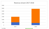
I've also tried to replicate how I envision the graph working, but of course as I don't know how to achieve the result, I've recreated this with cell colouring. Hopefully though, you can see that the data series have swapped places in the stacked column YoY on account of them being weighted differently.

EDIT: I attached an updated version of the file that shows the column chart. You can see that series 1 (blue) is always on the bottom and series 2 (orange) is always on the top, regardless of the weighting in the specific year.
 

Attachments

  • Chandoo sample data updated.xlsx
    15.7 KB · Views: 4
Last edited:

Anon9149

Your realistic sample data has two rows of data...
... and You would like those show like Your cells.
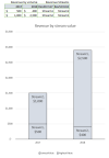
One possible solution could be something like this ... the newest chart
 

Attachments

  • Chandoo sample data updated.xlsx
    19.9 KB · Views: 2
Thanks for your effort but this does not solve the problem. All you've done is change the data around to make sure that revenue stream 1 always has the lowest level of revenue and therefore is always first in the column. We can't just change the data to fit the desired solution. The data is the data, it must remain.

The logic is:
Revenue stream 1 doesn't always have the highest revenue each year
Revenue stream 2 doesn't always have the lowest revenue each year
I want a column chart where the yearly column shows the lowest revenue stream for that year, first.
 

Anon9149

You used above many times not -word.
Your expected logic should explain - what do You want?
Could You show with realistic data with samples, which possible scenarios.
- what is missing?
So far, for my eyes, the yearly column shows the lowest revenue stream for that year, first.
Screenshot 2023-09-29 at 20.40.13.png
Did You try to change Your original sample data?
... always smaller value will be lower
You wrote something ... the highest and the lowest
... You have given realistic data with two values per year.
If those are different then one of those is the highest and other will be the lowest.
If You would like to see those colors in different order
- that is possible, but You've written to show something.
 
The logic is very clear. I've explained it very clearly, twice. It is now an issue of language and not of logic, there's nothing else I can add if you have not understood what I've written.
I don't need to show realistic data. The information I have provided expresses the problem precisely. Expanding the dataset won't make it easier to find a solution, if anything it will only confuse matters - look at how difficult things have become with just two lines of data.

You say that "for your eyes, the yearly column shows the lowest revenue stream for that year first". In your example, yes it does, but this is only because you changed my data; you switched the amounts for 2018 between revenue stream 1 and 2. I set the revenue this way because this is precisely how the problem arises. Changing the data around so that revenue stream 1 always has the lowest revenue and revenue stream 2 always has the highest revenue means there's no issue to solve in the first instance. My question is not how to have revenue stream 1 always on the bottom, my question is how to have the lowest revenue stream on the bottom.
In my dataset, revenue 1 has the lowest revenue for 2017 but it has the highest revenue in 2018. Therefore, in 2017 revenue stream 1 should be at the bottom, in 2018 revenue stream 2 should be at the bottom. You just made sure revenue stream 1 is always on the bottom by changing the data to make sure revenue 1 always generated the lowest level of revenue.
 
Last edited:
I assume I have done the same as @vletm. If you want to have data change series according to size ranking then you need to create data sets specifically for the purpose of creating your non-standard chart. You can place the chart data behind the chart so that it doesn't get confused for the real data. Sorted labels could help provide some meaning to the display.

1696012502542.png
 

Attachments

  • Chandoo sample data updated.xlsx
    27.3 KB · Views: 0
@Anon9149
I suspect you will not get the answer you hope for because what you want conflicts with the way in which Excel works.
The data as plotted cannot be the data as prepared if you are to achieve the results you desire. I use Excel 365 so it is reasonably easy for me to sort your data by column (values and revenue stream names). It would even be possible to use defined names to hold the values so that you wouldn't be offended by seeing your data being shuffled but, frankly, it is not worth the effort.
 

Anon9149

  • When drafting a question, try and lay out the question in a clear and concise way.
  • Try and tell the readers what is the situation, what have you tried and what do you want to achieve.
  • Don't leave out information more info is better
I asked: Could You show with realistic data with samples, which possible scenarios?
If You can - then I could try to continue.
Take care.
 
Back
Top