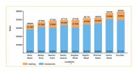
Hi, I have these data where one cell has a very high value compared to the other. Is there a way I can better represent the small stacked percentages or increase their size.
i
Ok how do I add the small value cells in a second axis under the first one?
Angola example; to put the 32k on an axis alone and the remaining values under it in a separate axis?
I understand your challenge. When one value in your dataset is significantly larger than the others, it can make it tough to represent the smaller values effectively. Here are a couple of suggestions that might help:
100% Stacked Bar Chart or 100% Stacked Column Chart: These charts show each category as a percentage of the total. This way, even if one value is very large, the smaller values are still visible and proportional, making the differences clearer.
Logarithmic Scale: If you're using a line chart or a bar chart, applying a logarithmic scale can help. This scale compresses the range of your data, allowing the smaller values to be more noticeable without losing the overall context.
Using a 100% stacked bar or column chart should make the smaller percentages stand out better, ensuring your data is accurately and effectively represented.