Hi all,
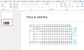
I have a table showing monthly data, and I’m looking for suggestions on the best way to present it in a chart format for easier understanding of month-on-month changes.
The goal is to highlight trends and fluctuations clearly to the reader. If anyone could recommend an effective chart type or formatting tips for this scenario, I’d really appreciate it.
Thanks in advance!


